Designed an AI-driven analytics platform that unlocked real-time operational clarity for oil & gas operators, technicians, and CFOs.
Role
Lead Product Designer
TEAM
Product, Strategy, Growth
Duration
Feb 2022- Apr 2023

Context & Problem
Oil & Gas environments are complex, high-volume, and deeply dependent on real-time accuracy. Teams rely on siloed SCADA systems, manual reconciliation, and fragmented financial/production data.
This results in:
• Delayed decision-making
• Missed anomalies
• Inefficient workflows
• Revenue leakage due to reconciliation errors
• Limited visibility into historical performance and production trajectory
SotaOG set out to fix this by merging SCADA familiarity + enterprise analytics into a single, intelligent, predictive system.
Strategic Principles
Information clarity over decoration
Speed of interpretation > speed of interaction
Progressive disclosure for dense data
SCADA familiarity preserved, not replaced
Visual hierarchy aligned to operator workflows
Cognitive load reduction through summarization
My Role & Scope
• End-to-end UX for enterprise analytics
• Information Architecture & data visualization
• 3D facility visualization / Digital Twin (Blender + Three.js)
• Stakeholder workshops with CEO, Petroleum Engineers, CFOs
• Establishing a minimal, enterprise-ready design system
Goals & Success Criteria
Business goals
• Provide a unified platform for monitoring, analyzing, and predicting production & cashflow
• Equip drilling engineers → operators → CFOs with a shared, real-time system
• Position the product as a category-defining analytics tool in the industry
Success criteria
• Reduce reconciliation time
• Improve anomaly detection
• Increase adoption of advanced analytics
• Deliver visual clarity for large datasets
• Reduce reliance on static SCADA views
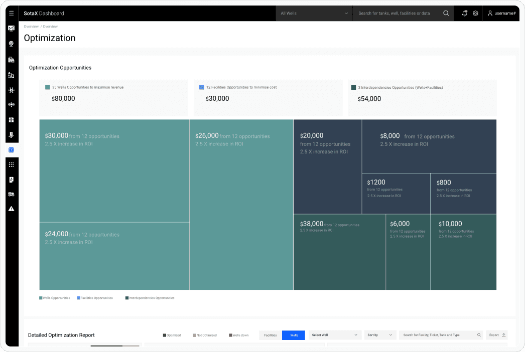
Key Problems We Identified
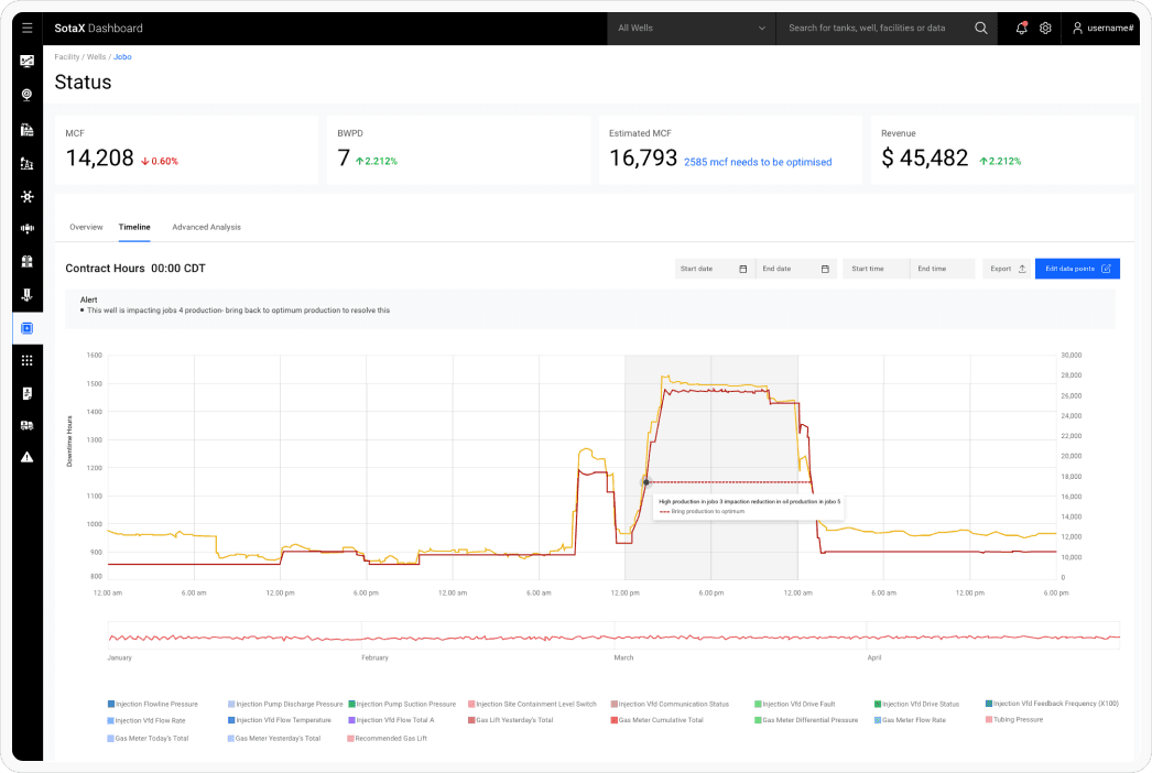
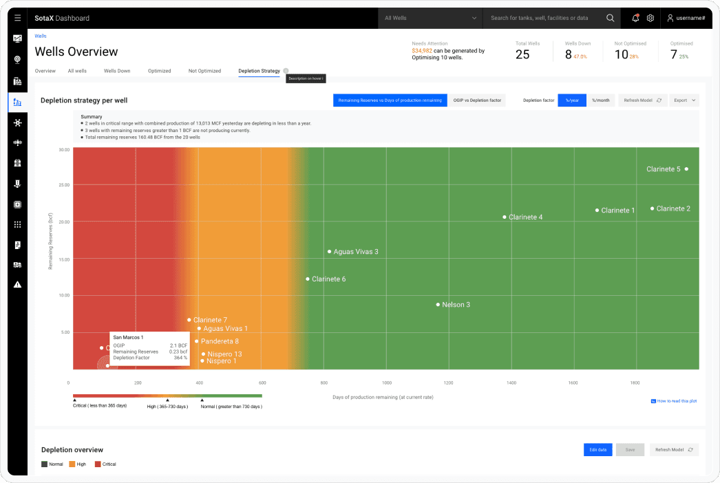
Low Production Visibility
Teams struggled to interpret massive, fast-changing datasets. Critical signals were lost in tables, slowing optimization and collaboration.
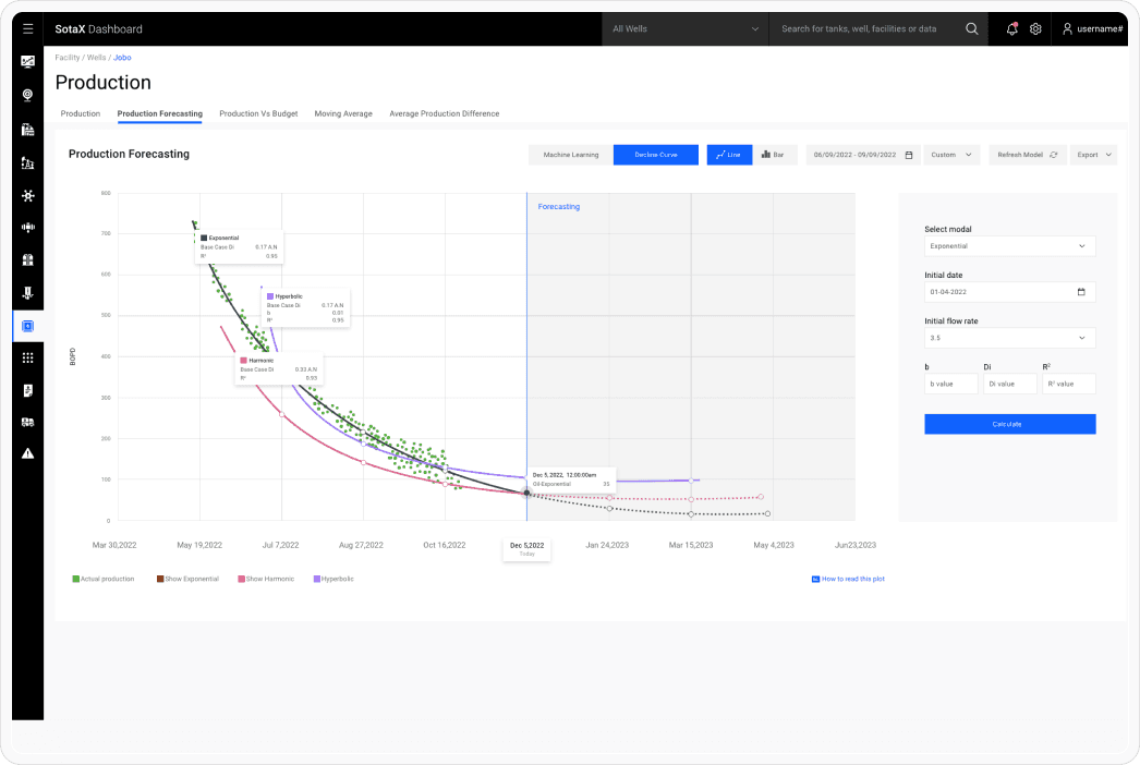
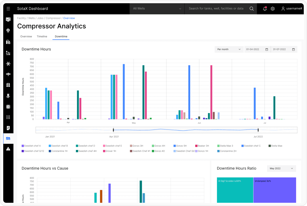
Poor Historical Insight
Historical sensor data was extremely dense. Users lacked a fast way to spot trends, anomalies or production drops across months.
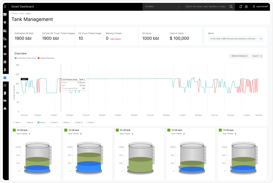
Manual & Error-Prone Reconciliation
Matching tank tickets with run statements was slow, inconsistent, and financially risky especially when physical tickets were misplaced or illegible.
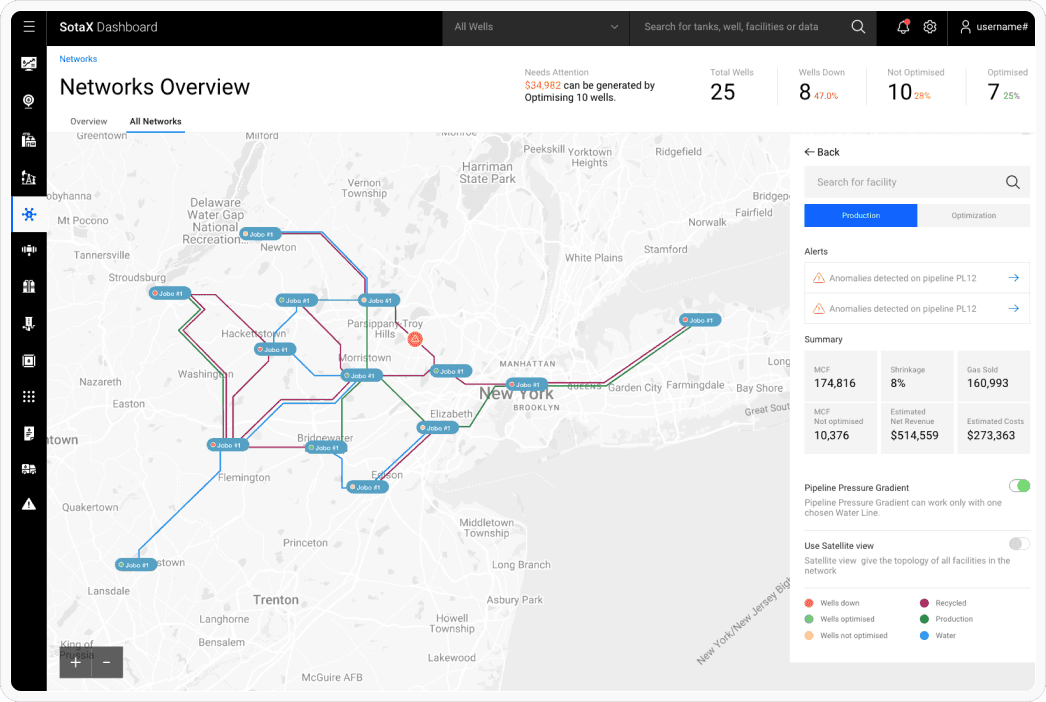
SCADA Limitations
Static SCADA screens lacked real-world context, 3D visibility, or integrated analytics. Users couldn’t visualize facility workflows or detect faulty assets early.
Solution Overview
A modern analytics layer built on top of SCADA operations surfacing real-time production, financials, historical trends, and facility-wide insights.
Core pillars included:
• History Bar → Fast anomaly detection across months
• Auto Ticket Reconciliation → OCR-powered matching and correction
• 3D Digital Twin → Real-time, interactive facility overview
• Predictive Analytics → Cashflow + production forecasting
• Unified Dashboards → Summary first, detail on demand
This architecture bridged silos, reduced manual load, and empowered every user tier with actionable clarity.
Why This Approach Works
Because Oil & Gas isn’t about screens it’s about maintaining flow, preventing losses, and maximizing production with confidence.
The design brought speed, certainty, and alignment across technicians, engineers, and financial teams, enabling them to act decisively instead of reactively.
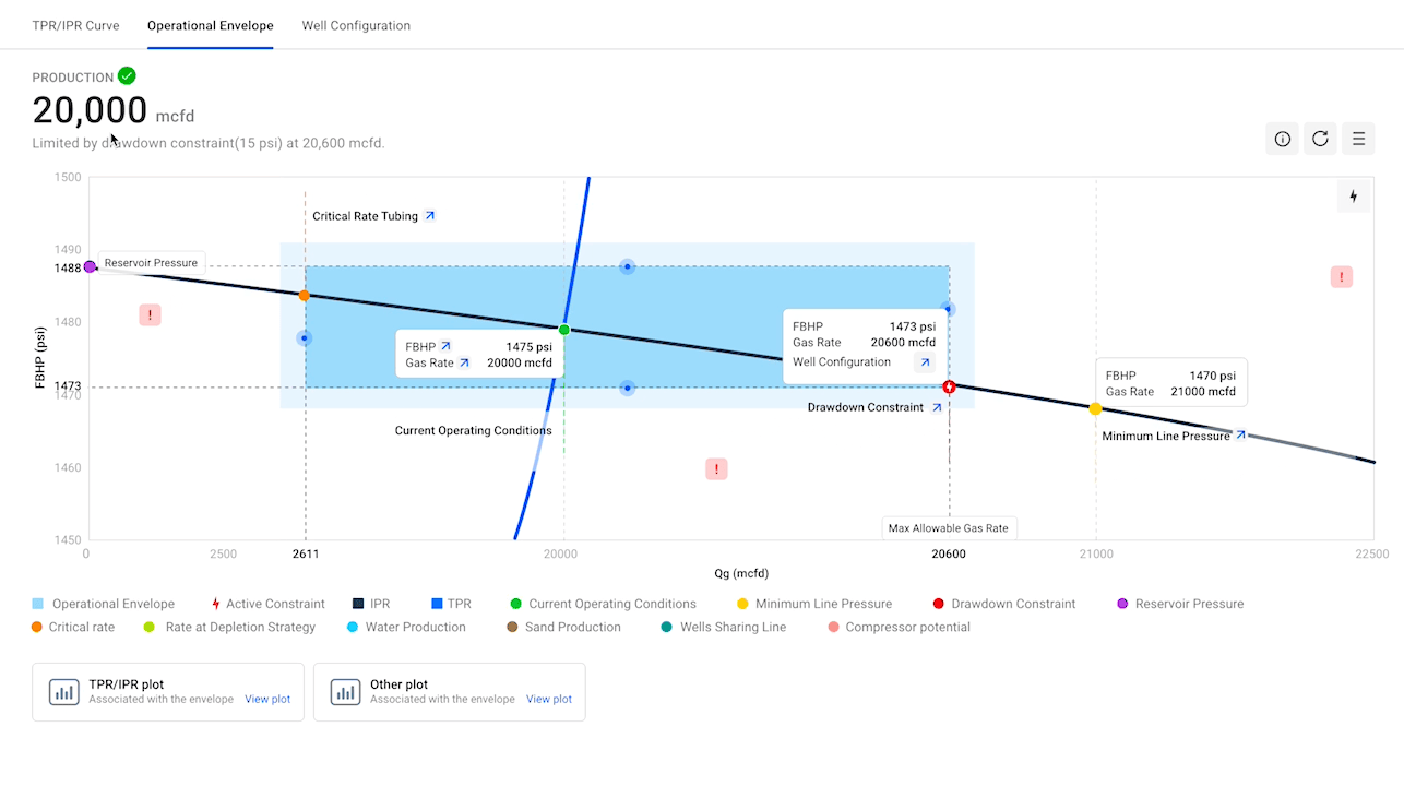
Production Efficiency Dashboard
Solution 01
Pain point
Users couldn’t quickly understand real-time production behavior or identify where attention was needed.
What I Did
• Action-oriented summaries highlighting key production deltas
• Data clusters grouped by relevance (not by raw SCADA hierarchy)
• Clear anomaly indicators to guide operators
• A hierarchy system that shows “what changed” → “why” → “what to do next”
Outcome
Faster interpretation, reduced cognitive load, and improved team response times.

Solution 02
Pain point
Thousands of sensor values made it difficult to spot mismatches or production anomalies manually.
What I Did
• A scrollable History Bar showing months at a glance
• Color-coded status indicators (matched, missing, error, sensor faults)
• Quick drill-down into specific days with anomalies
• SCADA-familiar layout to shorten learning time
Design
Instead of forcing users to scan thousands of rows, the History Bar compresses months of data into a single, interpretable visual layer.
Impact
Better anomaly detection and higher adoption among technicians.
Solution 03
Pain point
Manual tank-ticket reconciliation caused slowdowns, errors, and financial leakage.
What I Did
A structured ticket ingestion flow using OCR
• Automatic matching between ticket → run statement → sensor readings
• Flagging system for mismatches and missing data
• In-table edit tools with clear CTAs for quick corrections
• A searchable historical archive
Impact
1000× improvement in identifying overlooked accounts
Tens of thousands saved monthly
Reconciliation time reduced by 37.2%

3D Digital Twin (SCADA + Real Facility Context)
Solution 04
Pain point
SCADA lacked real-world spatial context, making troubleshooting slow.
What I Did
A high-fidelity 3D facility model (built in Blender + Three.js)
Real-time data overlays on equipment and valves
Color-coded alerts (flow issues, faulty sensors, low tank levels)
Drill-down views to inspect sensor details and status
Seamless integration with SCADA-like controls
Impact
Rapid fault detection, reduced downtime, and better alignment between engineers and operators.

Retrospect
Operational KPIs
• 52% improvement in efficiency
• 37.2% faster time-on-task
• Dashboard task time dropped from 8.3 min → 3 min
• 95%+ error recovery success
• 75%+ adoption of new History Bar & Reconciliation tools
Financial & Business Impact
• Auto Ticket saved clients tens of thousands monthly
• Real-time visibility reduced revenue leakage
• Digital Twin improved equipment uptime and operational reliability
• Increased user satisfaction → platform scaled to Manufacturing + ESG
User Feedback
• Technicians reported faster issue identification
• CFOs reported more confidence in cashflow predictions
• Engineers preferred 3D views over static SCADA panels
• Management noted improved decision cycles and fewer surprises
Final Reflection
Designing for Oil & Gas isn’t about aesthetics it’s about clarity, reliability and operational precision.
The new analytics system empowered teams to act faster with confidence, turned dense data into actionable insight, and positioned SotaOG as a category leading enterprise platform.
The system met nearly every success metric, and users expressed strong enthusiasm for the 3D Digital Twin, History Bar, and Auto Reconciliation workflows.
This project shaped my understanding of enterprise data design, system thinking, and operational UX and remains one of my most high-impact contributions.