Bringing urgency to maps: A smarter alert system for emergency vehicles
Reimagining how Google Maps and Android Auto help drivers act faster, calmer, and more confidently when every second matters.


Trigger moment
A regular day. Windows shut. AC humming. Music at a comfortable volume. I was following Google Maps through a busy intersection when an ambulance flashed past me from behind.
I didn’t hear it.
Not faintly. Not distantly. Not even as a clue.
By the time I noticed it in my side mirror, it was already beside me, weaving through two startled lanes of cars. And the drivers weren’t careless they were unaware. No one meant to block it. It’s simply that our modern driving environment has made sirens optional; awareness is now accidental. That moment shifted something.

Emergency response isn’t delayed because people refuse to give way. It’s delayed because we notice too late.
I kept thinking:
Google Maps already knows our routes.
What if emergency vehicles could simply tell Maps where they’re headed
and Maps quietly prepared the road ahead?
That became my north star:
Use the intelligence Google Maps already has,
to solve a life-and-death awareness problem it never directly touches.
No new sensors. No new hardware. Only better coordination.
Understanding the
real problem
Before designing anything, I spent time studying what actually causes delay. It wasn’t disobedience or carelessness. It was cognition.
Three failures consistently appeared:

1. Late recognition
Drivers hear the siren seconds before the vehicle is right behind them or not at all, especially in EVs or closed cabins.
2. Directional ambiguity
Even when they think they hear something, drivers don’t know:
Which side it’s coming from
Whether it’s behind, ahead, or adjacent
Whether it’s crossing their path or not related at all
Sound doesn’t provide reliable spatial cues inside a modern vehicle.
3. Action hesitation
Most drivers want to help
they just don’t know what to do quickly enough.
Left? Right? Slow down? Stop?
Five seconds of hesitation is five seconds too many.
When you observe emergency response holistically, the problem isn’t sirens.
It’s timing.
And timing is something maps already understand remarkably well.
The insight
The deeper I went, the more one pattern kept resurfacing:
drivers barely look anywhere except their navigation screen.
Not the mirrors.
Not the rearview.
Not the road edges.
Not even the instrument cluster.
Modern driving compresses attention into one predictable surface: the map.
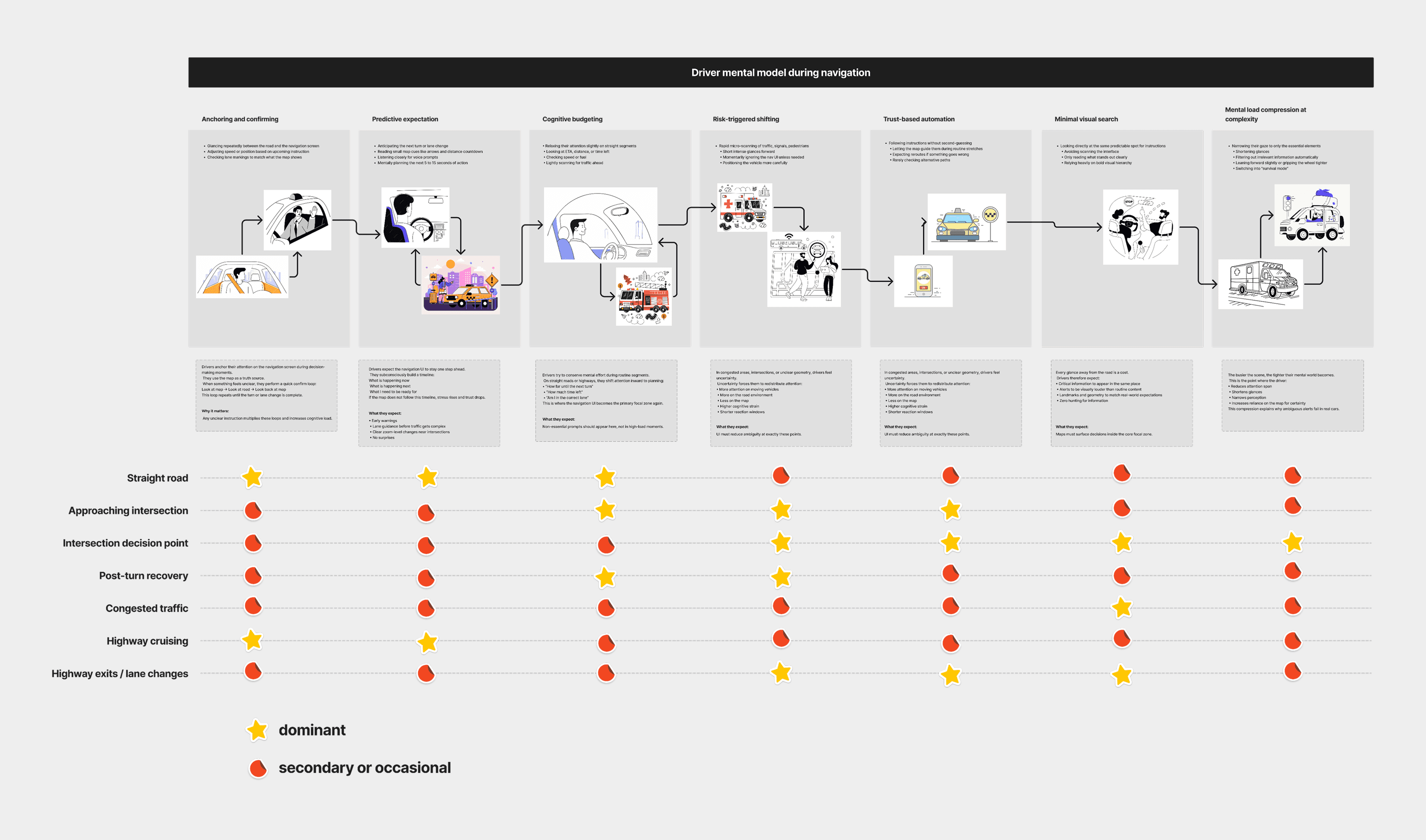
Mapping attention
Across ride-alongs and behavioural studies, the allocation was almost identical:
Road ahead - 70%
Navigation screen - 25%
Everything else - 5%, and shrinking
Quieter cabins, louder roads, and layered distractions erode that final 5% even further.
This exposed a simple heuristic:
Critical awareness must appear where attention already lives.
Anything outside that zone is invisible until it’s too late.

The unexpected realisation
Sirens aren’t failing because they’re quiet they’re failing because they live in the wrong attention channel.
Sound is unreliable.
Peripheral cues get ignored.
Mirrors are checked after the fact.
So if emergency awareness needs to work, it must enter the visual stream drivers already trust not as another display, not as a new device, but inside the surface they check every few seconds.
There is only one universal driver surface: their navigation app, aka Google Maps

Emergency responders already use it to navigate.
Drivers already use it to follow directions.
Android Auto and CarPlay already run on millions of dashboards.
What if we used this existing ecosystem to coordinate drivers long before they realize they need to move?
That became the foundation of this project.
Research process
I combined human behaviour, cognitive load, urban environments, and system-level inputs.
Driver interviews
Commuters, Car owners, Uber drivers, new drivers:
“I always hear it too late.”
“I can’t tell the direction.”
“My eyes are always on Maps.”
Ride-alongs
Ambulance delays came from late driver awareness, not unwillingness. Intersections were the biggest choke points.
Cognitive load mapping
Drivers have almost no spare attention. Alerts must appear inside the existing focal zone.
Policy + competitor scan
Waze, EU corridor laws, V2X, EV sound rules. No system provides direction-aware, predictive, adaptive emergency alerts.

Core concept
Emergency Work Profiles inside Google Maps**
Emergency teams ambulance, police, fire set their Work Profile inside Google Maps.
In a real emergency, the responder simply:
Switches to Emergency Mode
Enters their destination (hospital, incident site, safe zone)
Selects the level of emergency (High / Moderate / Low)
Starts navigation
Once they hit “Start,” Google Maps automatically:
identifies all drivers along the same upcoming route
calculates the responder’s approach speed
sends calm, minimal alerts to those drivers
updates or intensifies the alert as the vehicle gets closer
No sensors.
No microphones.
No triangulation.
Just software.
Drivers only see alerts if the emergency vehicle is:
on their route
on their lane
approaching them
The system is precise, not noisy.
This was the heart of the design:
Use route intelligence, not hardware sensing.

System design
The breakthrough: Work Profiles for emergency responders
The breakthrough was simple:
every emergency vehicle already uses Google Maps and so do the drivers around them.
Instead of adding new hardware, new sensors, or new city systems, we upgrade the one thing both sides already rely on:
their Google Maps profile.
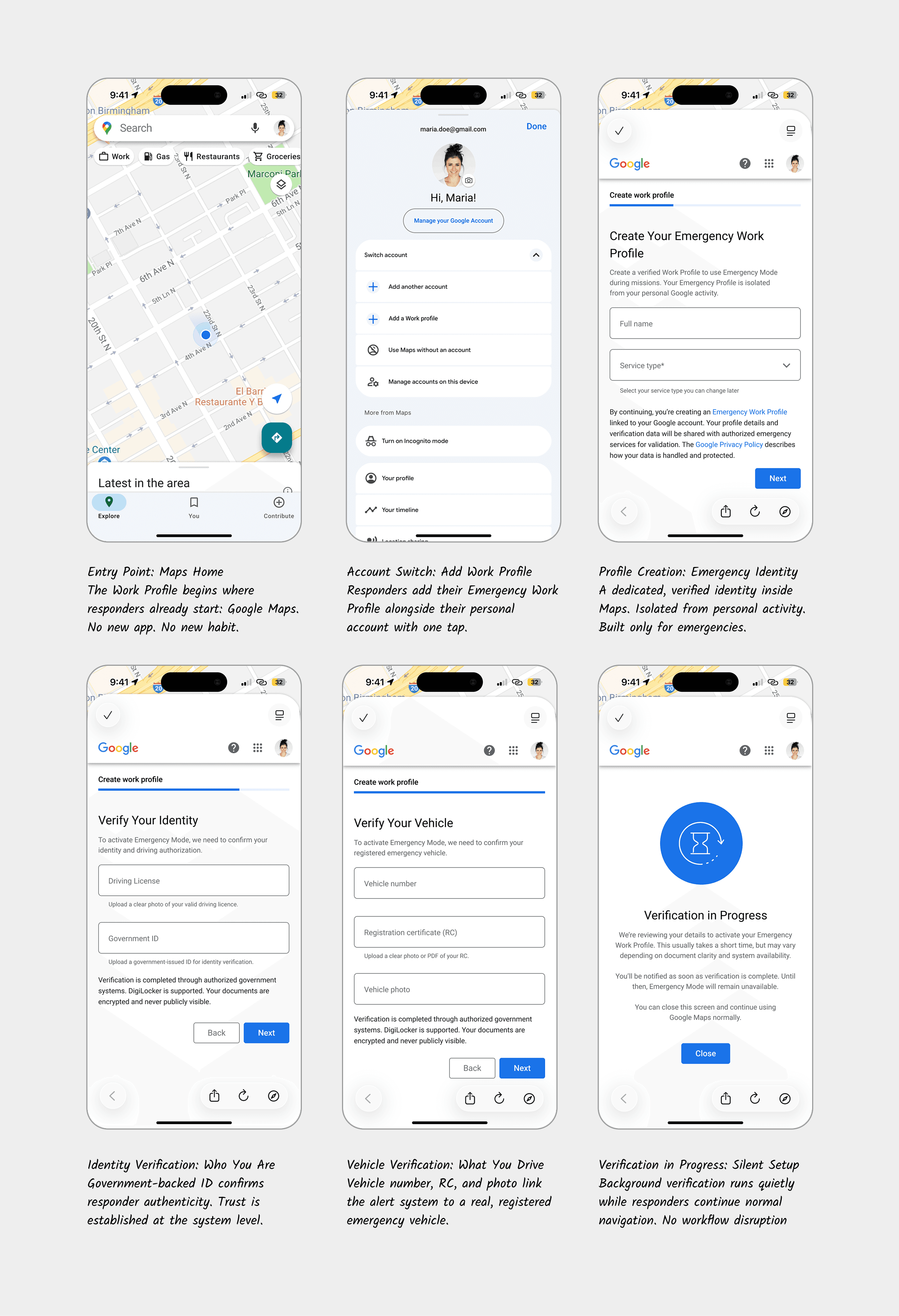
Emergency Work Profile
Responders switch to a dedicated Work Profile inside Maps.
During an emergency, they:
Select destination
Choose urgency level
Hit Start
That’s it.
This single action triggers awareness across the city.
What Happens in the Background
Once navigation begins:
Maps knows the responder’s full route.
It identifies drivers whose paths will intersect.
It predicts when both vehicles may cross.
It sends calm, minimal alerts only to relevant drivers.
Alerts intensify gently as the responder approaches.
Everything disappears automatically once the vehicle passes.
No extra steps.
No new devices.
Just better coordination using what people already use every day.
Why It Works
Instead of detecting sirens or tracking vehicles with sensors, the system uses route intelligence something Maps already calculates with high accuracy.
Transition
So the core idea is established, but can it actually be built? Yes

Trigger Layer : Responder Action
Work Profile activated
Destination + urgency selected
Navigation start = system start
Output: Emergency intent + route metadata
Path Intelligence Layer (Maps backend)
Uses existing Maps capabilities:
Lane-level positioning
Predicted speed and ETA
Intersection timing
Traffic density
Driver behaviour patterns
Output: A predictive model of where responders and drivers may intersect.
Driver Targeting Layer
Maps identifies only the drivers who:
share the upcoming route
share the same lane
fall into the responder’s conflict window
Output: A lightweight, real-time list of relevant drivers.
Alert Engine
Progressive cues based on distance + urgency:
Early Pulse - ambient edge glow
Directional Cue - side-specific highlight
Action Banner - short instruction
Output: Clear, calm, time-based guidance.
Auto-Dismiss Layer
As soon as paths diverge:
alerts fade
system resets
no lingering UI
Design principles
Designing the driver experience: calm, not alarming
Most emergency alerts today are jarring - loud, intrusive, and often unclear.
I wanted the opposite.
A design language that behaves more like a gentle hand on your shoulder:
“You don’t need to panic. Just be aware.”
So the system was built on three progressive visual cues, each one activating only when necessary.
1. Early Awareness - The Subtle Pulse
A soft, almost ambient glow around the map edge.
No sound.
No text.
Just a quiet signal: something important is approaching.
2. Directional Guidance - The Focused Edge
If the vehicle is approaching from behind or the side, only that edge lights up.
Drivers instantly know which lane might be affected.
No guessing.
No mental friction.
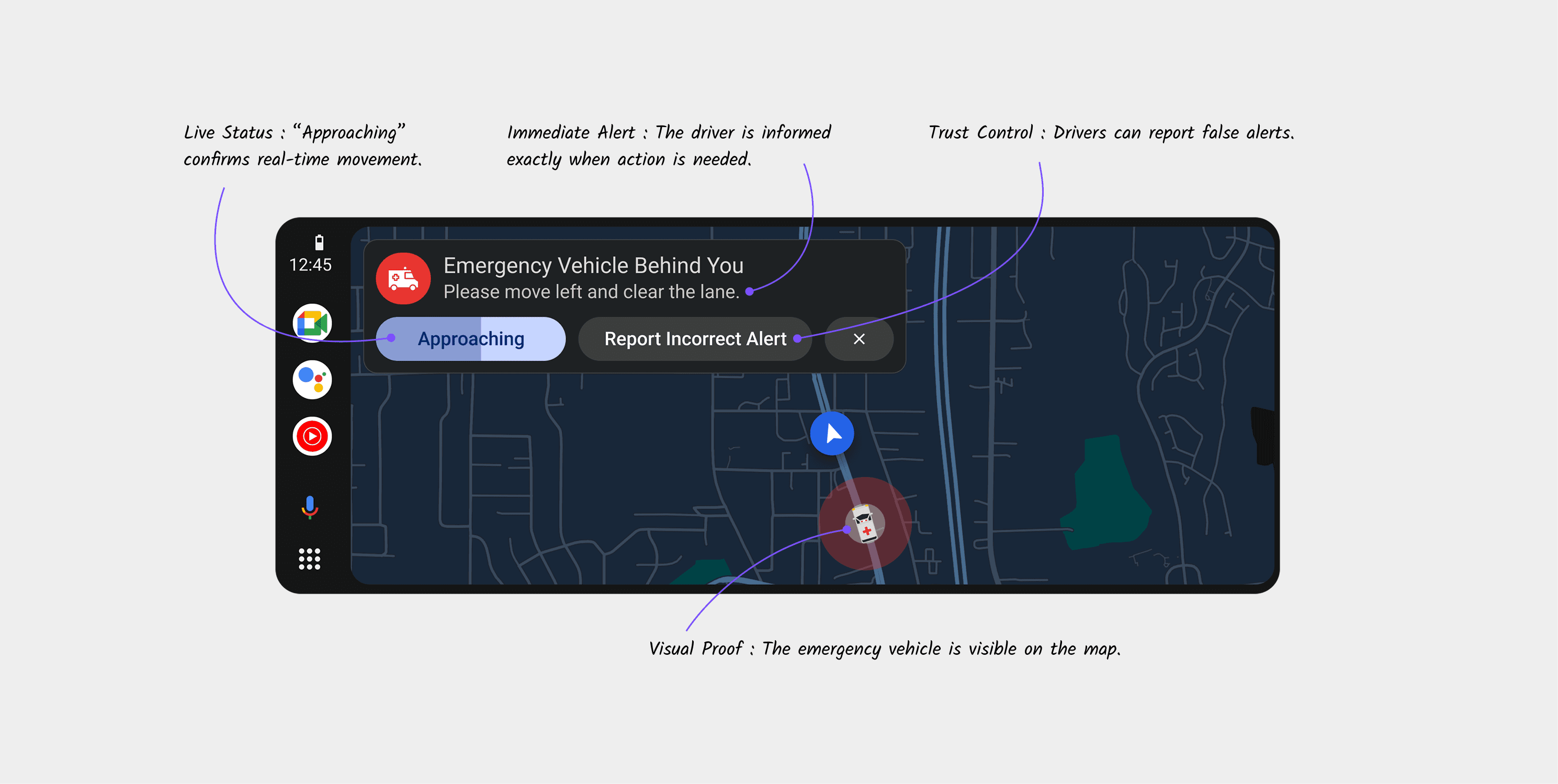
3. Immediate Action - The Clear Banner
When the vehicle is only seconds away:
A calm banner slides in:
“Ambulance approaching - keep left to clear the path.”
One line.
One action.
No clutter.
And when the vehicle passes, the system self-dismisses quietly, restoring peace to the screen.
What this changes for the everyday driver
When the system works as intended, the change is subtle but powerful.
You don’t hear the siren too late.
You don’t guess the direction.
You don’t hesitate at the worst possible moment.
Instead:
You know something is approaching.
You know which direction to look.
You act early and confidently.
Traffic flow stays smoother.
Emergency response gains precious seconds.
Seconds that could save a life.
And the best part?
No one had to buy anything new.
No one had to learn a new system.
No one had to upgrade their car.
We simply elevated awareness at the right time, in the right place.
Final design
The final design focused on simplicity, calm guidance, and predictable behavior. Every alert remained lightweight, visual first, and intentionally minimal.
The visual system was built around three key elements
• screen edge lighting
• subtle directional movement
• a single action-oriented banner
These cues allowed the driver to understand urgency and direction instantly without reading large amounts of text or interpreting symbols.
Designing for the Responders
The other half of the system most people never see.
Drivers see the alert.
But the true orchestration starts long before that inside the ambulance.
The deeper I went into ride-alongs, the more I realized something subtle:
Emergency responders do not have time for new tools. Their world is built around repeatable muscle memory.
When a call comes in, there is a quiet choreography:
one person confirms the case
one checks the equipment
one enters the destination in Maps
That last action something they were already doing became the entire foundation of the system.
I reframed the question:
“How do we design a system that helps the city, without adding a single extra step for the responder?”
The answer:
Turn a routine action into an intelligent signal.
A work profile built for urgency
Today, responders use the same Google account you and I use.
But their needs are profoundly different.
So I designed a new identity inside Maps a Work Profile that feels invisible until it matters, and powerful the moment they need it.
The experience had to be:
fast (minimal multi-screen setup)
frictionless (uses their existing Google identity)
trustable (requires official verification)
customizable (different emergency types have different needs)
Once set up, responders unlock a private mode within Maps:
emergency destinations
dynamic urgency levels
one-tap activation
integrated routing logic
Emergency Mode: Rethinking the moment that matters
Inside the ambulance cabin, I studied the tension between speed and clarity.
When the responder taps “Start,” two timelines begin:
their race to reach the hospital
the system’s silent race to prepare the road ahead
Ambulances don’t need to shout louder.
They need the city to whisper sooner.
Emergency Mode introduces a single new element:
a floating “Emergency Alert” button always reachable, never intrusive.
When pressed, responders select:
Destination → Urgency → Start
Nothing more.
Nothing less.
No new workflow.
No new training.
Maps handles the rest.

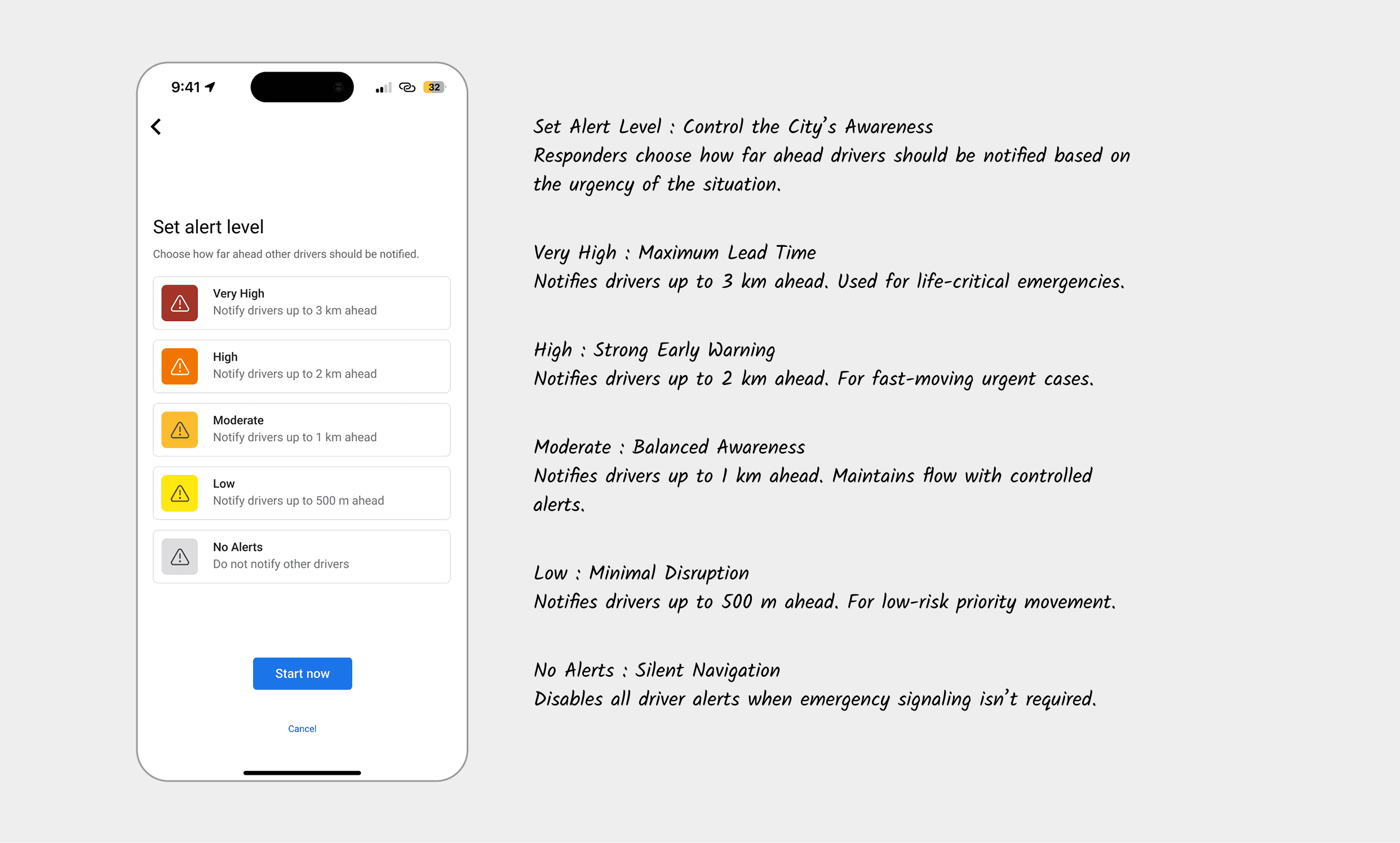
Why urgency levels matter (and how they shape city behavior)
In early interviews, I learned something counterintuitive:
Responders don’t want maximum alerts all the time.
One driver told me:
“If everything is urgent… drivers stop trusting the alert.”
So urgency in this system doesn’t mean volume.
It means radius and relevance.
High urgency
wide notification radius
early awareness
edge pulses intensify faster
Moderate urgency
local radius
directional cues only
banner appears later
Low urgency
passive
alerts only if paths intersect dangerously
It keeps the network respectful, quiet, and precise not a city flooded with unnecessary warnings.
How intelligence flows through Maps (without new hardware)
This was the most important systems insight:
Emergency vehicles don’t need to be detected.
They need to be understood.
Maps already knows:
exact routes
lane positioning
predicted speed
ETA windows
intersection timing
micro reroutes
congestion density
Instead of reinventing a V2X ecosystem, I simply connected the dots.
When an emergency responder starts navigation:
Maps knows their full path
It identifies drivers whose upcoming path intersects
It computes a “conflict window”
It begins early visual cues
It intensifies based on urgency
It shuts down automatically once paths no longer overlap
No beacon.
No radio.
No sensor fusion.
Just intelligent routing transformed into situational awareness.

Designing for the driver: Calm over alarm
When an alert appeared on my earliest prototypes, I kept asking myself:
“Would this make me panic?”
If the answer was yes, I removed it. The final experience is built on three micro-moments:
1. Early Awareness - Ambient Presence
A soft border glow. Barely noticeable, yet subconsciously calming.
This wasn’t a warning.
It was a heads-up.
2. Directional Clarity - Know Where to Look
Only one side glows — left, right, or bottom. One second of glance, instant understanding.
3. Immediate Action - A Gentle Command
“Ambulance approaching - keep left.”
Only when the situation is imminent.
No drama.
No panic.
Only clarity.
The tone analysis
Emergency alerts fail when they rely on fear. They succeed when they rely on clarity.
This system avoids loud, alarming language and instead uses calm, direct, human instruction. The goal is not to startle the driver it is to guide them.
“Please move left and clear the lane.”
One sentence. One action. No ambiguity.
The Structure of Every Alert
Each message follows a fixed behavioral pattern:
• What - “Emergency vehicle behind you”
• Action - “Move left”
• Outcome - “Clear the lane”
This removes hesitation and decision-making under stress.
Urgency Without Panic
Instead of using fear-heavy words like Danger or Emergency, the system uses:
“Approaching”
This communicates movement and urgency without triggering shock or anxiety.
Trust-Preserving Language
“Report Incorrect Alert” keeps the system accountable and prevents misuse - without making the driver doubt the system in the moment.


What I learned
Across months of research, prototyping, and behavioural simulations, a few truths stayed with me:
The most powerful designs don’t add behaviour they reuse it.
Systems thinking solves problems UI alone cannot.
Calm design builds more trust than aggressive signals.
Predictability is the antidote to panic.
When in doubt, remove steps, not add features.
This wasn’t about redesigning Google Maps.
It was about redesigning a moment.
A very human one.
Reflection
Designing for emergencies taught me something humbling:
Humans don’t fail because they don’t care.
They fail because context reaches them too late.
Design has the power to shift that timing
to turn “too late” into “just in time.”
When technology steps aside and clarity steps in,
the city becomes safer, smoother, kinder.
And that, to me, is design at its highest purpose.