Designing a smarter, seamless journey for delhi metro riders
A system that quietly guides riders from wallet to platform to exit.

How this project began
This project started as a simple interview assignment to redesign metro ticketing.
While mapping the flow, I realized that buying a ticket was not the real problem. The real friction lived between moments. The handoff between planning, entering the station, finding the right platform, changing lines, exiting, and feeling safe throughout the ride.
People were switching between multiple tools for one journey:
A wallet app for the ticket
Google Maps for directions
Station signs and guards for everything else
Nothing connected the full experience. Riders were stitching the journey together themselves.
That’s where this project began:
Not as a ticket redesign.
But as a journey operating system for Delhi Metro.
Problem spectrum
Delhi Metro has strong physical infrastructure.
What it lacks is continuous cognitive support.
Through observation and conversations, four major problem areas emerged:
1. Planning disconnect
People plan routes outside the wallet. The ticket has no idea where the rider is going or why.
2. In-station hesitation
At platforms and interchanges, riders slow down to confirm direction, read boards, or follow crowds.
3. Exit confusion
Riders often choose the wrong exit and walk long distances outside the station.
4. Safety uncertainty
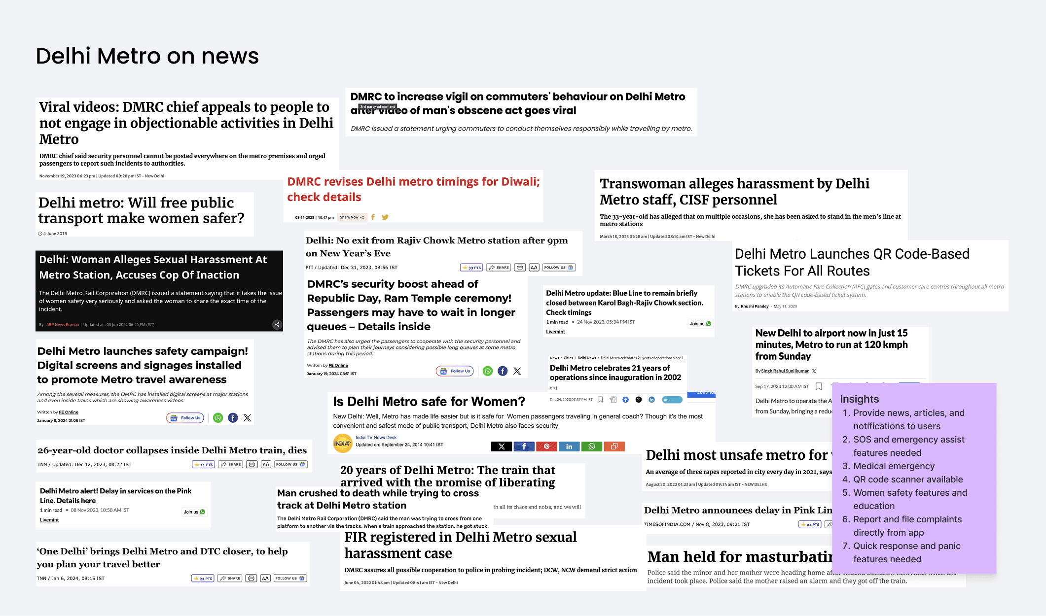
Women, late-night riders, and solo travelers often feel unsafe but lack a fast, discreet way to reach help directly from the journey screen.
Each of these issues feels small in isolation.
Together, they create stress, delay, and loss of confidence.
Research journey
I studied this problem through three lenses.
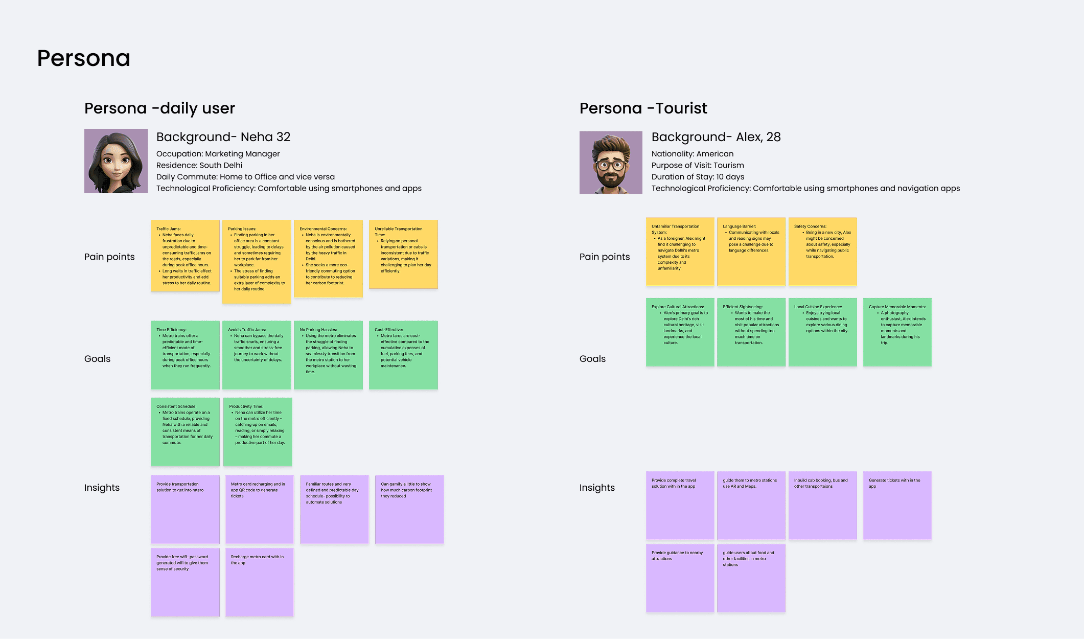
Rider conversations
I spoke with students, office commuters, and daily riders across Delhi and Kochi. Patterns repeated:
Confusion at platform splits
Anxiety during long interchanges
Habit of following crowds even when unsure
Fear during late-night travel
No quick way to call security during distress
Most riders did not describe themselves as frustrated.
They described themselves as uncertain.
Station shadowing
I observed movement at major interchanges including:
Rajiv Chowk
Kashmere Gate
Chandni Chowk
Sikandarpur
Hauz Khas
Two behavioral patterns stood out:
People only slow down when they are unsure
Most wrong turns happen within the first 20 seconds of entering a new space
Physical movement was not the bottleneck.
Decision-making was.
Incident and safety analysis
Public reports show repeated incidents in large metro systems related to:
Harassment
Medical emergencies
Late-night safety
Lost commuters
Panic during congestion
Most existing safety systems require:
Finding a guard
Dialing a number
Calling a hotline
Or exiting the current app
All of which take time during distress.
Global systems analysis
To benchmark clarity, I studied patterns from systems like Singapore MRT, Hong Kong MTR, Seoul Metro, and Tokyo Metro.
The best metros don’t force riders to interpret.
They remove the need to interpret.
This became a foundational insight for the design.

Problem definition
Pain points and hypotheses to test
How might we turn a metro wallet into a real-time journey and safety companion that reduces hesitation, wrong turns, and vulnerability?
Pain points
Journey planning is disconnected from the ticket
Platform choices require last-second validation
Interchanges create anxiety and backtracking
Exits are chosen by guessing
Safety features are buried or physically distant
Hypotheses
If the journey begins inside the wallet, context will never be lost
If decision points are anticipated early, hesitation will reduce
If exits are mapped to real destinations, unnecessary walking will drop
If emergency access is persistent and visible, riders will feel safer even if they never use it
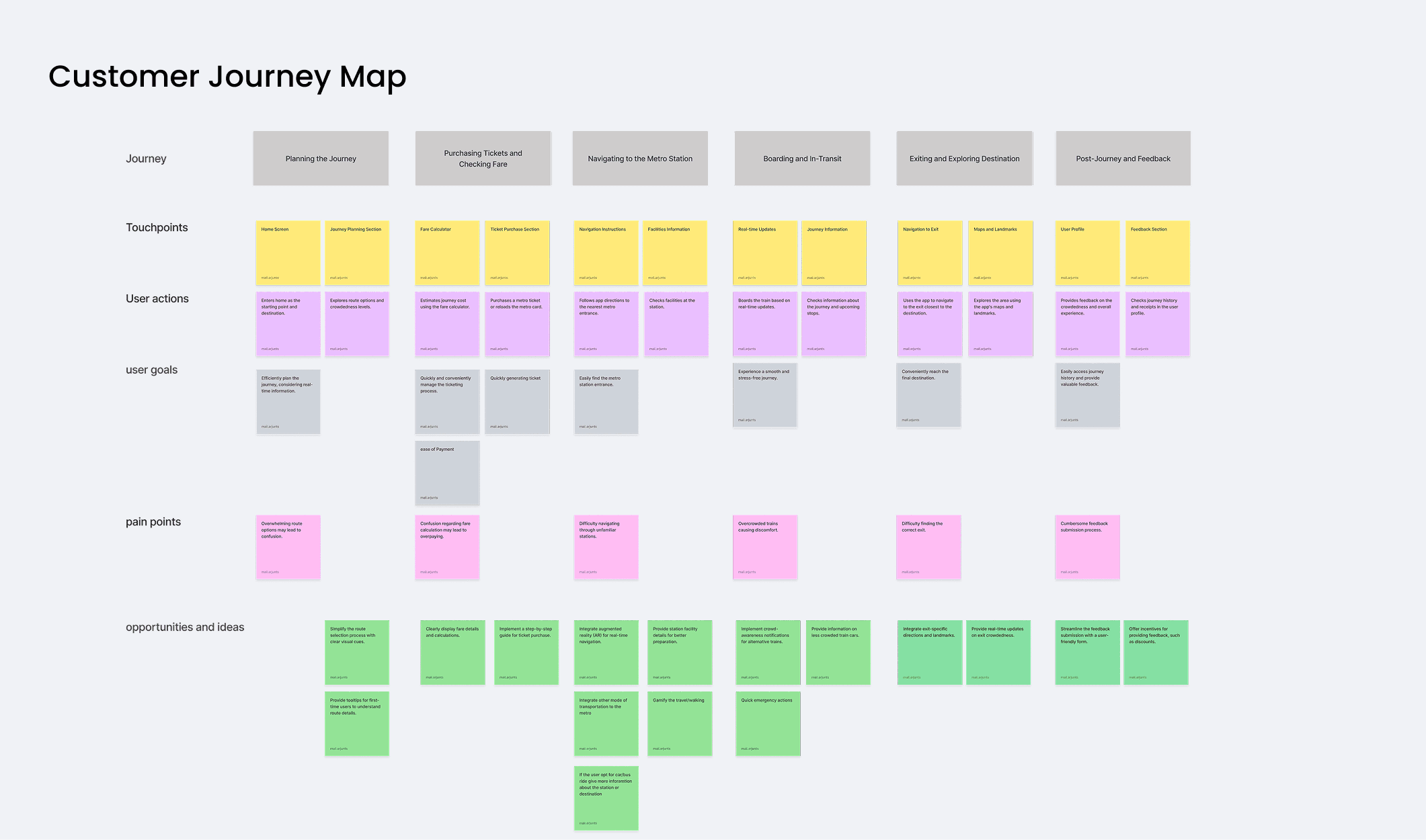
Journey moments
Every Delhi Metro journey can be broken into four key moments where doubts spike:
1. Entering the station
“Where do I go from here?”
2. Reaching the platform area
“Which side is the right direction?”
3. Navigating interchanges
“How far is the transfer? Which corridor is correct?”
4. Exiting the station
“Which exit gets me closest to my destination?”
Each moment becomes an opportunity to reduce confusion.
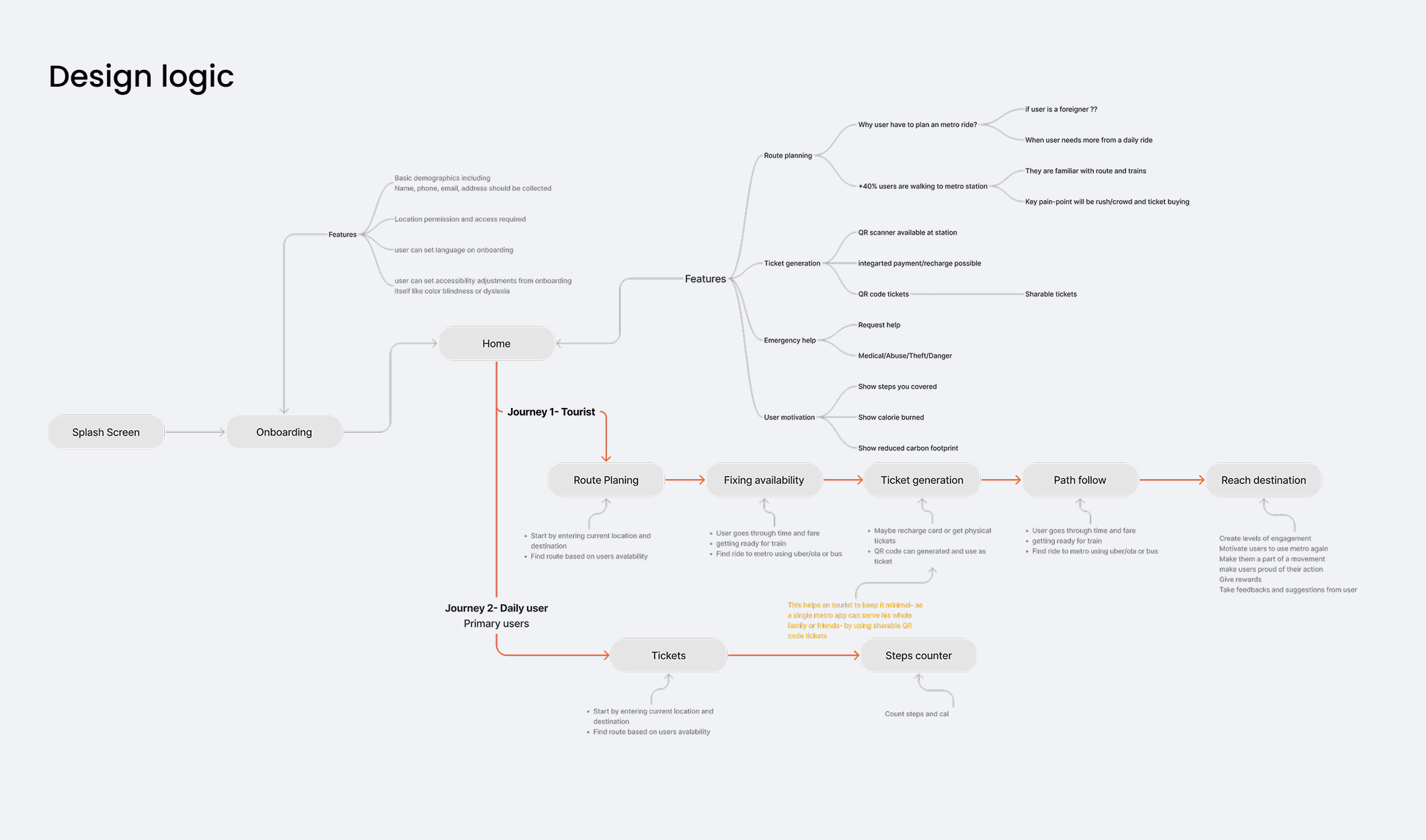
Final design
Solution 01
Wallet becomes the journey hub
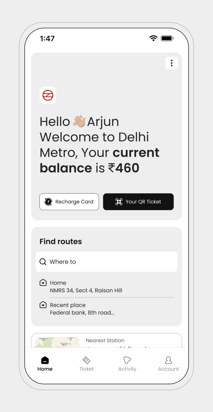
The wallet is designed to be the psychological starting point of every metro journey. Instead of acting as a passive storage for money or tickets, it actively reassures the rider, prepares them for movement, and removes the need for constant checking, planning, and validation. The interface prioritizes certainty, speed, and emotional safety before the journey even begins.
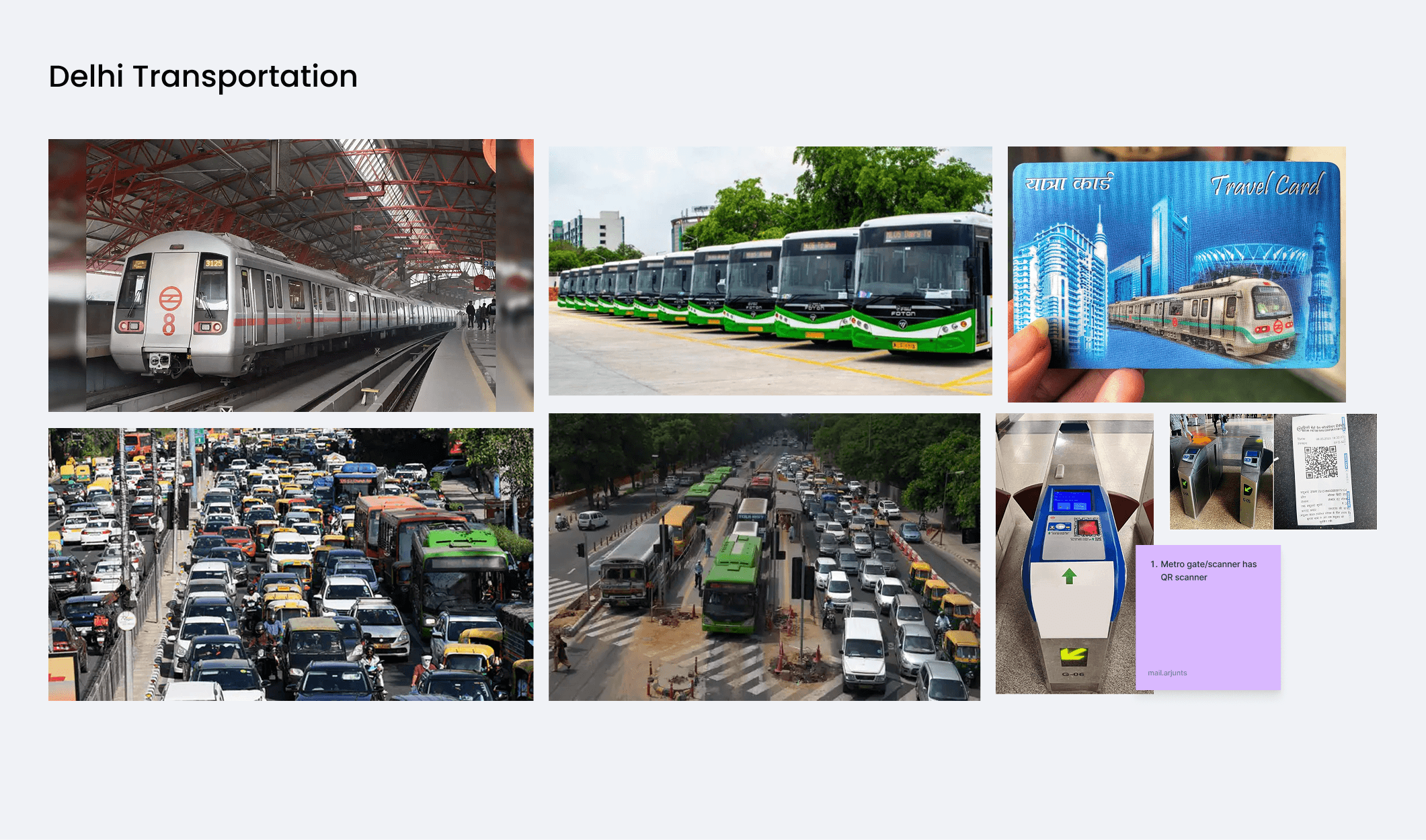
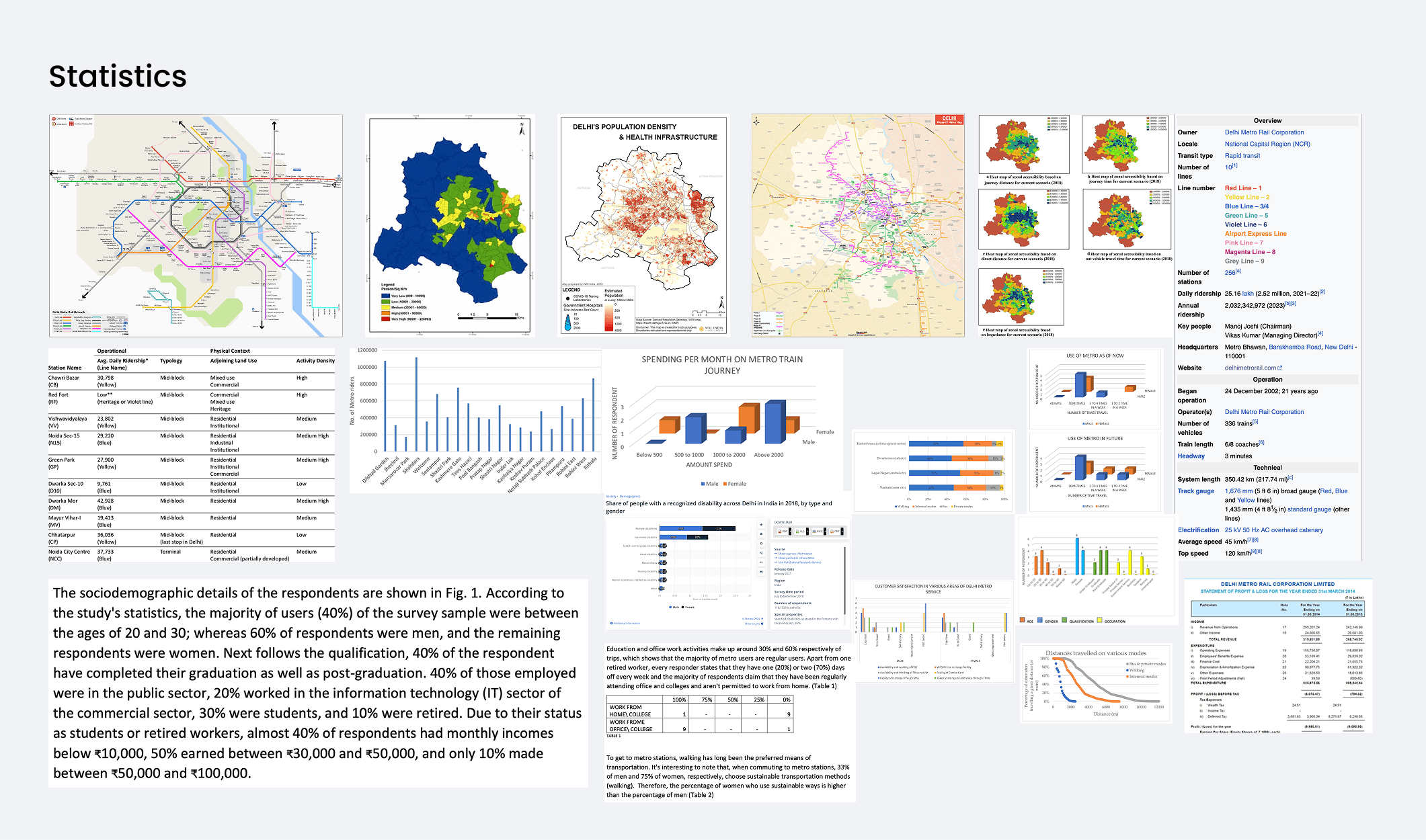
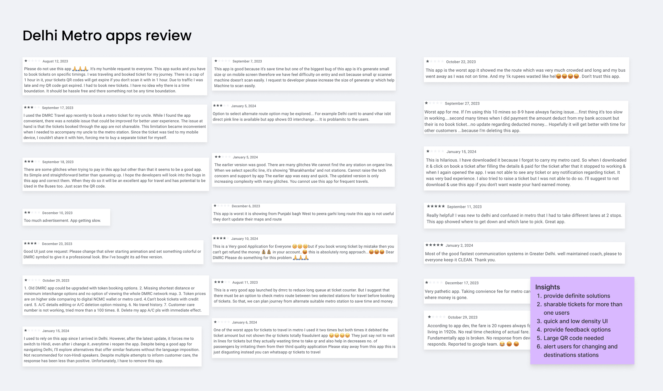
Through our research, we discovered that the majority of our users are daily commuters who are well-acquainted with the routes and fares. Their primary pain point lies in the ticket collection process. To address this issue, I have developed a QR code generator linked to a virtual smart card. Users can recharge this smart card when their balance is low. When a user scans the QR code at a gate, a minimum amount is reserved, and the fare is deducted upon reaching their destination
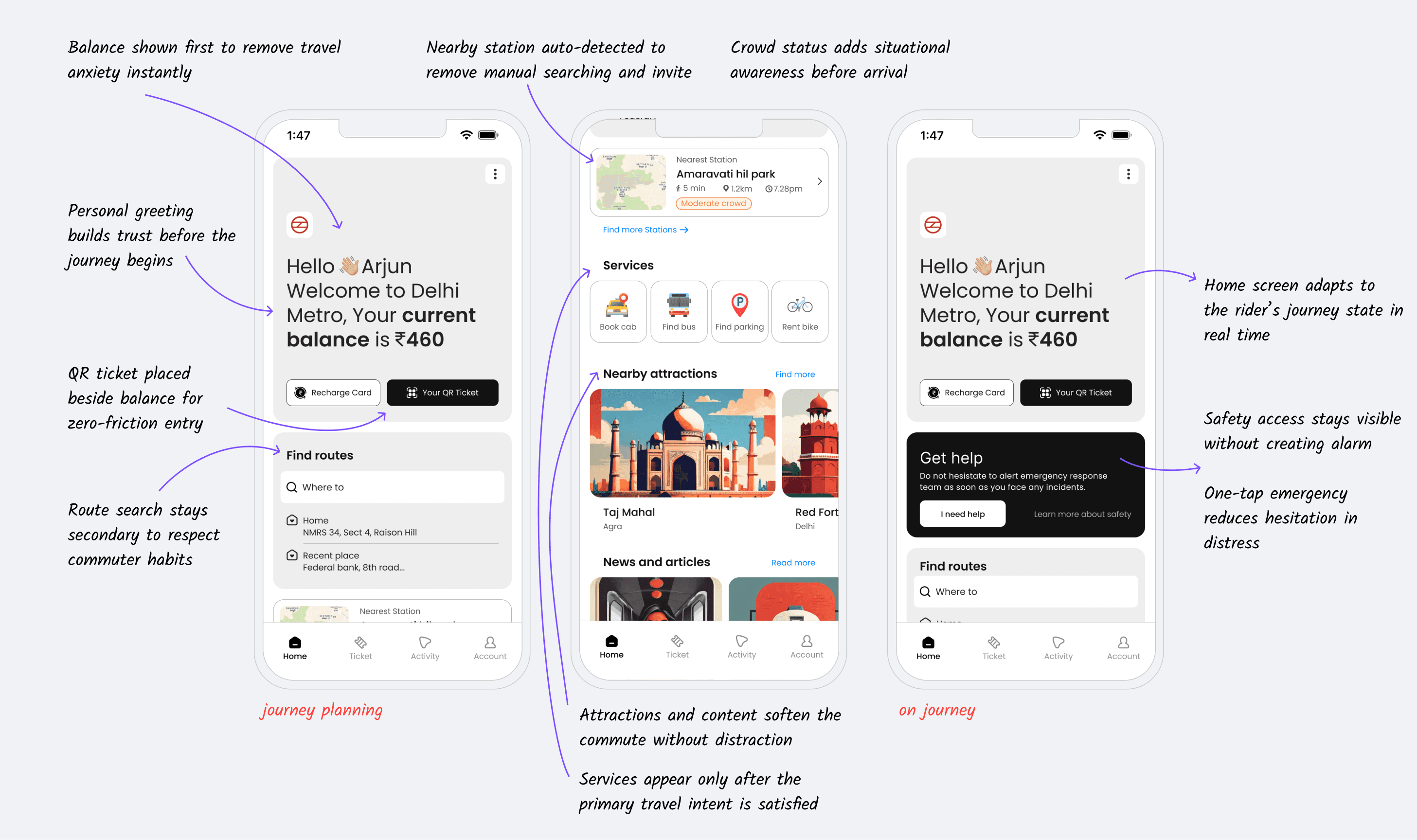
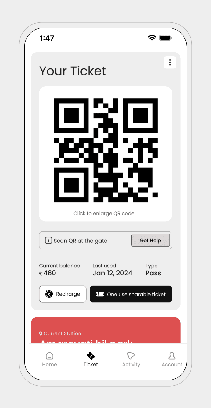
Ticket and station navigation become one system
QR ticket lives inside the journey view
Route, changes, and exits live beside the ticket
The ticket becomes a live journey object, not just a barcode
After pinpointing a common frustration where users encounter difficulty obtaining tickets solely from the counter, which remains the sole accessible option for non-smart card holders, I'm addressing this concern by integrating QR scanning capabilities directly at the gate
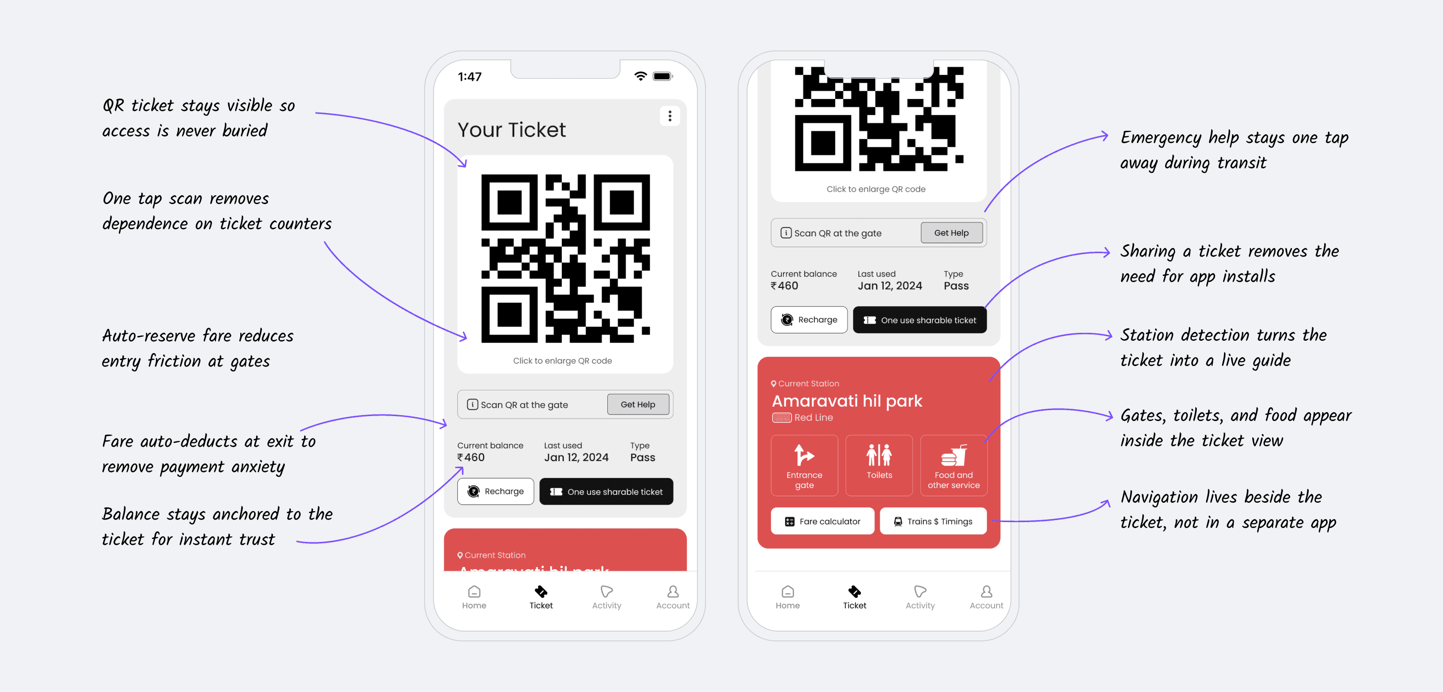
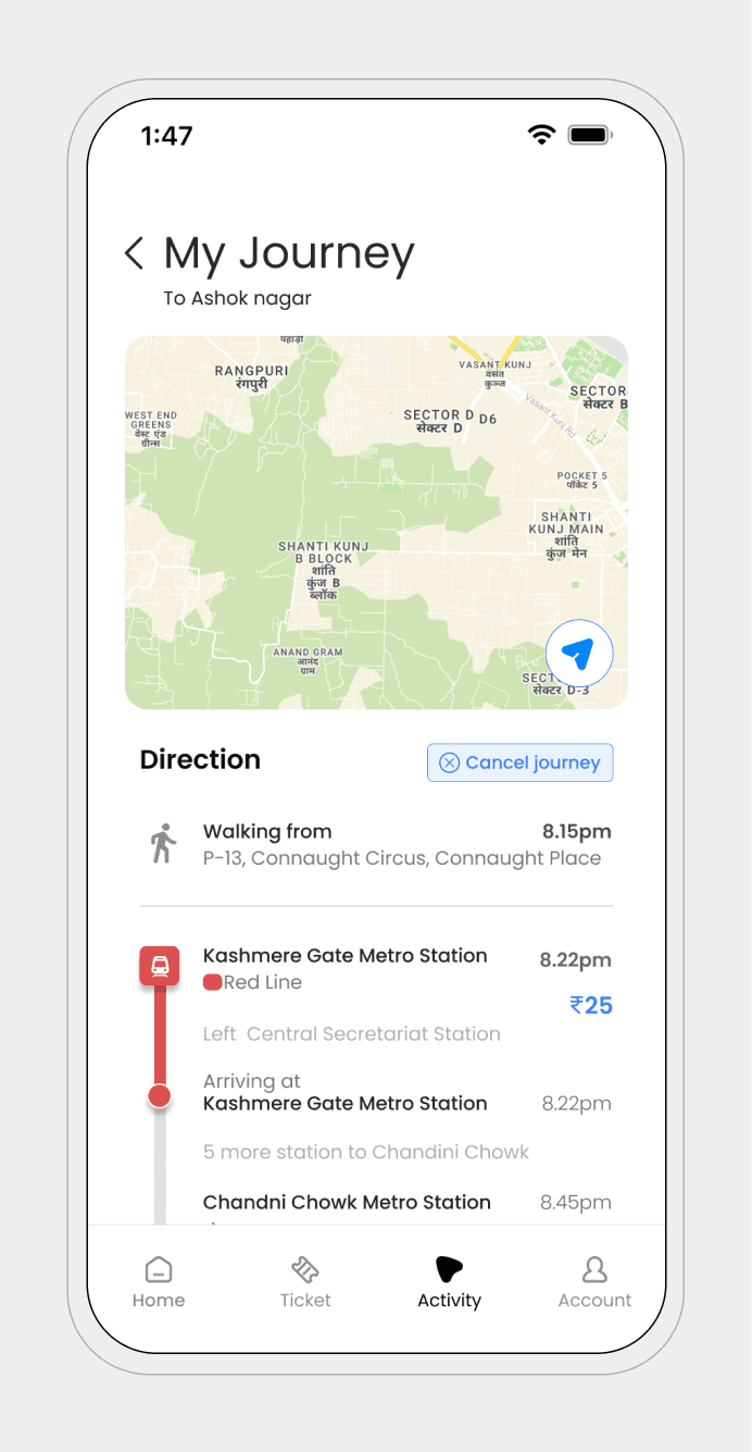
Smart platform guidance
Smart platform guidance removes uncertainty at the most stressful part of the journey the platform. The system highlights the correct platform before arrival and instantly shows train direction, time, and distance. Riders no longer need to scan boards or follow crowds.
Interchanges are predicted early with corridor distance, walk time, and stair or escalator guidance surfaced in advance. Crowd pressure is signaled subtly without overwhelming the screen.
At exit, guidance shifts to real-world orientation. The correct exit is chosen based on the rider’s destination and aligned to street-level context, reducing post-exit confusion and unnecessary walking.
The result is faster decisions, fewer wrong turns, and a confident flow through the station.
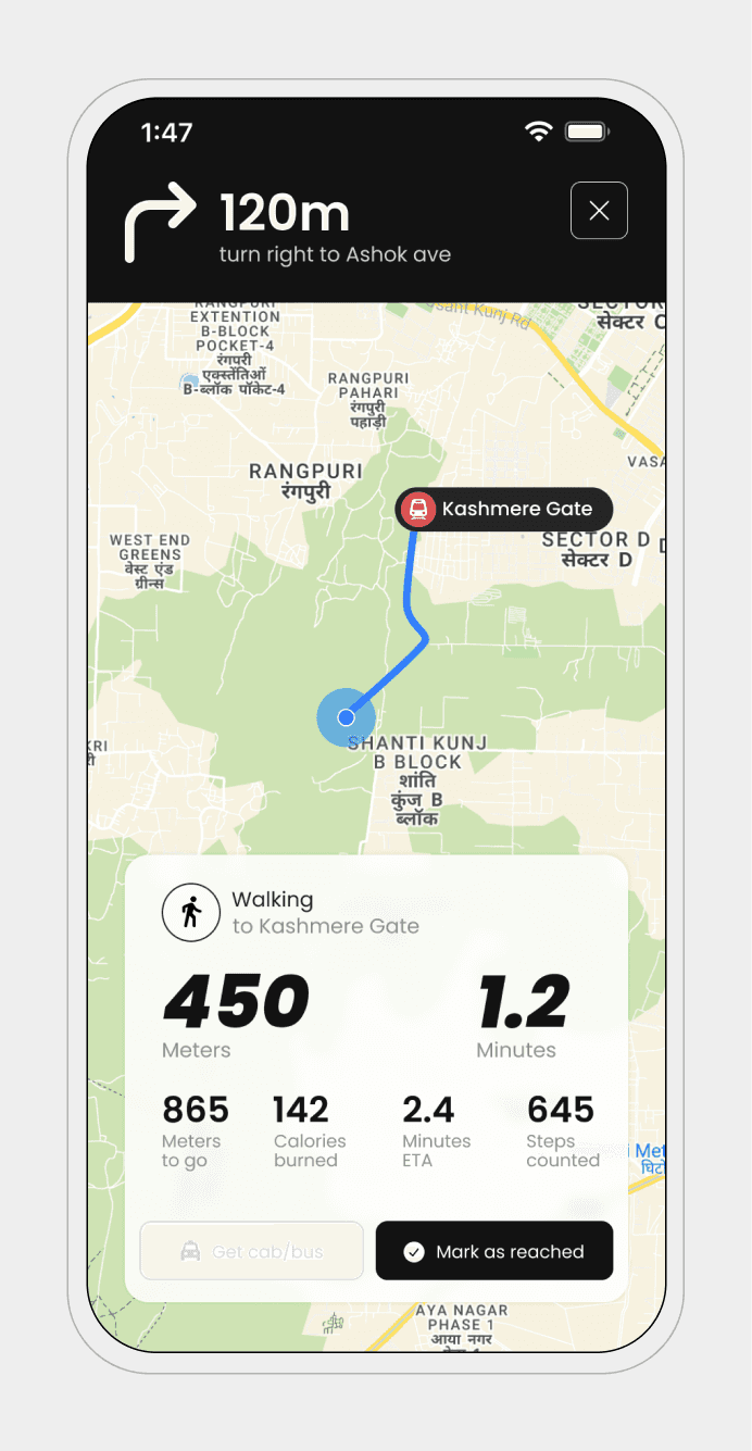
Based on our research findings, it's evident that a significant portion of users walk to the station daily(66%). To enhance this user journey, I'm introducing gamification elements aimed at making the walking experience more engaging and rewarding
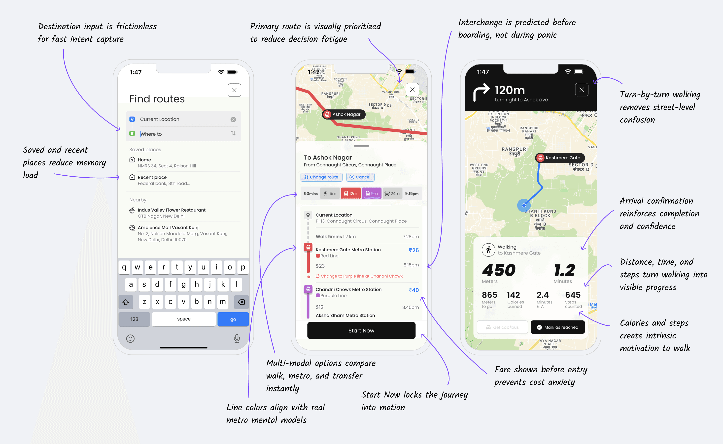
Predictive interchange navigation
Corridor distance shown before entering
Walk time previewed
Stair or escalator guidance surfaced early
Crowd pressure signaled softly
I designed a tone checker that will always check the tone of the text and gives a hint about how the other person feels about it. This will helps to make a smooth conversations and convey message clearly and apps to understand how each person react and texts.

The flow
the entire flow explaining from planning to end of journey

Bringing colors for life
I designed patterns inspired by real-life objects that intuitively associate with the metro line colors. For instance, the Red Line features diamond patterns evoking playing cards, while the Blue Line mimics waves for water. These thoughtfully crafted patterns ensure that colorblind individuals can easily identify lines, blending color associations with universal symbols for seamless navigation.

What this system improves
Faster wayfinding for first-time riders
Fewer wrong-platform mistakes
Smoother interchange flow
Safer late-night travel
Reduced exit confusion
Lower cognitive load during peak hours
Small clarity creates large behavioral shifts.
Reflection
Public transport is not a feature checklist.
It is a daily emotional experience.
People carry:
Fatigue
Urgency
Fear
Distraction
And responsibility
Good design does not add intelligence on top of that.
It takes weight off their mind.
If this system ever ships, most people will never notice the design.
They will simply take the right train.
Exit at the right gate.
And reach home feeling safe.
And that is success.