Paradym is an emotional wellbeing app where users arrive feeling vulnerable and skeptical. My mission was to redesign onboarding so users feel safe, understood, and motivated to continue without cognitive overload or early financial pressure.
Role
Lead Product Designer
Team
Product, Content, Growth
Duration
Apr 2023- Nov 2023
Overview
The original onboarding was causing 42% of users to abandon the app in under two minutes before they understood how it could help them.
For a subscription-based wellness product, this was a business leak and a trust failure.
I transformed onboarding from a transactional flow into a supportive first interaction that users could emotionally trust.
The result: users reached their personalized programme earlier unlocking both clinical impact and long-term value.
69% reduction in early drop-off
Early abandonment improved from 42% to 13%
+31% completion rate of emotional profile
7% of all users converted to paid (≈56% trial-to-paid conversion)
~38% faster onboarding (4.0 min → 2.5 min)
Approach
Simplify the Flow → Strengthen User Trust
By reordering onboarding to educate first, I built a calmer bridge into the product without reinventing the flow.
Reduce Cognitive Load → Increase Emotional Safety
New onboarding reframed questions as reflections, not data entry.
Extend Trial → Build Ownership
Originally: 7-day trial → users churned before seeing meaningful emotional insights
New: 30-day trial, mapping to Paradym’s 2-week insight cycle.
Clear Reciprocity Cues → Transform Uncertainty into Trust
Instead of “try our app,” we show exact transformation users will unlock
My Role
Partnered closely with clinical psychologists from Harvard to translate behavioral science into product decisions.
Led research synthesis and problem scoping with Content & Research teams to define trust-first onboarding principles
Drove design strategy and execution for monetization flows, subscription trial model, and emotional profile experience
Collaborated with Product, Growth, and Engineering to validate solutions through rapid prototyping and iterative tests
Organized design critiques, shared frameworks, and elevated craft across cross-functional pods
Research
We conducted 42 remote, moderated usability interviews, along with a Nielsen heuristic evaluation, Cognitive Walkthrough, and Product psychology of the full onboarding and assessment flow. Participants were 19–32 years old, 84% women across multiple regions of EU and North America.


Key Findings
Users felt overwhelmed by long flows, dense text, and unclear expectations.
Privacy concerns increased friction, especially when sensitive data was shown early.
The intro video created time burden → major drop-off.
Assessment questions felt repetitive and cognitively heavy.
Paywall placement caused perceived pressure and loss of control.
Users wanted clarity, emotional safety, and quicker progress.
Major drop-offs occurred during the multi-step assessment and pre-paywall screens due to time, cognitive load, and unclear expectations.
What users told us
“It’s too much information before I even know what this app does.”
“Why am I being asked to pay already?”
“I feel unsure about sharing my data.”
Insights
Users feel high uncertainty and financial anxiety, needing early trust and reassurance.
Lower cognitive load increases confidence and willingness to continue.
Self-reflection framing makes questions feel safer and more personal.
Short, simple flows improve motivation and completion rates.
Transparent data explanations reduce privacy concerns.
Clear milestones and progress cues boost motivation and perceived value.
The Challenge
Why users were abandoning onboarding and why it mattered?
Emotional wellbeing only works when people feel emotionally safe. Users told us they wanted support not a checklist. To uncover why trust was breaking,
For a subscription based wellbeing app, onboarding is the business model.
But Paradym’s original flow was causing:
Most drop-offs within the first 2 minutes
42% early abandonment
Users felt anxious → not supported
Payment was asked too early, before users understood value
This wasn't just a UX friction issue it was:
A revenue leak that limited subscription growth
A clinical impact blocker (no onboarding = no wellbeing outcome)
A trust failure at the most vulnerable moment
When emotional vulnerability is high, cognitive load must be low and clarity must be immediate
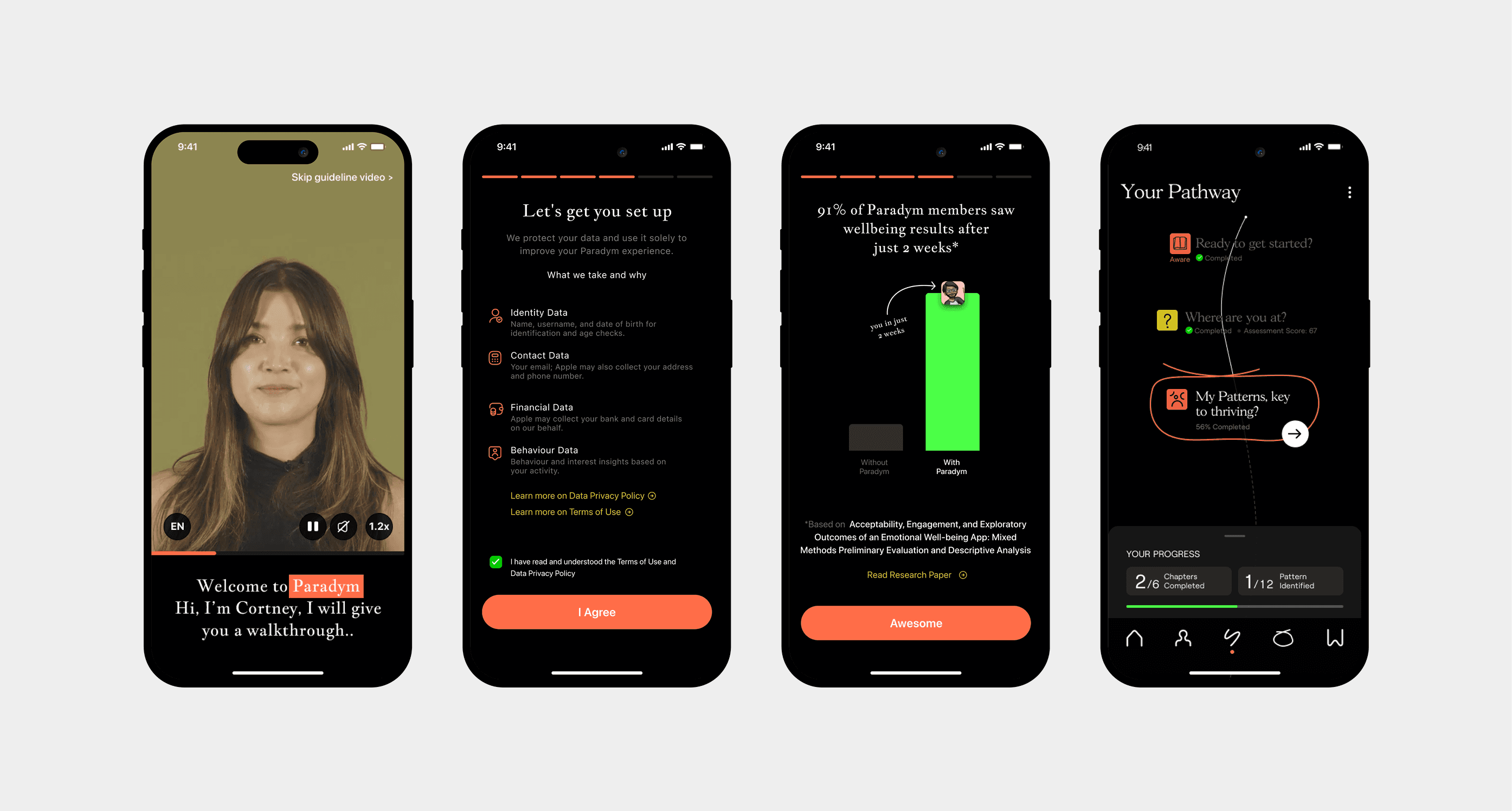
Product Introduction
Problem 1
What Was Broken
Too much reading upfront → cognitive overload
No tone/empathy established in first impression
Users unsure why the app is valuable to them
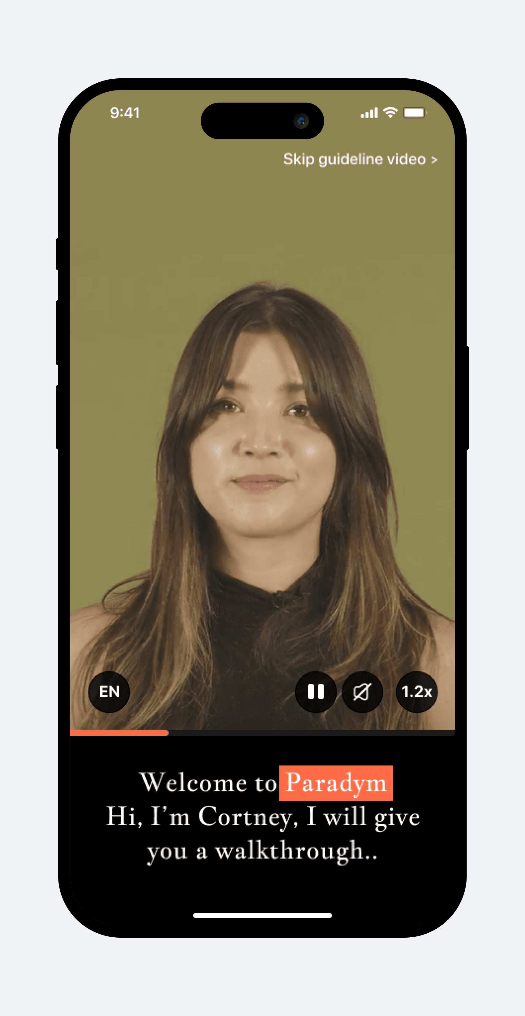
Hypothesis to test: If we reduce upfront reading and introduce a human led explanation, users will feel less cognitive overload and understand the app’s value faster.
What I Did
Introduced intro video with a 1.2x speed, captioned intro video
Communicated purpose, benefits, and emotional reassurance
Added skip + controls to respect autonomy
Used human presence + supportive tone to reduce anxiety
Impact
82% of users reported clearer understanding of app value
More users continued past first touchpoint
Stronger emotional connection → lower early exits

Problem 2
What Was Broken
Early data & payment prompts triggered mistrust
Users didn’t understand why their personal info was needed
Higher drop-off at data + paywall stage
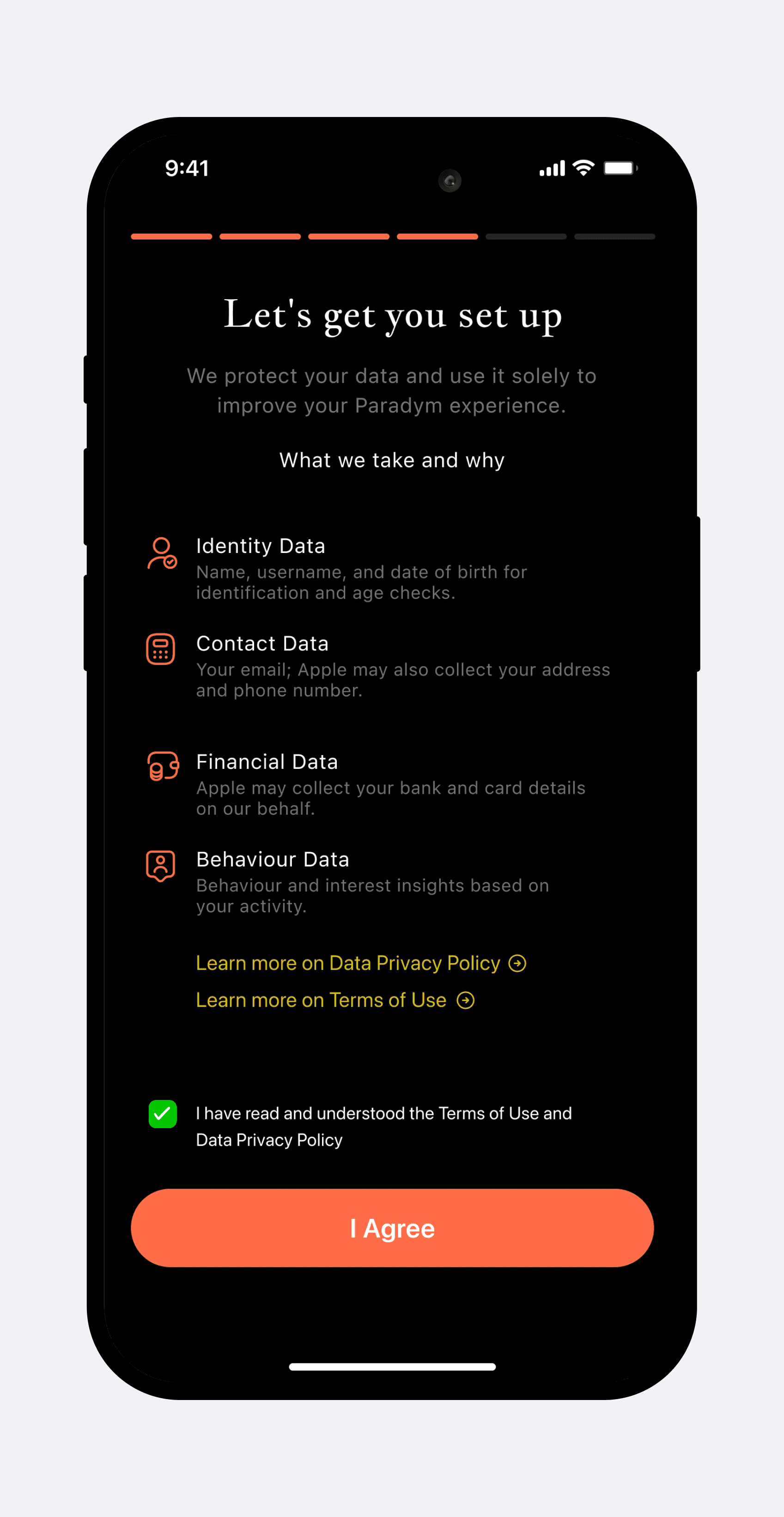
Hypothesis to test: If we explain why data is needed before asking for login or payment, users will perceive the experience as safer and be more willing to continue.
What I Did
Introduced transparent data policy screen before login
Explained clearly: why data is collected and how it helps users
Placed login after trust building so users commit with confidence
Social login → reduced friction
Impact
Increased login completion → more users reach personalization
Trust complaints reduced in feedback
Higher readiness for further onboarding steps

Problem 3
What Was Broken
Users didn’t know how long onboarding would take
Anxiety from unclear effort (“How many steps? What’s next?”)
Weak motivation without visible outcomes
Hypothesis to test: If users see the journey ahead (steps, duration, expected outcomes), anxiety will reduce and motivation to complete onboarding will increase.
What I Did
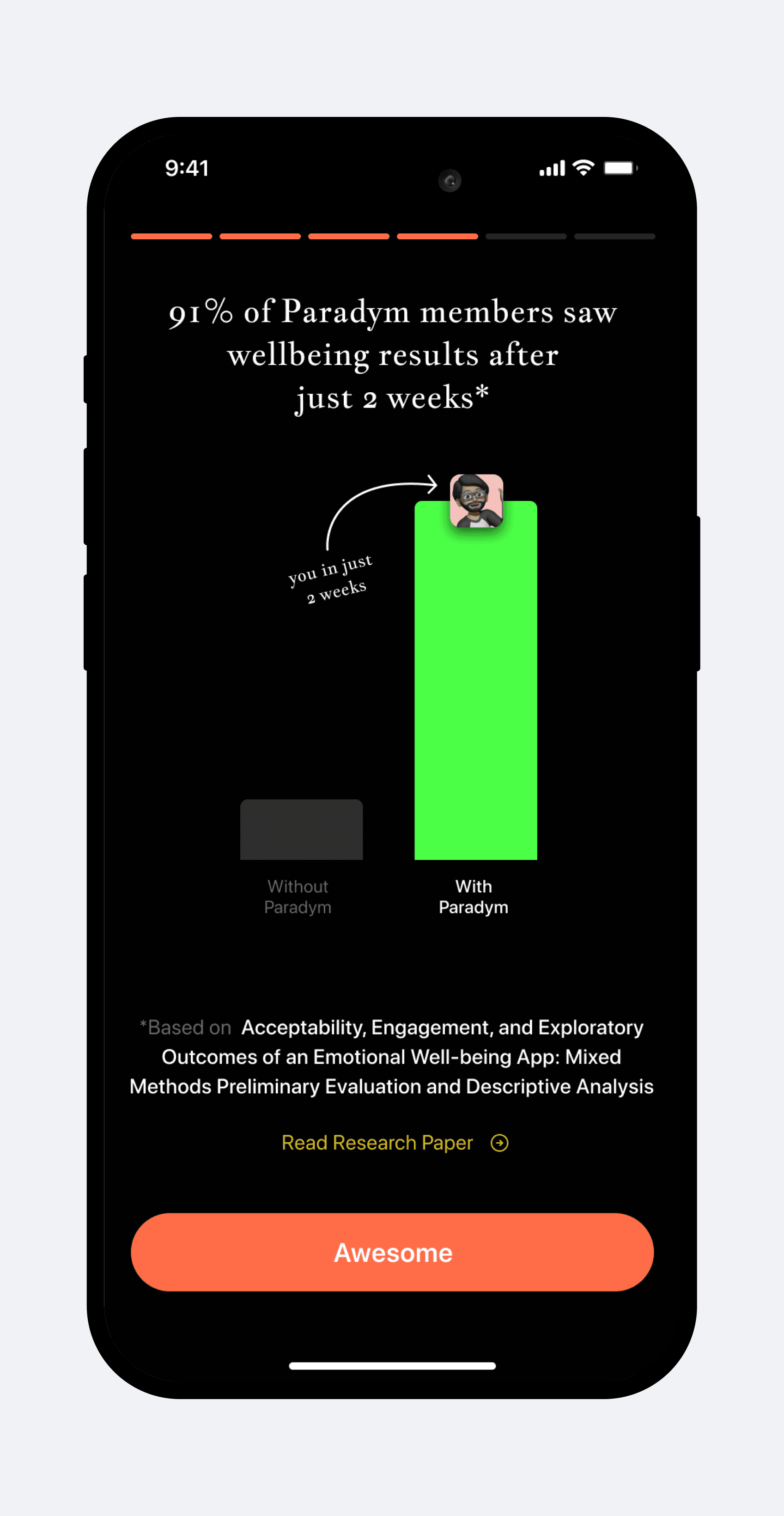
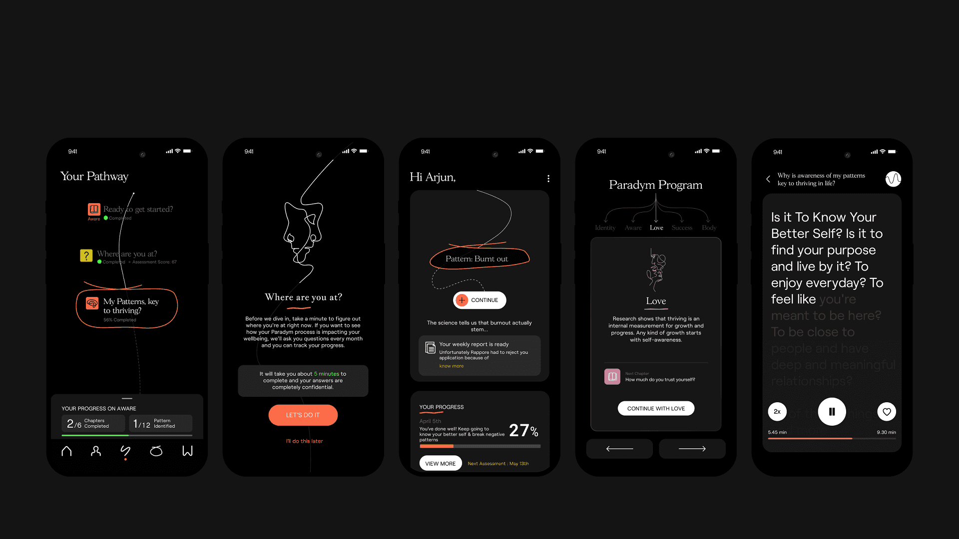
Added a 2-week roadmap visual after login
Clear progress tracking + “what’s coming next” guides
Showed expected benefits upfront
Impact
Increased motivation and completion rates
Users reported more confidence & less hesitation
“Clarity reduced dropout at mid flow points”

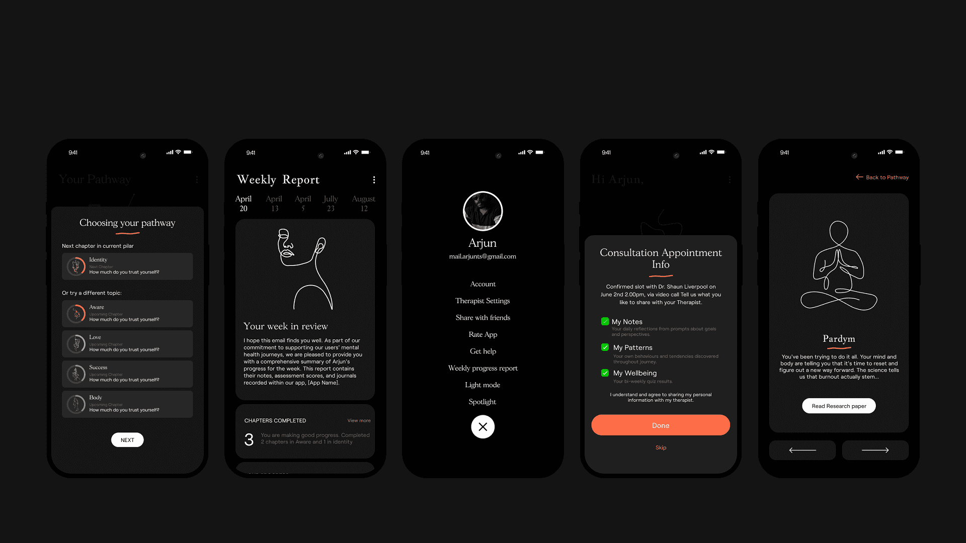
Trial + Paywall
Problem 4
What Was Broken
Trial messaging lacked clarity → perceived financial risk
Daily value not visible → price felt high
Drop-off pattern near pricing screen
Hypothesis to test: If we make trial value and pricing more transparent, financial anxiety will decrease and trial adoption will increase.
What I Did
Simplified trial explanation + transparent pricing
Showed daily cost to reduce cognitive friction
Notification permission requested after trial decision
Clear breakdown of what’s included= no surprises
Impact
Reduced paywall friction → smoother trial adoption
Increased trust in subscription decision
Lower anxiety → more users continued
Deferred Improvements
Delay Paywall Activation: Trigger subscription only near the end of the trial window, once personal value is visible.
We explored this direction, but existing billing architecture limited flexible trial handling planned for future release.
Pause & Resume Subscription: Support financial vulnerability by allowing users to temporarily pause payments and retain core access.
Concept validated through research, but deferred due to dependencies on new entitlement management.
Guest Flow Trial: Let users try core features without login or payment.
Deferred because it created inaccurate personalization, weakened first-time value, and conflicted with Paradym’s data model.

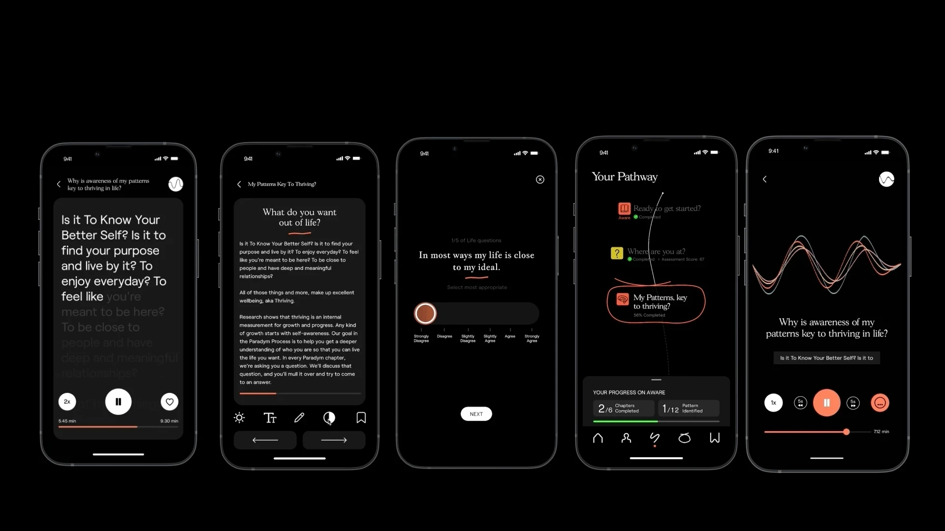
Problem 5
What Was Broken
Questions appeared intrusive without context
Click-through one question at a time = higher effort
Users expected insights after assessment, but didn’t get any
Hypothesis to test: If users understand why questions matter and see immediate insights, they will feel the experience is personal and worth completing.
What I Did
Used scroll-based full-view for better comparison & lower effort
Applied Miller’s Law → memory friendly option layouts
Delivered immediate personalized insights post-assessment
Impact
Faster assessment completion
Higher satisfaction (“It finally feels personal”)
Users reached the program start screen more reliably

Trade offs
Login placement: trust vs business continuity
In the first iteration, login was placed at the end of onboarding to remove friction but with 42% mid-flow drop-off, we may loose all ability to re-engage users. We moved login to just before the paywall, preserving early emotional safety while ensuring the business could recover drop-offs and maintain revenue continuity.
Shorter flows = fewer data signals
Simplifying onboarding decreased cognitive load, but reduced the amount of early behavioral data we could capture. We offset this by collecting signals later, after pathway journey starts.
Why the Redesign Worked
The redesign succeeded because it reframed onboarding from a linear set of UI steps into a behaviorally informed decision system. Instead of removing friction superficially, I restructured the experience around how users evaluate trust, effort, and value and aligned design decisions with both human psychology and the subscription business model
It addressed the root cause, not the symptoms
69% drop in early abandonment
Users reached value across 80% fewer screens (25 → 5)
It aligned onboarding with actual user psychology
+31% completion of emotional profile
82% of users reported clearer understanding of app value
It reduced cognitive load while increasing perceived value
~38% faster onboarding
Higher willingness to proceed to trial
It solved a core business problem without compromising user trust
Higher login completion → healthier funnel depth
Subscription intent increased while protecting brand trust
It created a predictable, low-anxiety decision environment
Mid-flow drop-offs significantly reduced
Users reached the personalized programme consistently
It delivered value earlier to unlock subscription readiness
Higher satisfaction in qualitative studies


Retrospect
🧩 Onboarding is the brand
A wellbeing app isn’t just a product ,it’s a promise. Every screen, question, and moment shapes whether users believe that promise.
✨ Trust, motivation, and reliability are not features
They are the brand. If users feel rushed, confused, or exposed too early, the damage isn’t a lost signup, it’s a lost belief in the brand.
📉 Conversion issues become reputation issues
A single early drop-off isn’t just a metric dip; it’s a user who decides the brand isn’t for them. Trust-first onboarding protected brand equity while unlocking revenue growth.