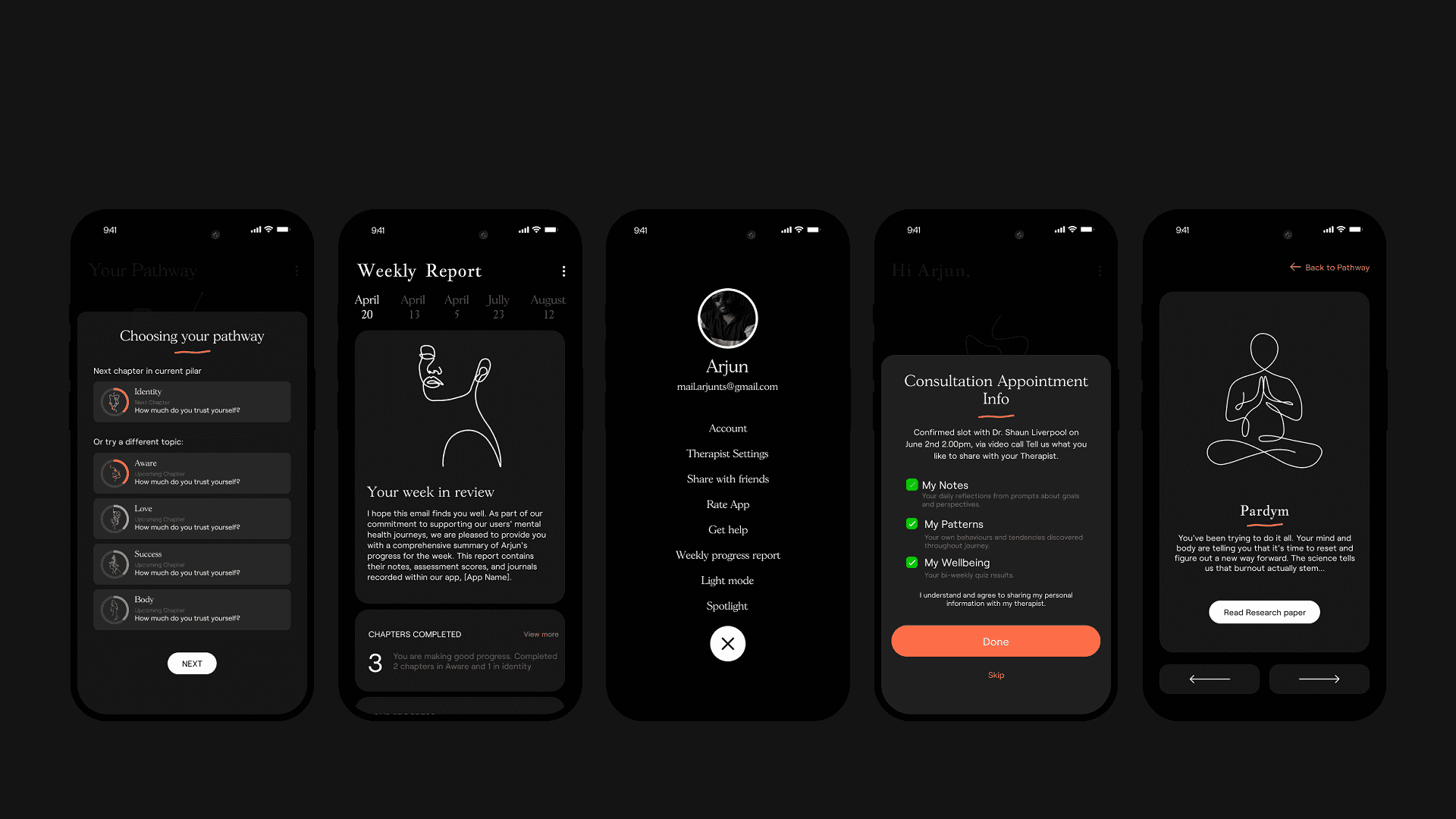
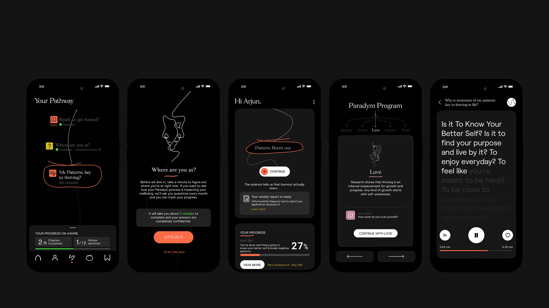
Onboarding people can trust, at the moment they feel most exposed.
Paradym is an emotional wellbeing app. Its first two minutes were losing 42% of the people who opened it. I redesigned onboarding around one idea: when someone feels vulnerable, ask less of them and explain more.
Role
Lead Product Designer, founding designer
Team
Product, Content, Growth, Engineering
When
April to November 2023
Status
Shipped
−69%
Early drop-off
42% to 13%
−38%
Time to finish onboarding
4.0 to 2.5 minutes
−80%
Screens before first value
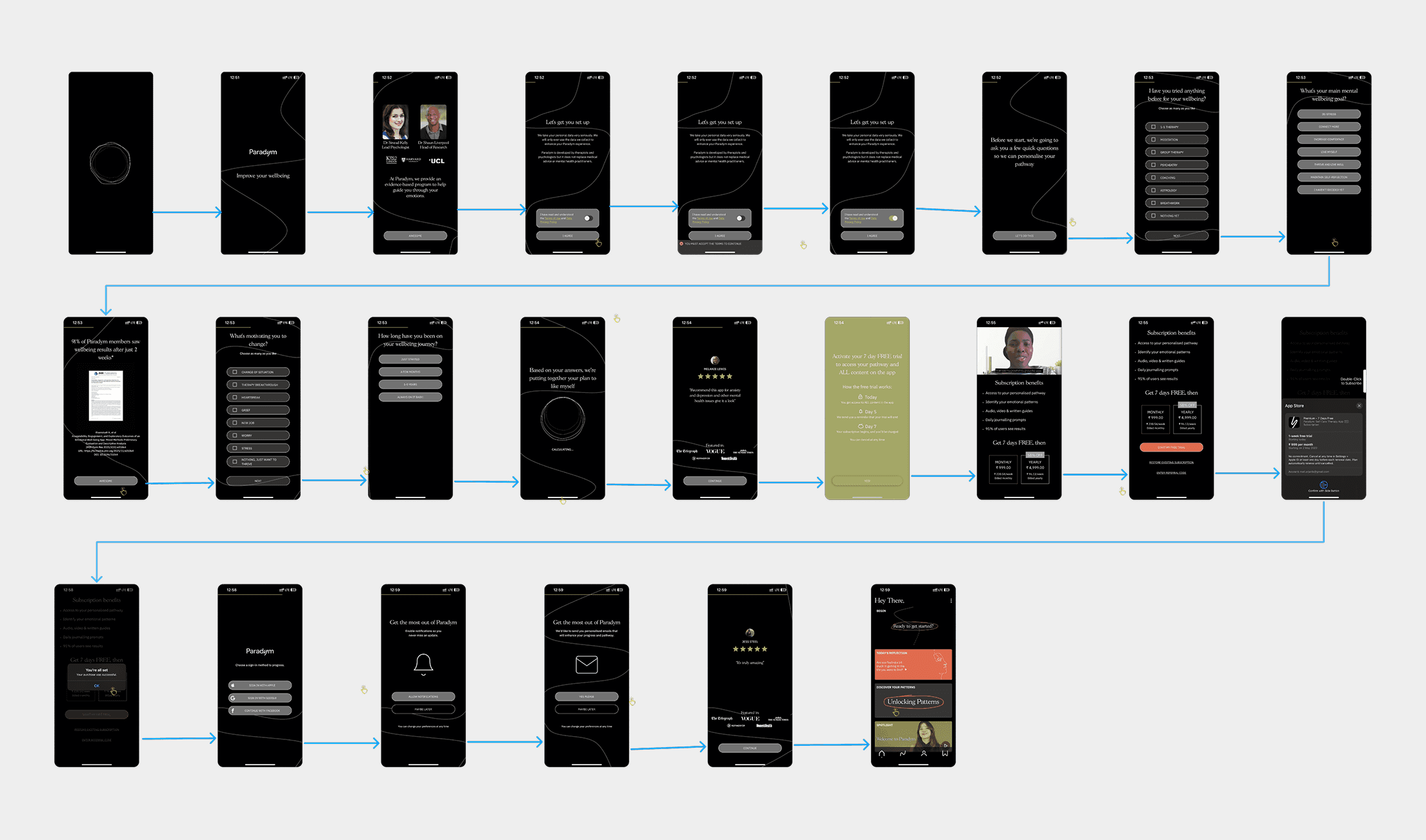
25 to 5
+31% more people completed their emotional profile.
7% of all users converted to paid.
The problem
For a subscription wellbeing app, onboarding is the business model. Ours asked people to read too much, share too much and pay too soon.
Many left in the first two minutes, before they understood how the app could help. That was lost revenue, a wellbeing outcome that never began, and a failure of trust at the most vulnerable moment.
My role
As the founding designer, I led the design from research to shipped screens, working with product, content, growth and engineering. My training in applied psychology shaped how we read every hesitation in the data.
I set the principle the whole redesign followed: when emotional vulnerability is high, cognitive load must be low and clarity must be immediate. Every decision below was tested against it.
What we learned
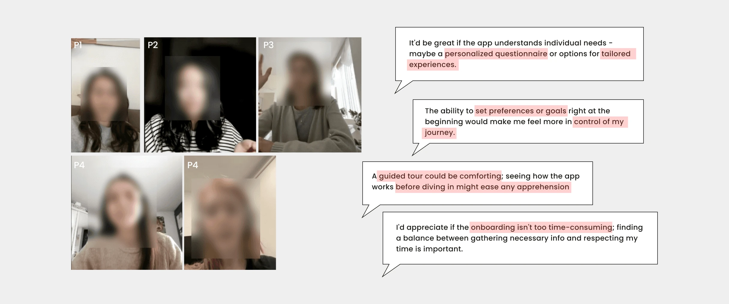
We ran 42 remote, moderated interviews with people aged 19 to 32, 84% of them women, across Europe and North America. Alongside them: a heuristic evaluation, a cognitive walkthrough and a behavioural review of the whole flow.
“It’s too much information before I even know what this app does.”
Long flows and dense text left people overwhelmed before they had a reason to stay.
Asking for sensitive data early raised privacy worries.
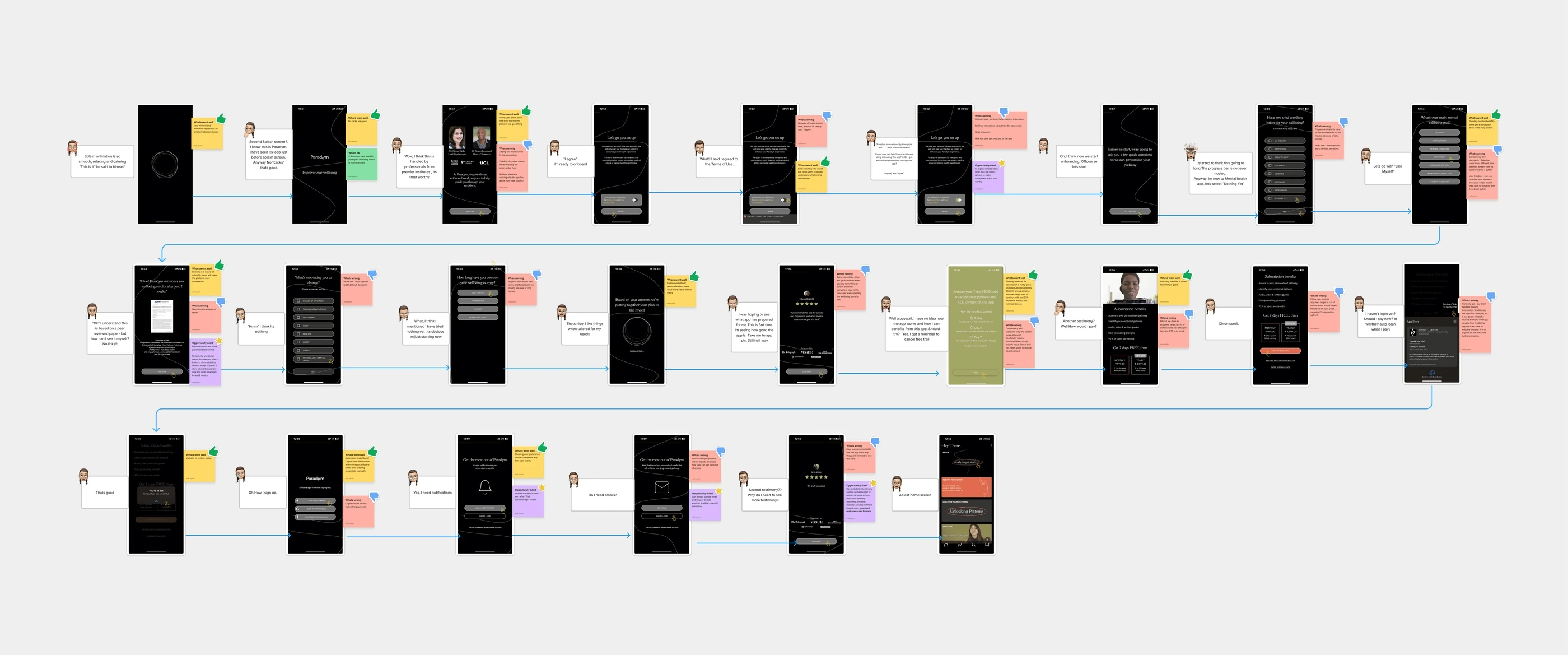
The biggest drop-offs were in the multi-step assessment and the screens before the paywall.
Questions framed as reflection, not data entry, felt safer to answer.
Evidence
Notes from the interviews
Evaluating the previous design
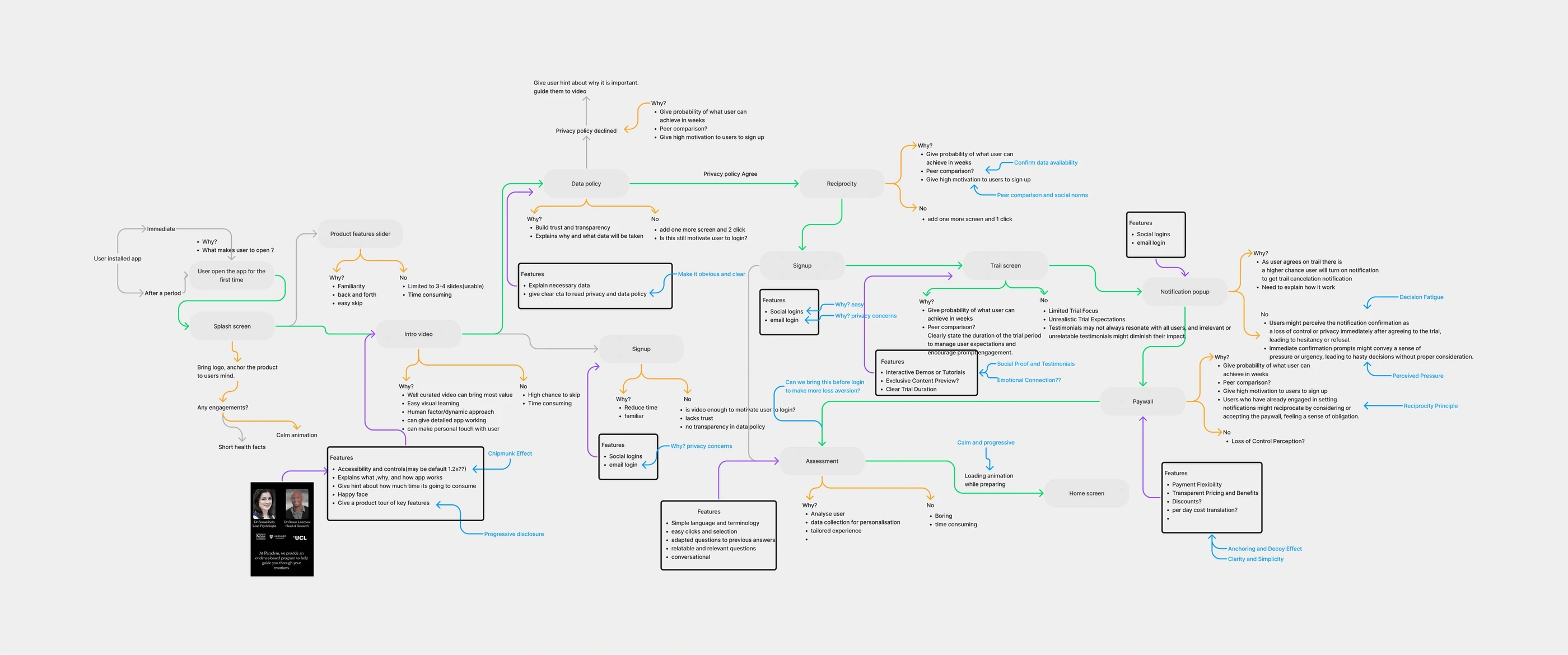
Working toward the shortest honest path
1 / 3
Five decisions
1 of 5
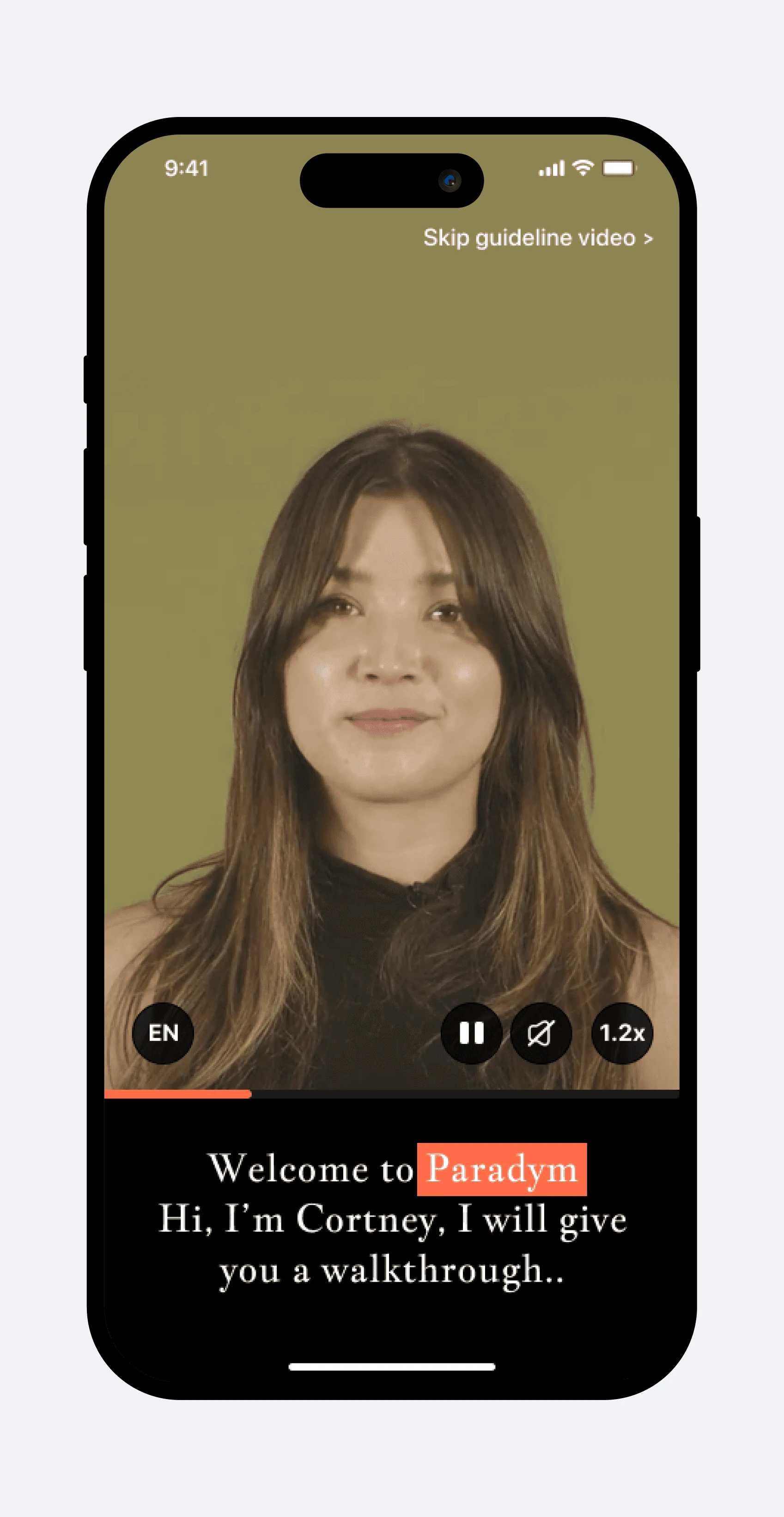
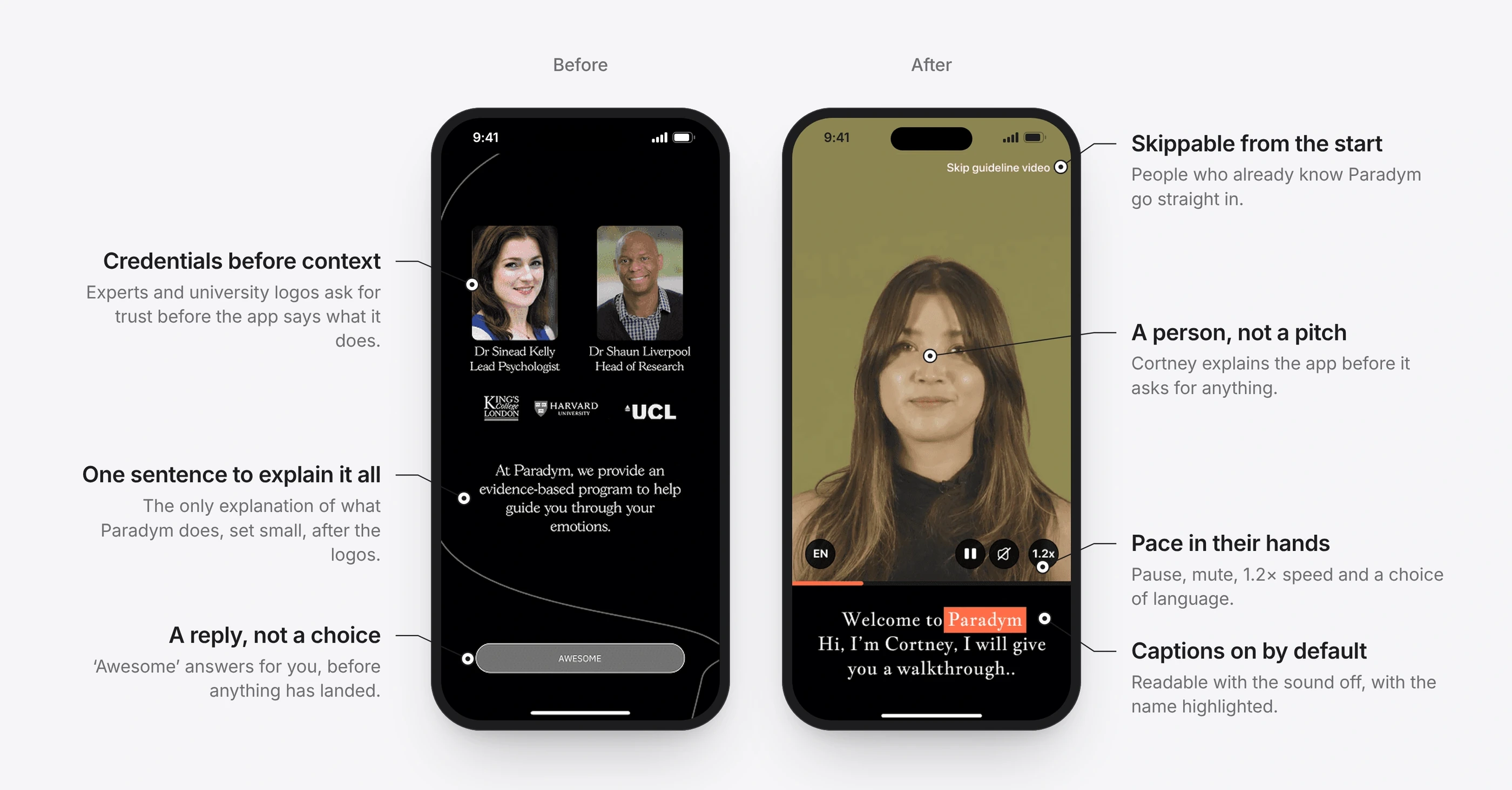
Introduce the product with a person
BeforeA wall of reading, with no tone or empathy. People couldn’t tell why the app mattered to them.
ChangeA short captioned video at 1.2× speed, with skip and playback controls so people stay in charge.
Result82% of users said they understood the app’s value more clearly.
2 of 5
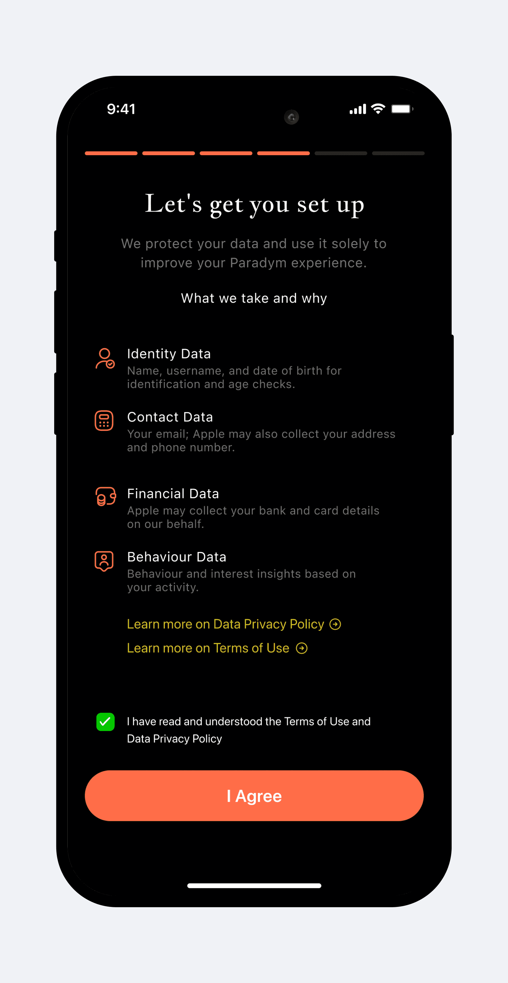
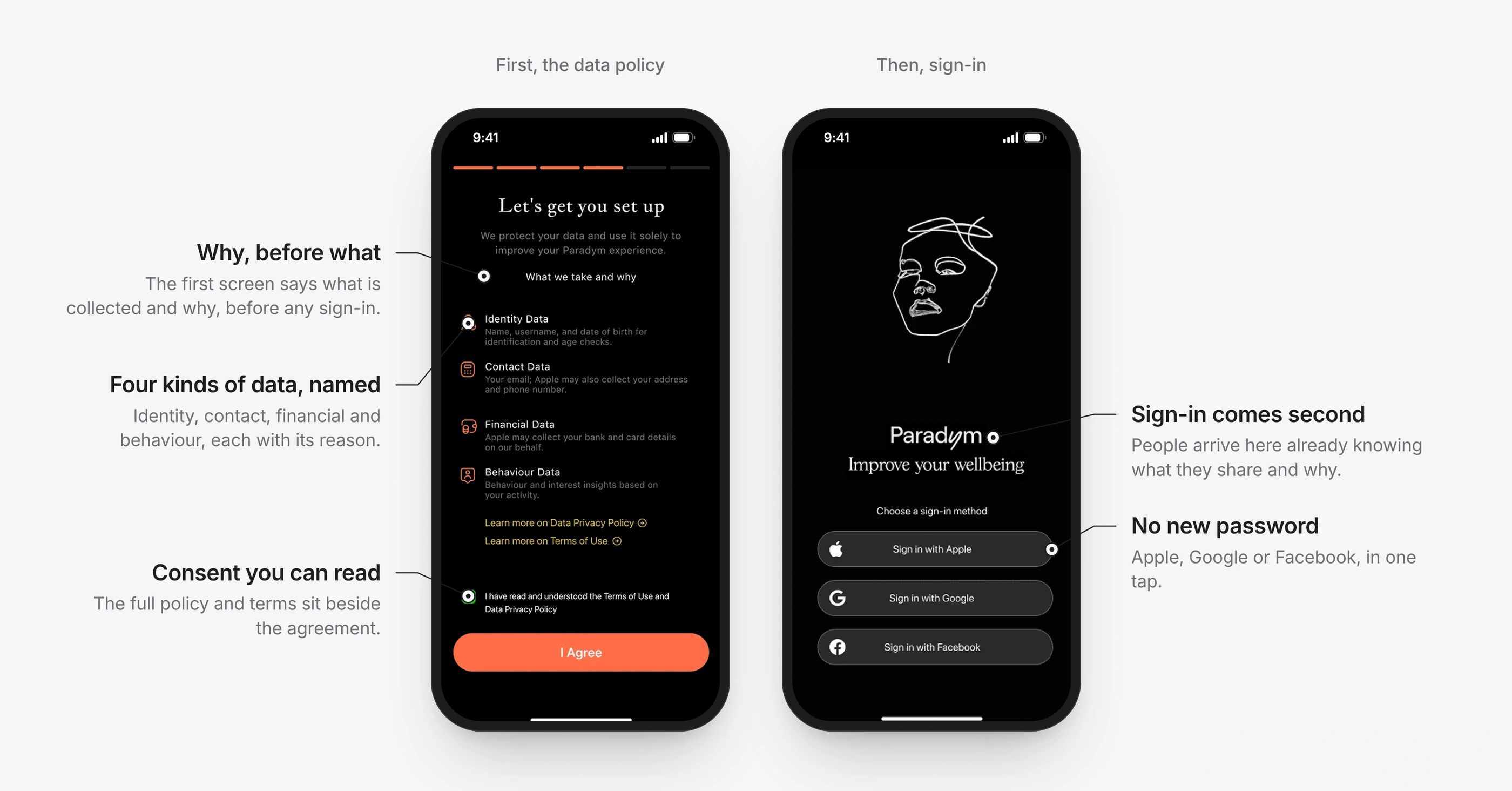
Explain the data before asking for it
BeforeData and payment prompts arrived early, and people weren’t told why their information was needed.
ChangeA plain data policy screen now comes before login. Login follows once that trust exists, with social sign-in to save effort.
ResultMore people logged in and reached personalisation, and trust complaints fell.
3 of 5
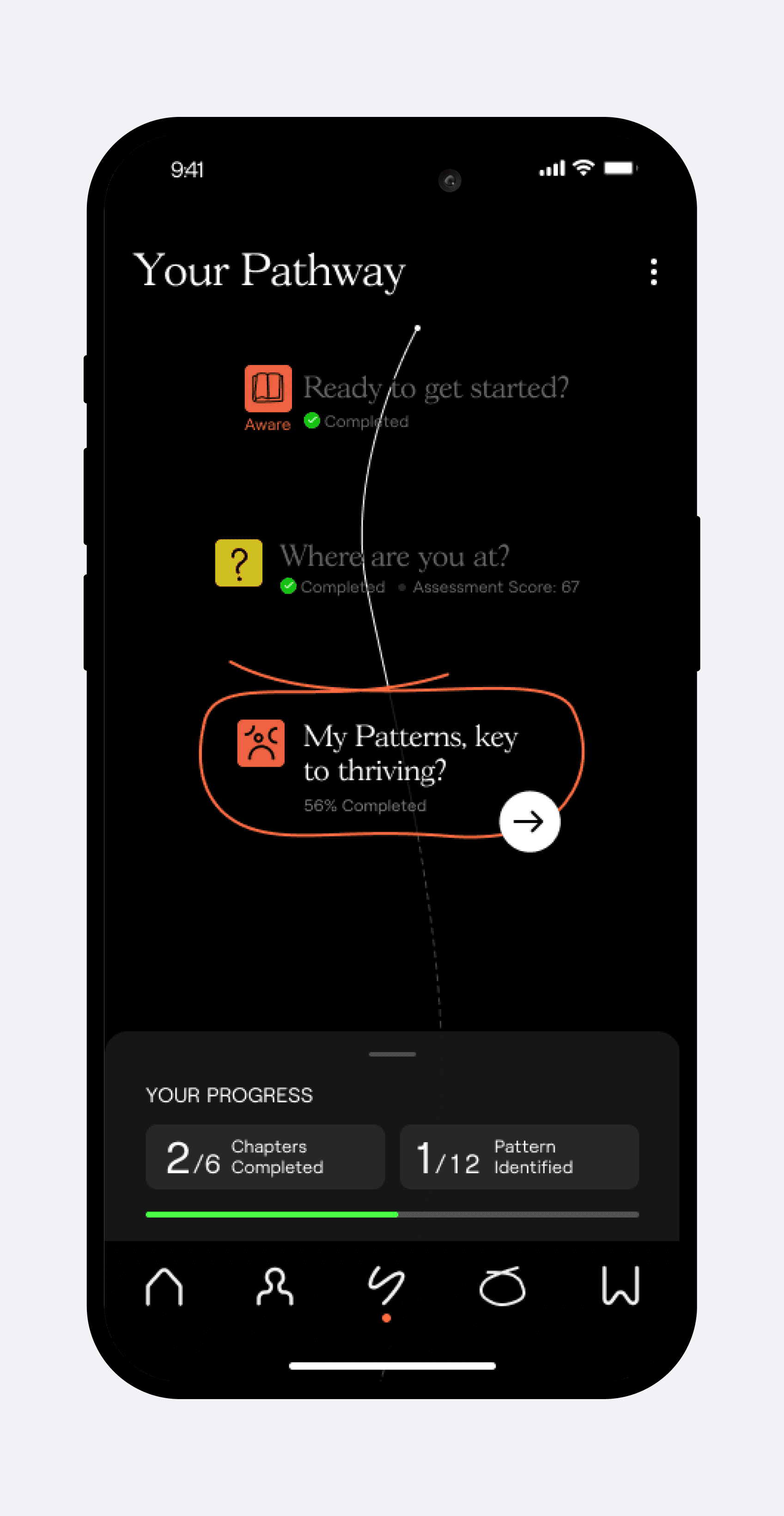
Show the road ahead
BeforePeople couldn’t tell how long onboarding would take, so the effort felt open-ended.
ChangeA two-week roadmap after login, with progress and the benefit to expect at each point.
ResultPeople hesitated less, and fewer left mid-flow.
4 of 5
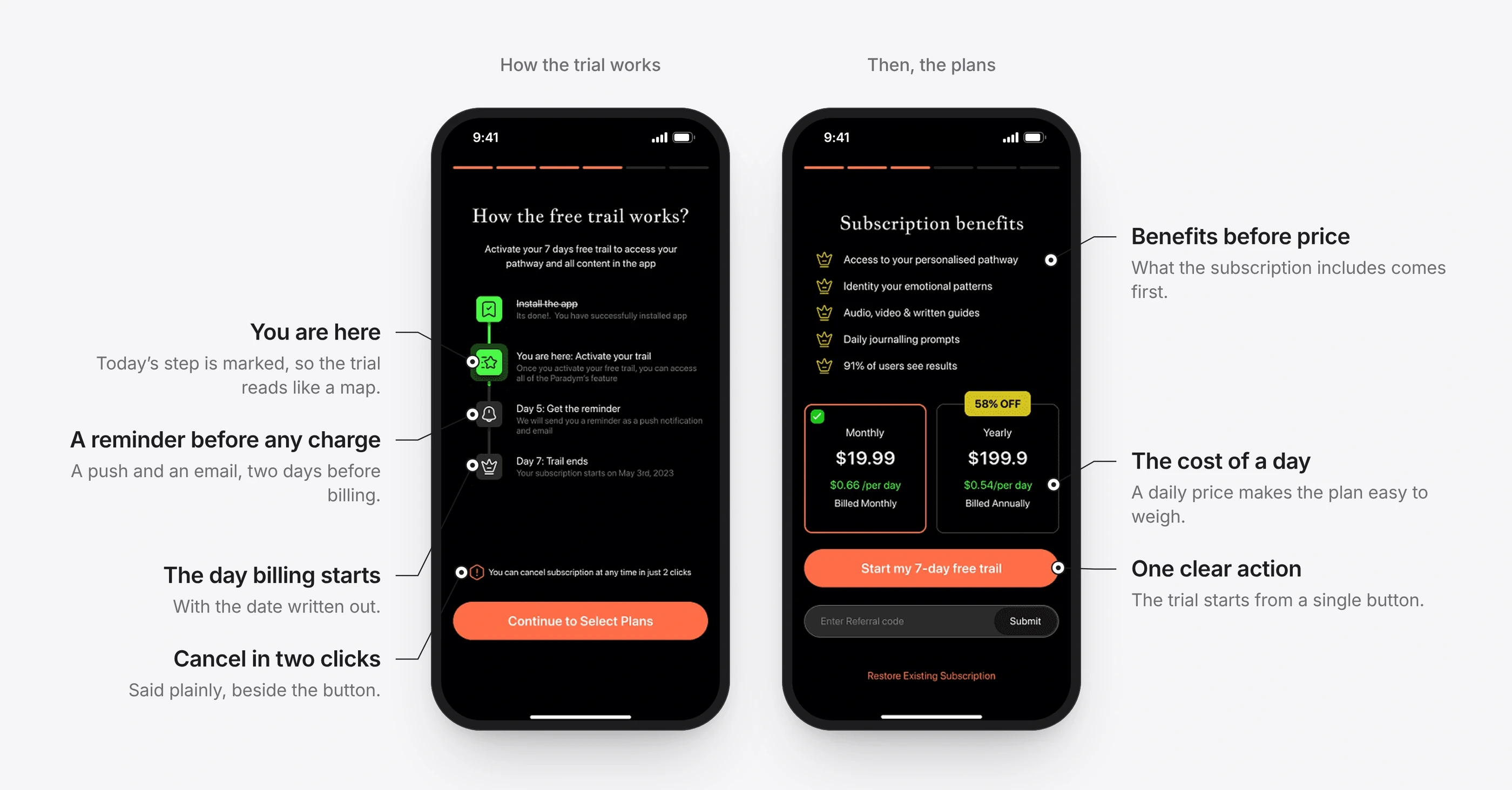
Make the trial honest
BeforeVague trial terms made the price feel like a risk. People left at the pricing screen.
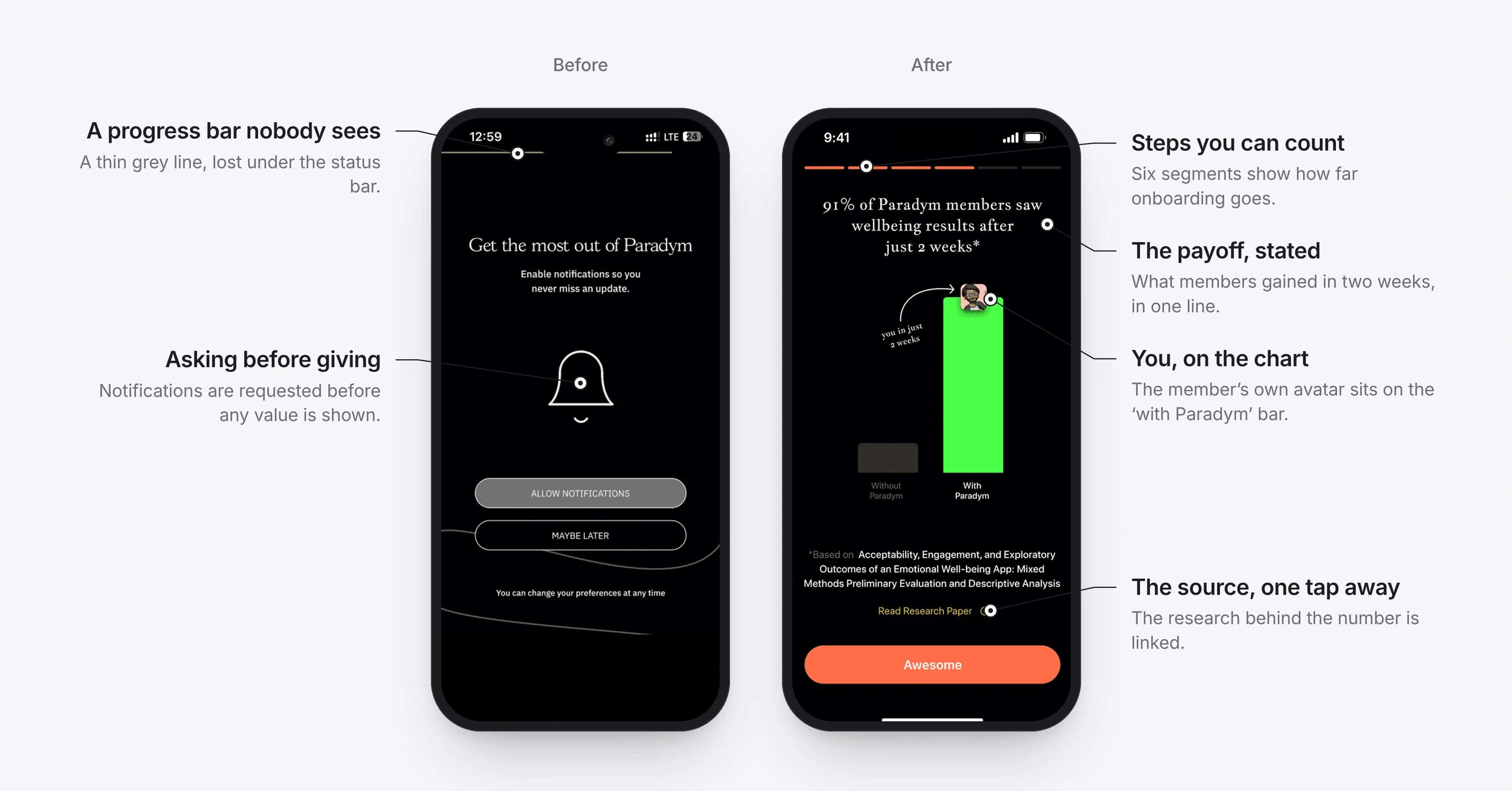
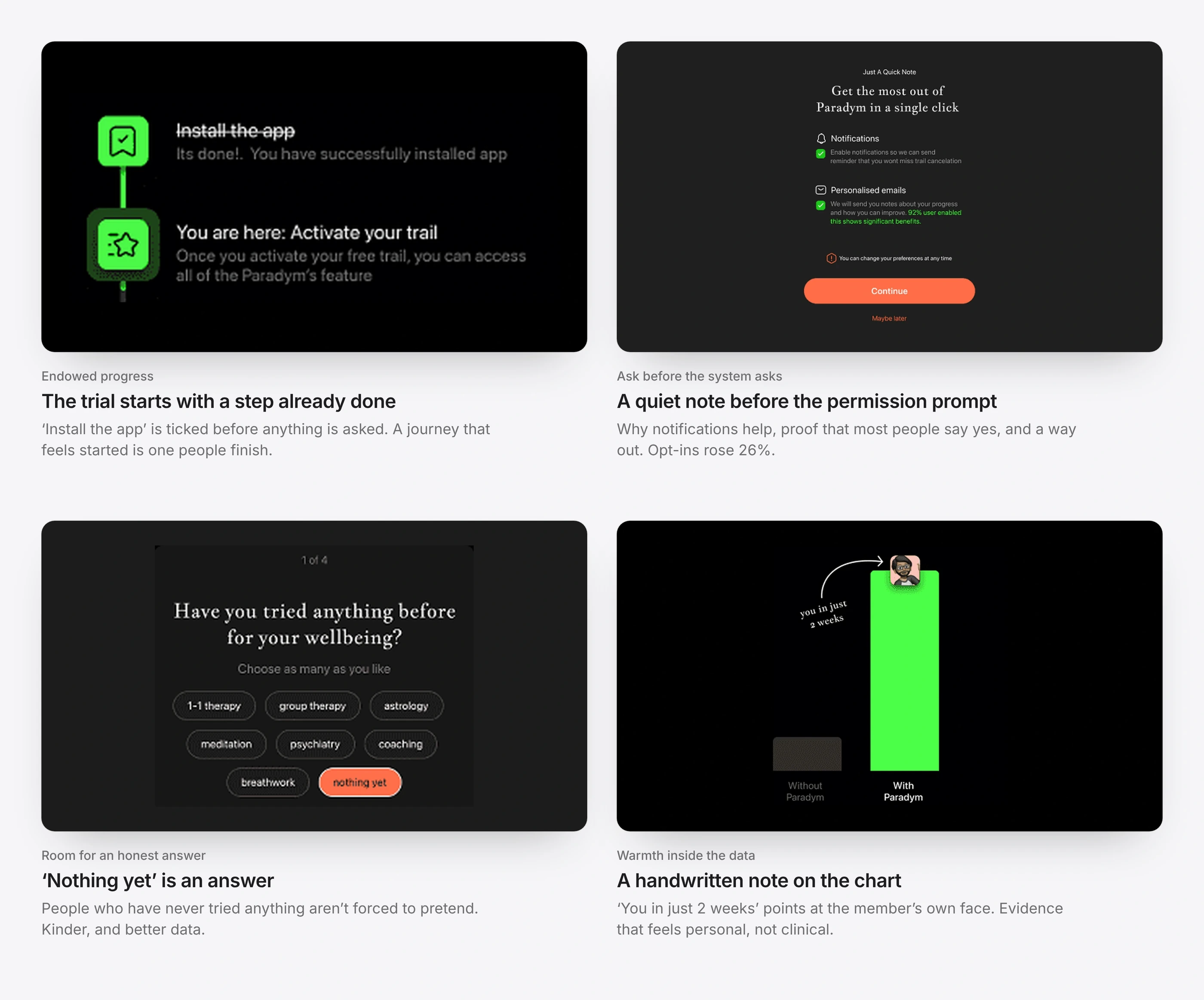
ChangeThe 7-day trial is explained before any price appears: a timeline marks today, the reminder on day 5 and the exact day billing starts, and says cancelling takes two clicks. Pricing then shows the daily cost and exactly what is included. Notifications are requested only after the trial decision.
ResultLess friction at the paywall, and more people starting the trial.
5 of 5
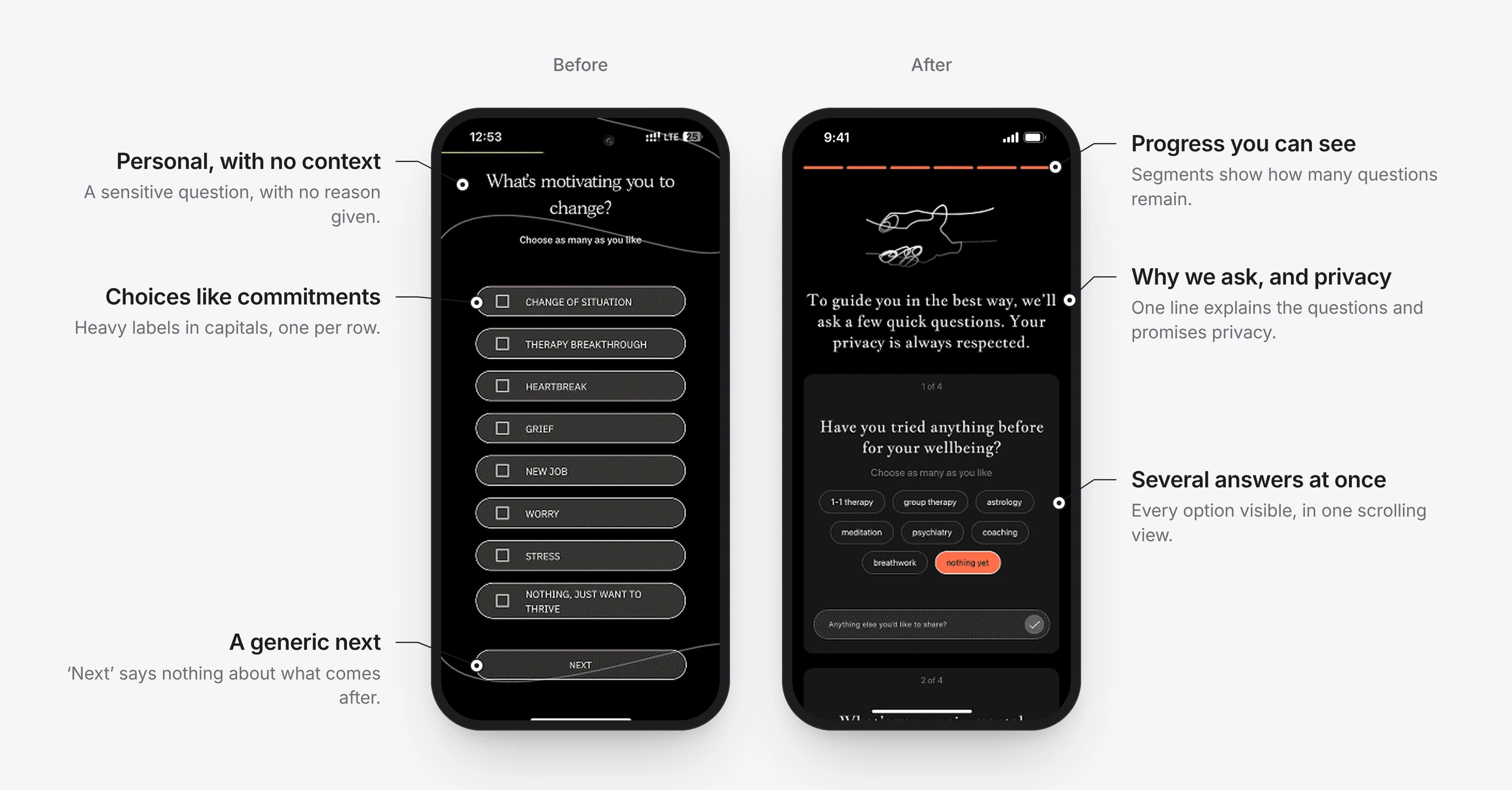
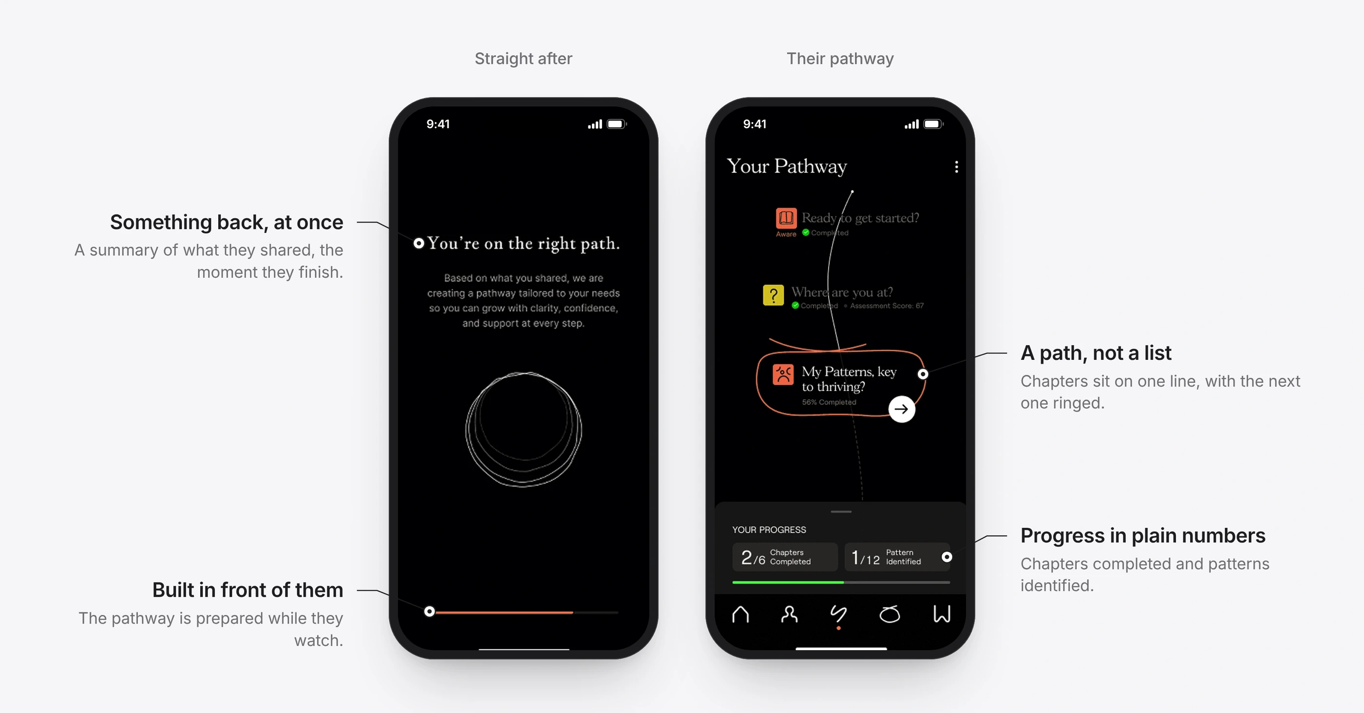
Give something back for the assessment
BeforeOne question per screen was slow, questions felt intrusive, and people got nothing in return.
ChangeOne scrollable view with options laid out to be easy to remember, followed straight away by personal insights.
ResultFaster completion, and feedback like “It finally feels personal.”
From a form to a conversation.
Something back, straight away.
1 / 2
Details that did the work
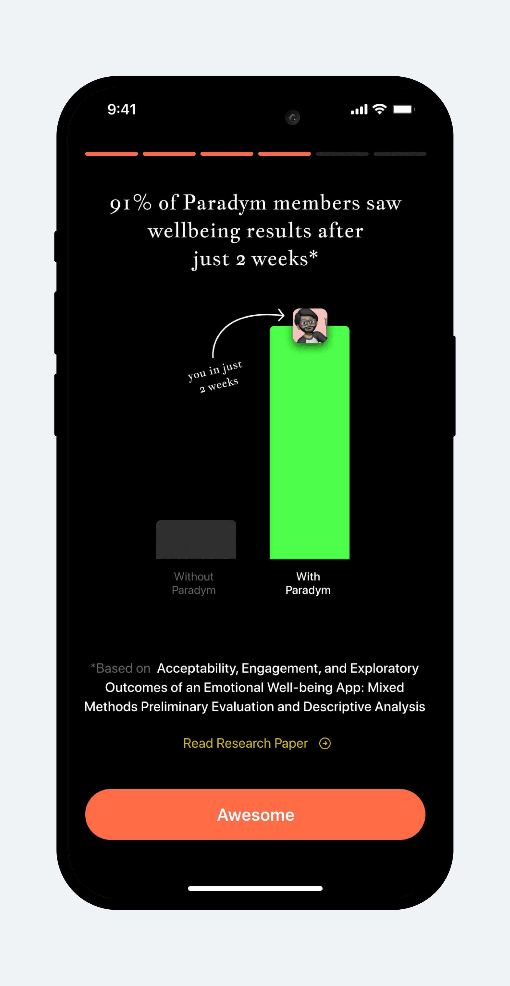
Small decisions, each grounded in how people actually behave, carried as much weight as the big ones.
Before and after
Before: 25 screens to reach value
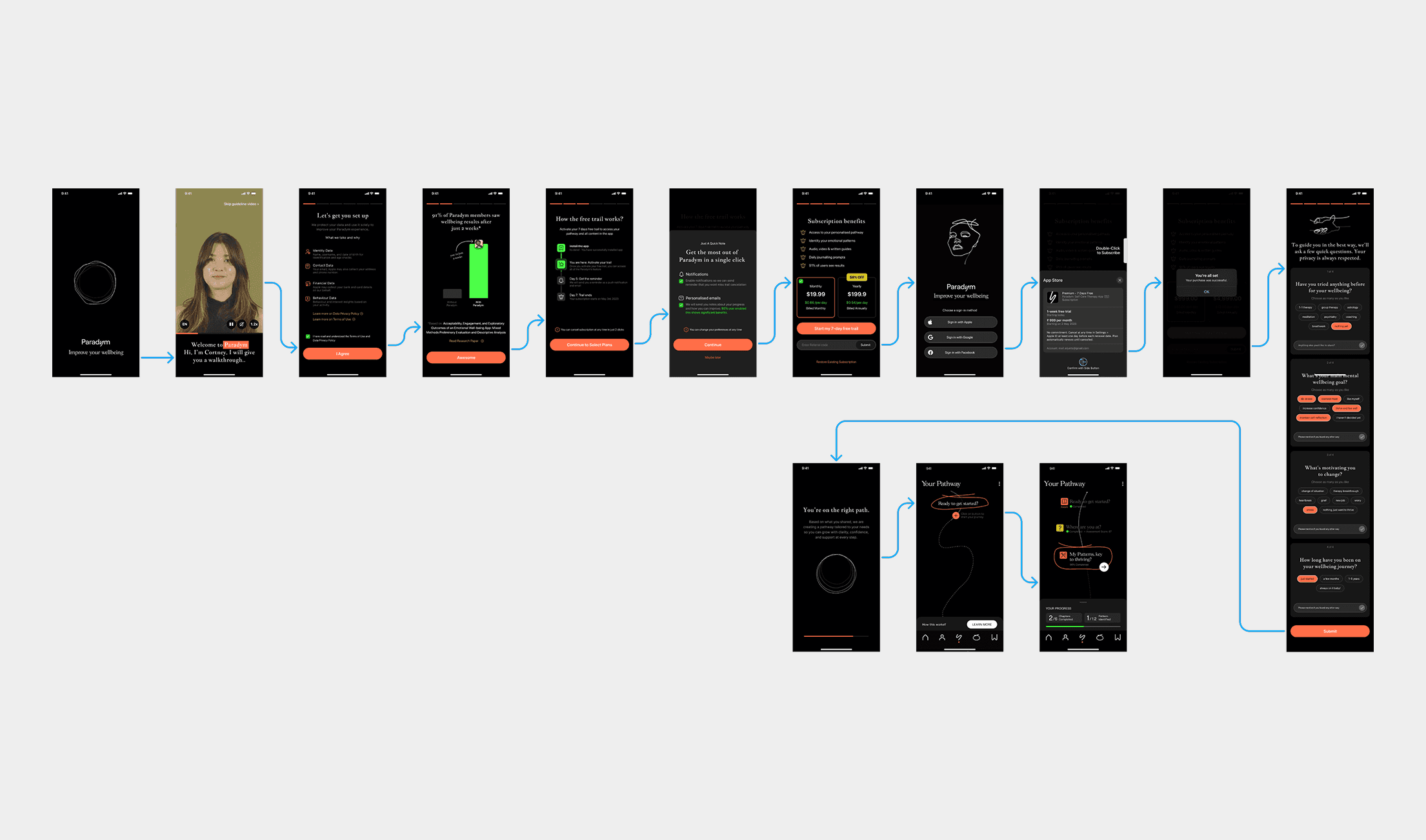
After: 5 screens to reach value
1 / 2
The shipped product
1 / 3
Trade-offs
Where login goes. We first moved login to the very end to remove friction. But with people still leaving mid-flow, that left no way to bring them back. Login now sits just before the paywall: the early steps stay light, and the business can recover people who leave.
Shorter flow, fewer signals. A shorter onboarding captured less behavioural data up front. We now collect it later, once someone’s pathway has started.
Not shipped
A 21-day trial, long enough for people to see their assessment result, which arrives after 14 days, before the first charge. I proposed it; the business kept 7 days.
A later paywall, once personal value is visible near the end of the trial. The billing system couldn’t support flexible trials yet.
Pausing a subscription for people under financial pressure. Validated in research, waiting on a rebuild of entitlements.
A guest trial without login or payment. Dropped: personalisation became inaccurate and the data model couldn’t support it.
Reflection
A wellbeing app is a promise. Every onboarding screen decides whether people believe it.
An early drop-off is a person deciding the product isn’t for them. Designing for trust first protected that belief, and helped the business at the same time.