Telling drivers an ambulance is coming, before they can hear it.
A concept for Google Maps and Android Auto that uses route intelligence, not new hardware, to help drivers make way calmly and in time.
Role
Research, system and interaction design
Type
Self-initiated
When
2022
Status
Concept, not tested on the road
25%
of a driver’s attention
is on the navigation screen
3
cues, each only when needed
a pulse, an edge, a banner
0
new sensors or hardware
only route data Maps already has
5 alert levels, from 3 km ahead to silent.
1 line of copy, with one action.
Where it started
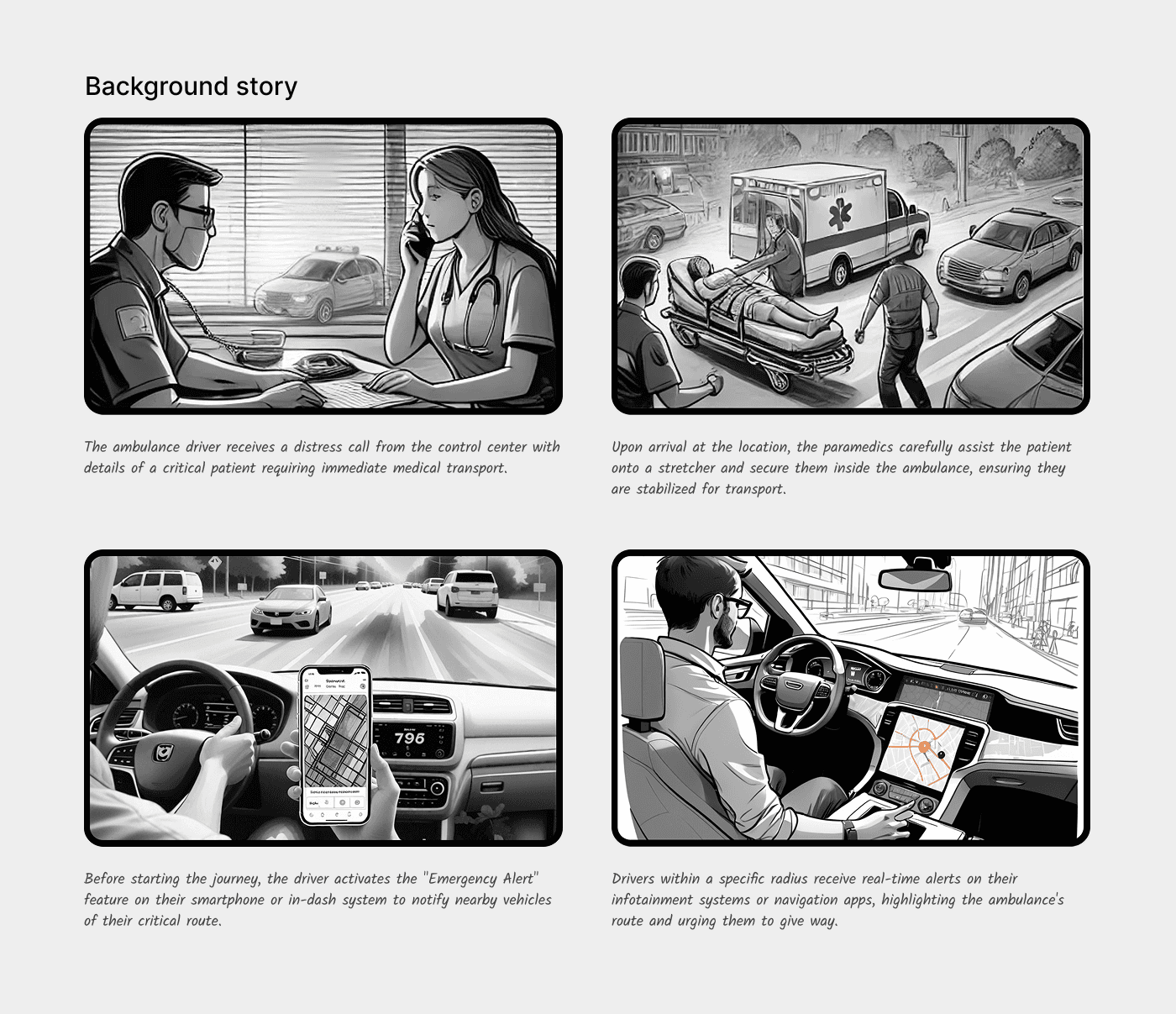
Windows up, music on, following Maps through a busy junction. I noticed the ambulance only when it was already beside me.
Nobody meant to block it. Emergency response isn’t slowed because people refuse to give way. It’s slowed because they notice too late. Maps already knows where every car is going, so I asked a simple question: what if an emergency vehicle could tell Maps where it is heading, and Maps prepared the road ahead?
The moment that started it
What I found
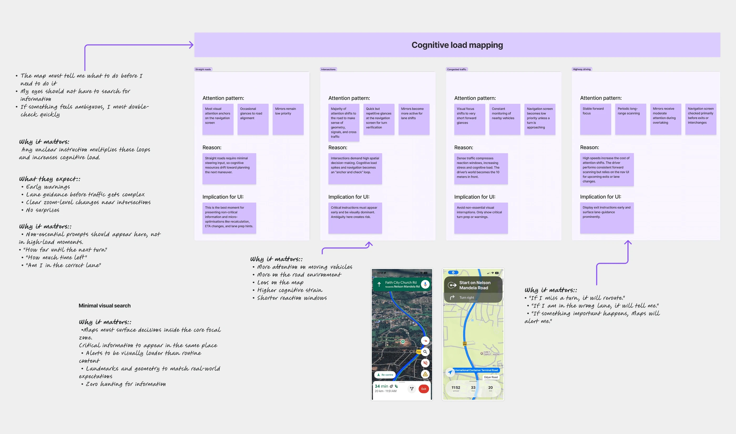
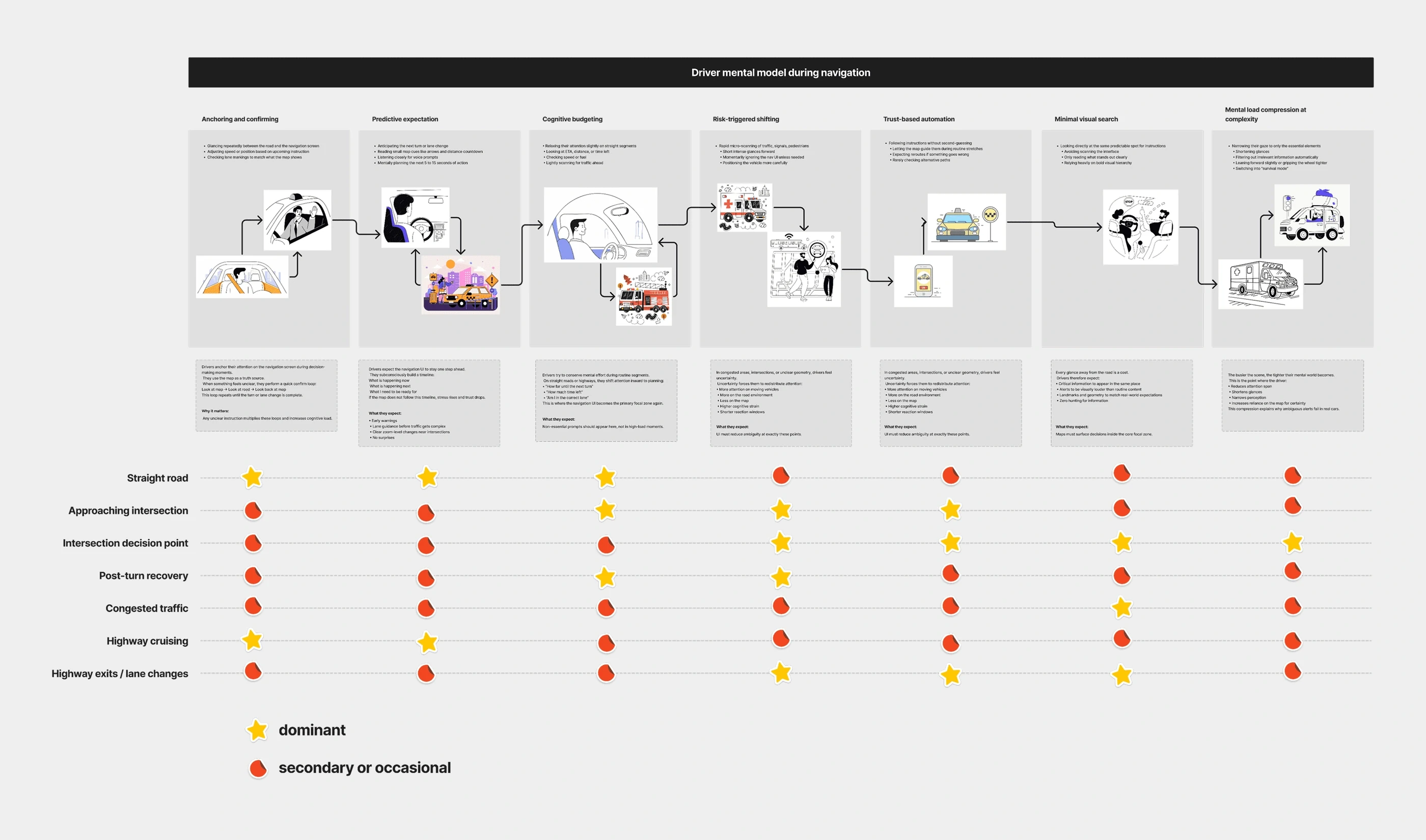
I interviewed commuters, car owners, cab drivers and new drivers, rode along in ambulances, mapped drivers’ attention, and scanned the policy and products around it: Waze, EU emergency-corridor rules, vehicle-to-vehicle systems and electric-car sound rules. None of the ones I found warns a driver ahead of time, with a direction.
Late recognition. In a closed or electric cabin, drivers hear the siren seconds before the vehicle arrives, or not at all.
No sense of direction. Sound inside a car doesn’t say which side, or whether it concerns you.
Hesitation. Most drivers want to help and can’t decide fast enough. Five seconds of hesitation is five seconds too many.
“My eyes are always on Maps.”
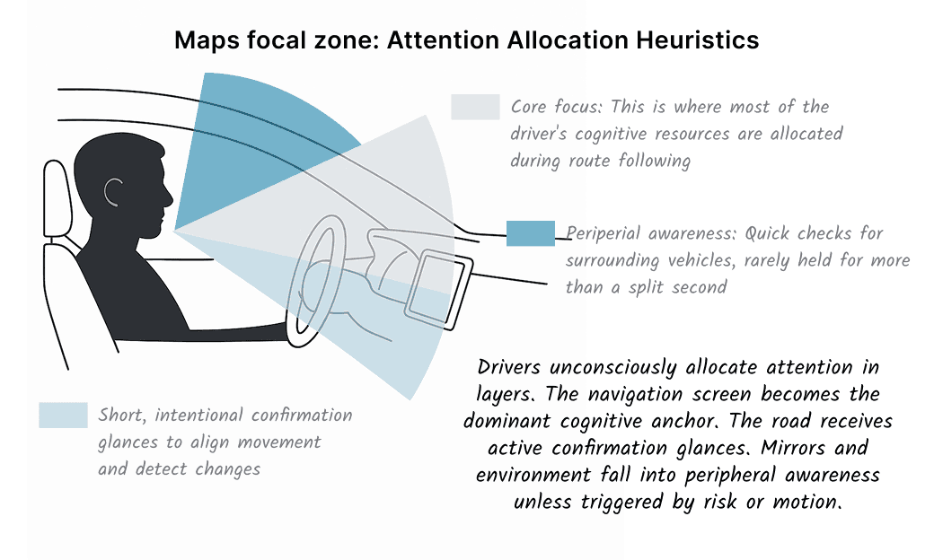
On the ride-alongs, the delays came at junctions, and from late awareness, never unwillingness. Drivers give about 70% of their attention to the road ahead and 25% to the navigation screen. Everything else shares the last 5%.
Sirens fail because they use the wrong channel. The warning has to appear where attention already is.
Research
1 / 2
The concept
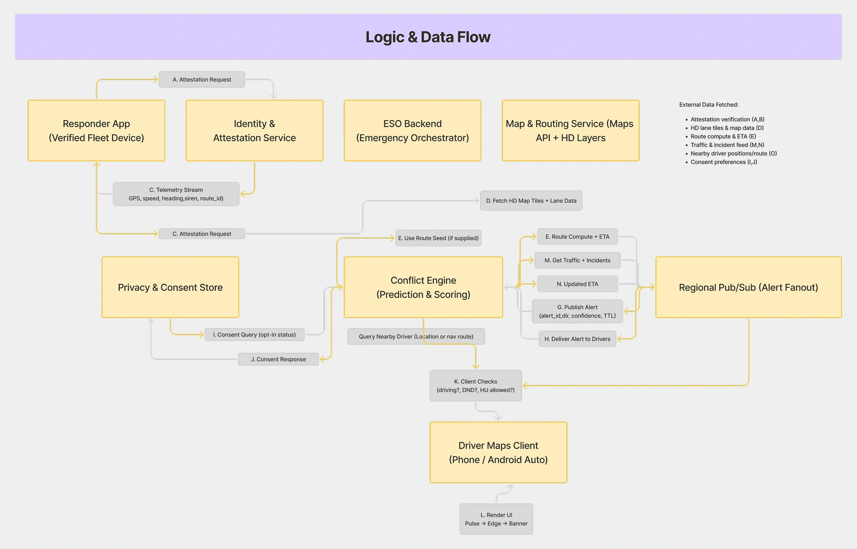
Responders already navigate with Maps, and drivers already follow it. So the whole system lives inside Maps. A responder starts Emergency Mode, picks a destination and an urgency, and drives. Maps finds the drivers whose route, lane and timing put them in the vehicle’s path, alerts only them, and lets the alert fade once the vehicle has passed.
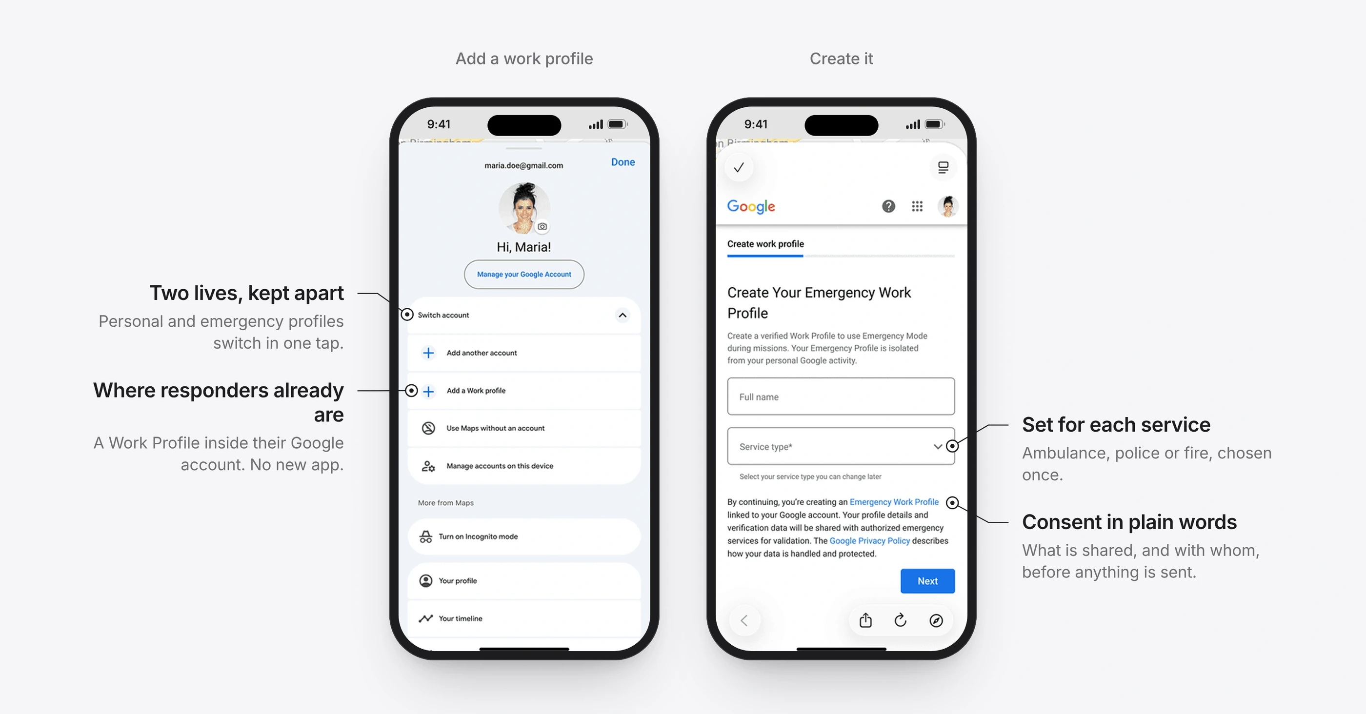
BeforeA new emergency app means installs, training and one more screen in the cab.
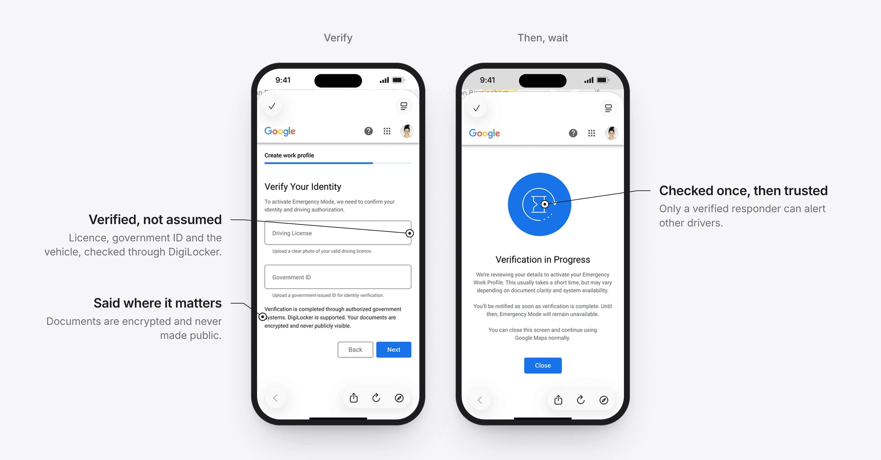
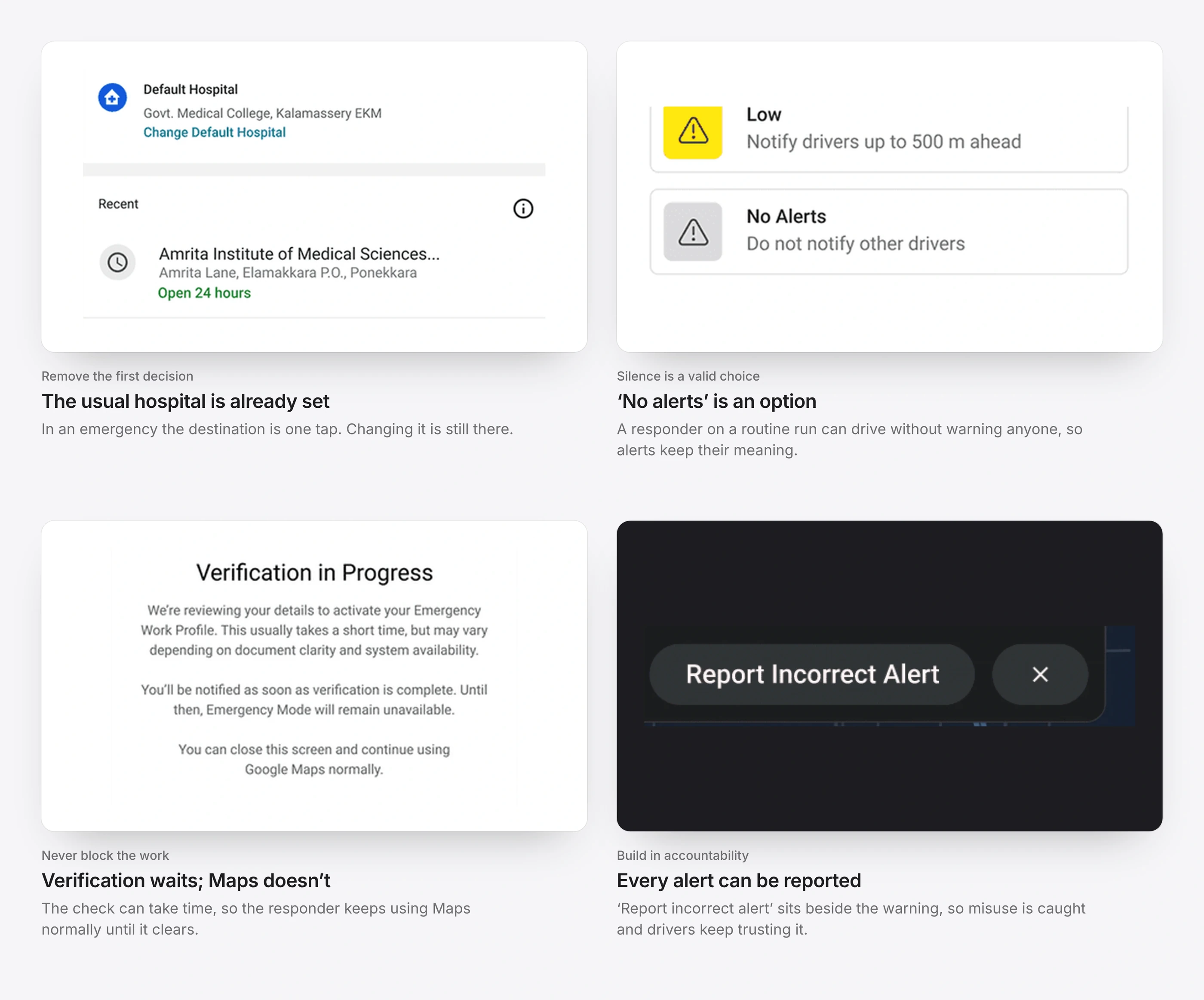
ChangeAn Emergency Work Profile inside the responder’s Google account, next to their personal one. It is verified once with a driving licence, a government ID and the vehicle’s registration, and the check runs in the background.
Intended outcomeNo new app and no new habit, and only verified responders can alert other drivers.
1 / 2
2 of 5
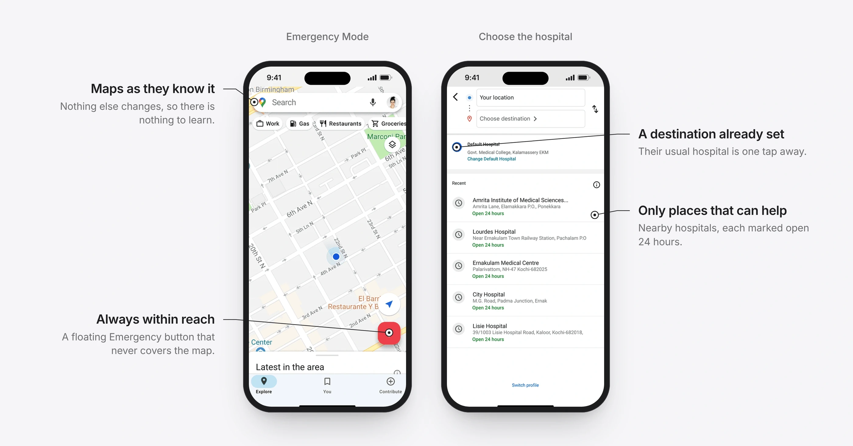
Dispatch in three taps
BeforeIn an emergency, every extra screen costs seconds.
ChangeA floating Emergency button on the normal map. The responder’s usual hospital is already set, so dispatch is three taps: destination, urgency, start.
Intended outcomeFrom the map to an alerted road in seconds.
3 of 5
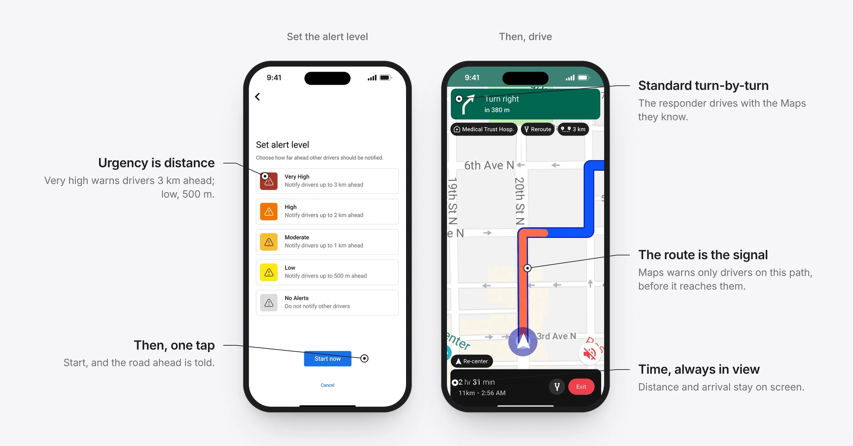
Urgency means distance, not volume
BeforeResponders didn’t want every alert at maximum. As one driver put it, if everything is urgent, drivers stop trusting the alert.
ChangeFive levels that change how far ahead drivers are warned: 3 km, 2 km, 1 km, 500 m, or no alerts at all. Navigation itself stays standard Maps.
Intended outcomeAlerts stay rare, so drivers are more likely to trust them.
4 of 5
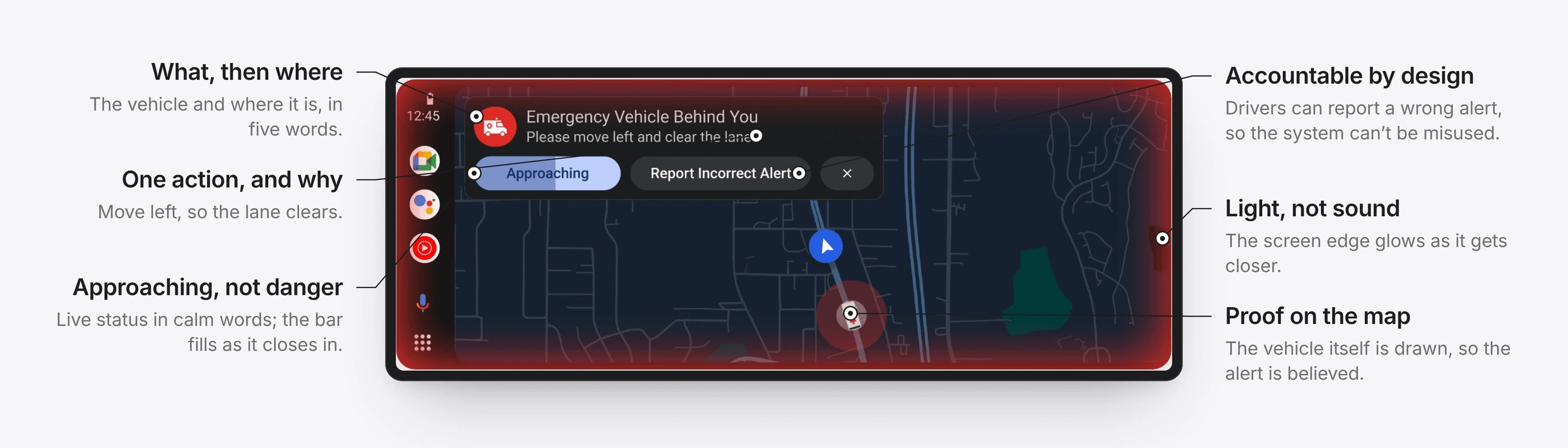
Calm cues where the driver already looks
BeforeA siren competes with music, closed windows and conversation, and still says nothing about direction.
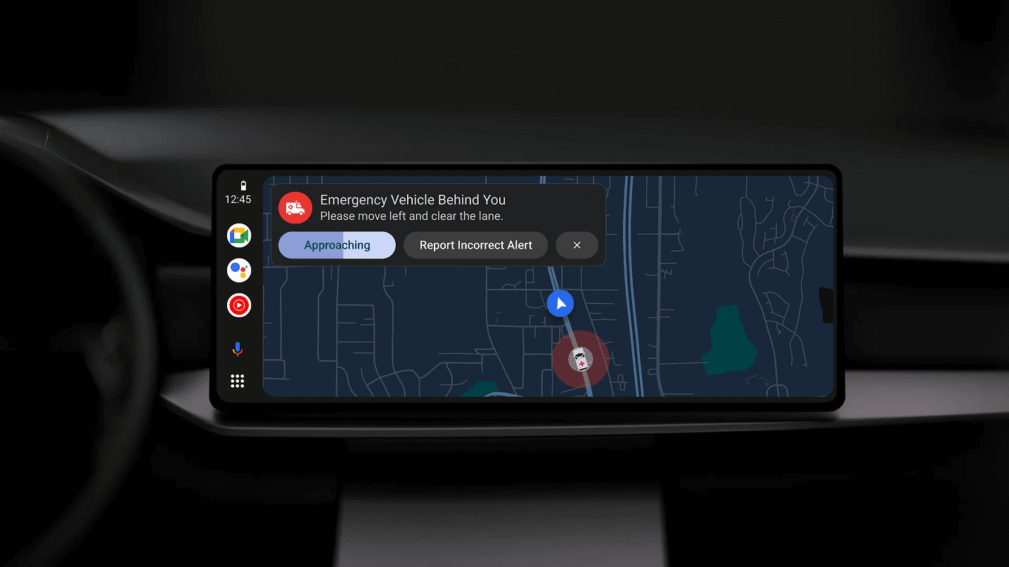
ChangeThree cues, each only when needed: a soft pulse at the map’s edge, light on the side the vehicle comes from, and a one-line banner when it is seconds away. Every early prototype was tested against one question: would this make me panic? Anything that did was removed.
Intended outcomeDrivers should know what is coming, from where, and what to do, without being startled.
The alert in motion: the edge light grows as the vehicle closes in.
5 of 5
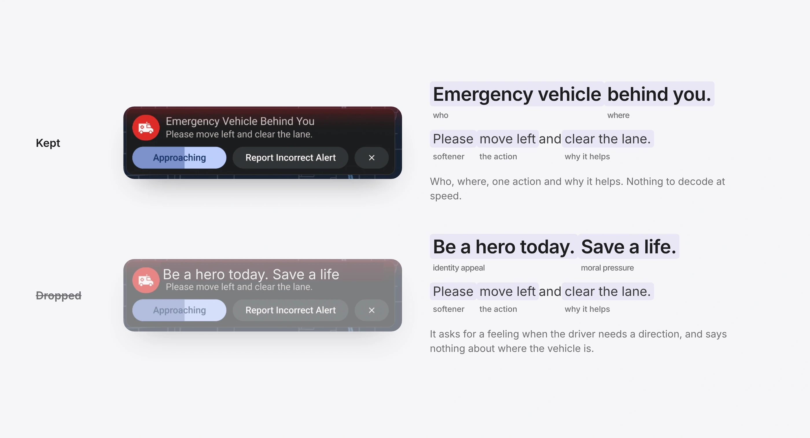
Words that guide, not alarm
BeforeAn early version asked drivers to “Be a hero today. Save a life.”
ChangeThe line says who, where, the action and why: “Emergency vehicle behind you. Please move left and clear the lane.” The status reads “Approaching”, never “Danger”.
Intended outcomeOne line, one action, nothing to decode at speed.
Details that did the work
The small choices are what make a system like this trustworthy enough to use.
What I would test next
Whether lane-level positioning is accurate enough to alert the right drivers.
False alerts, and several emergencies at once.
Privacy, and how responders are verified at scale.
Drivers who aren’t using Maps.
A driving-simulator test of the three cues against a siren alone.
What I learned
The strongest designs reuse behaviour people already have, instead of asking for new behaviour.
Systems thinking solves problems an interface alone can’t.
Calm builds more trust than alarm, and predictability is the antidote to panic.
When in doubt, remove a step rather than add a feature.
People rarely fail because they don’t care. They fail because context reaches them too late.
The full story
The complete case study, with the research, the iterations and the reasoning behind each decision, is on Medium.