A ticket wallet that guides you from entry to exit.
A concept that turns the Delhi Metro ticket wallet into a quiet journey companion, so riders hesitate less, take fewer wrong turns and worry less.
Role
Research and design
Type
Began as an interview assignment
When
2023
Status
Concept, not shipped
5
interchanges observed
Rajiv Chowk to Hauz Khas
20 s
where most wrong turns happen
after entering a new space
4
moments of doubt
entry, platform, interchange, exit
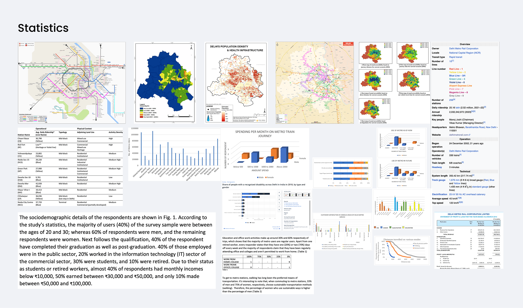
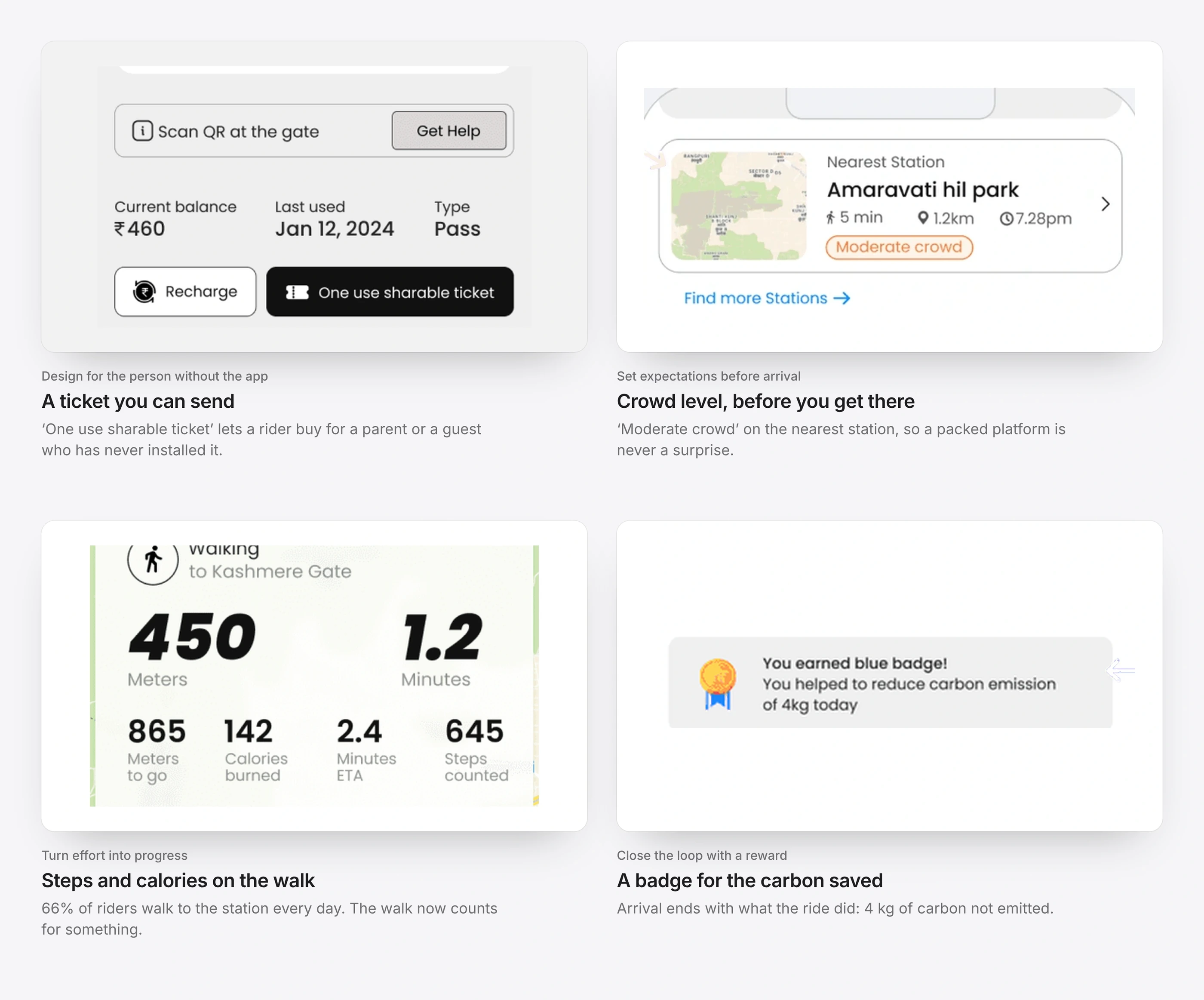
66% of riders walk to the station every day.
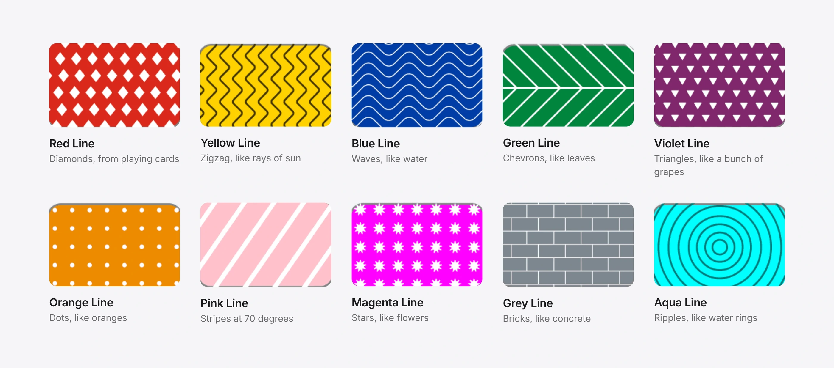
10 lines, each with its own pattern.
Reframing the brief
The brief was to redesign ticketing. Buying a ticket turned out not to be the problem.
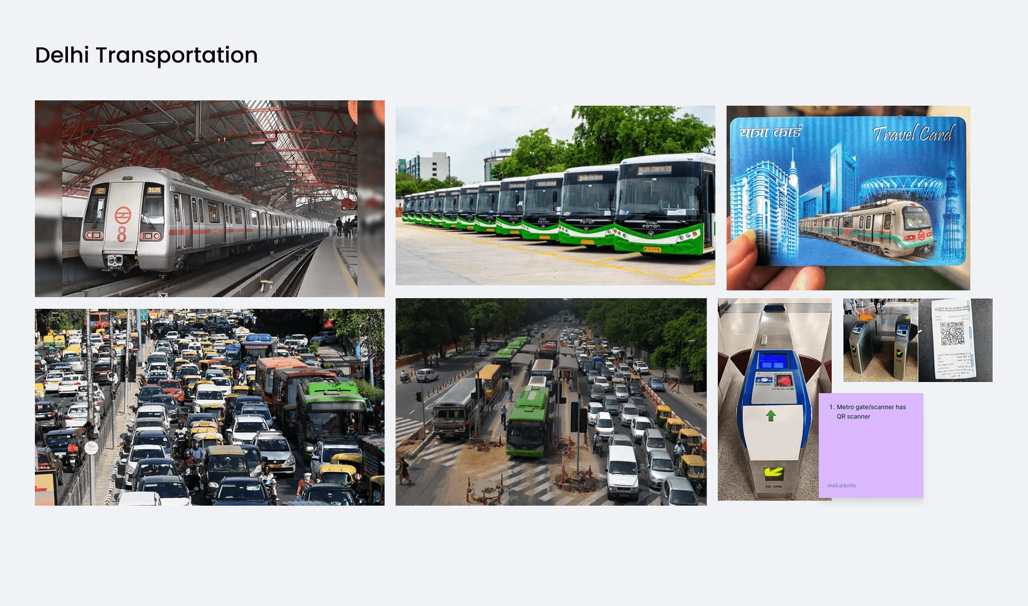
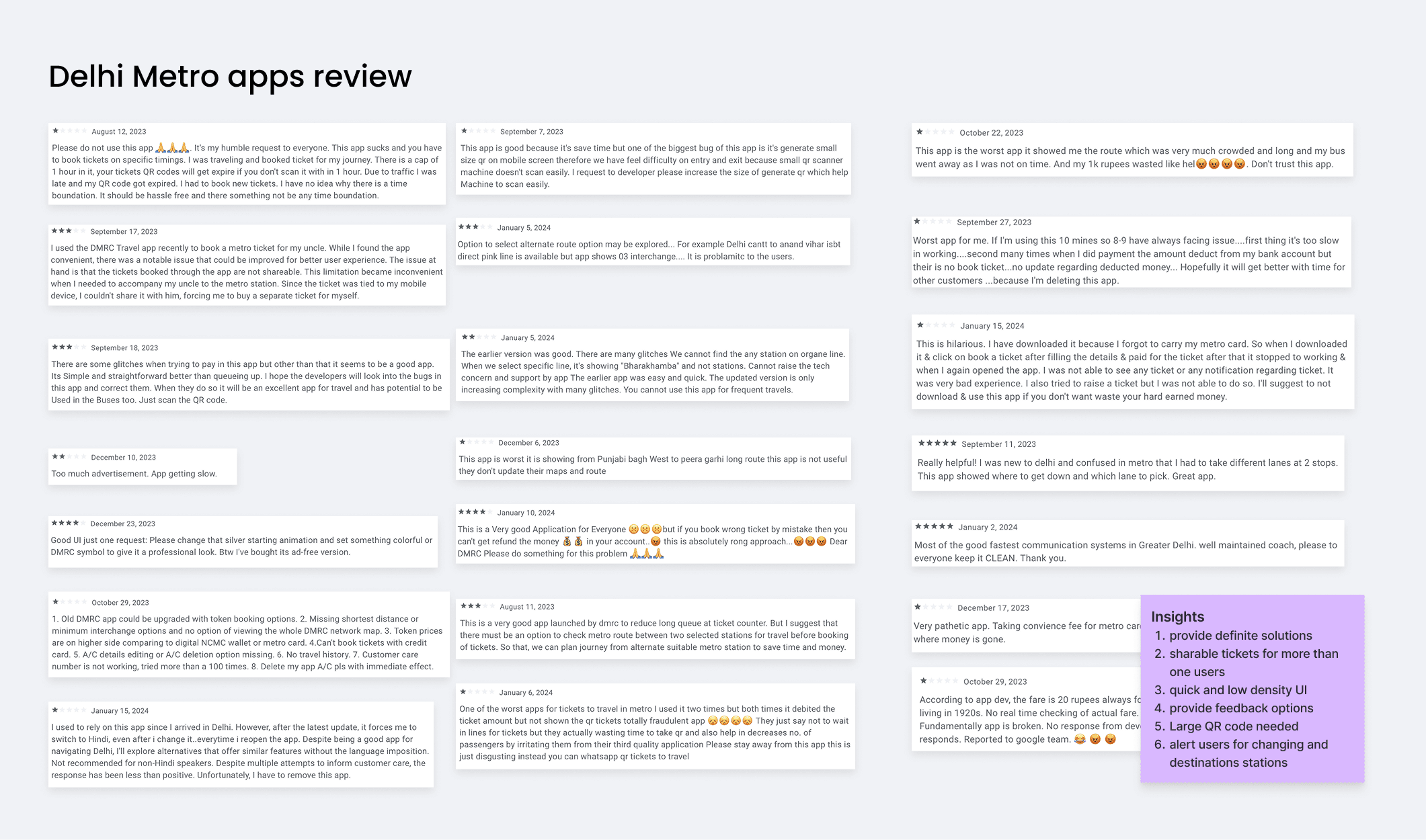
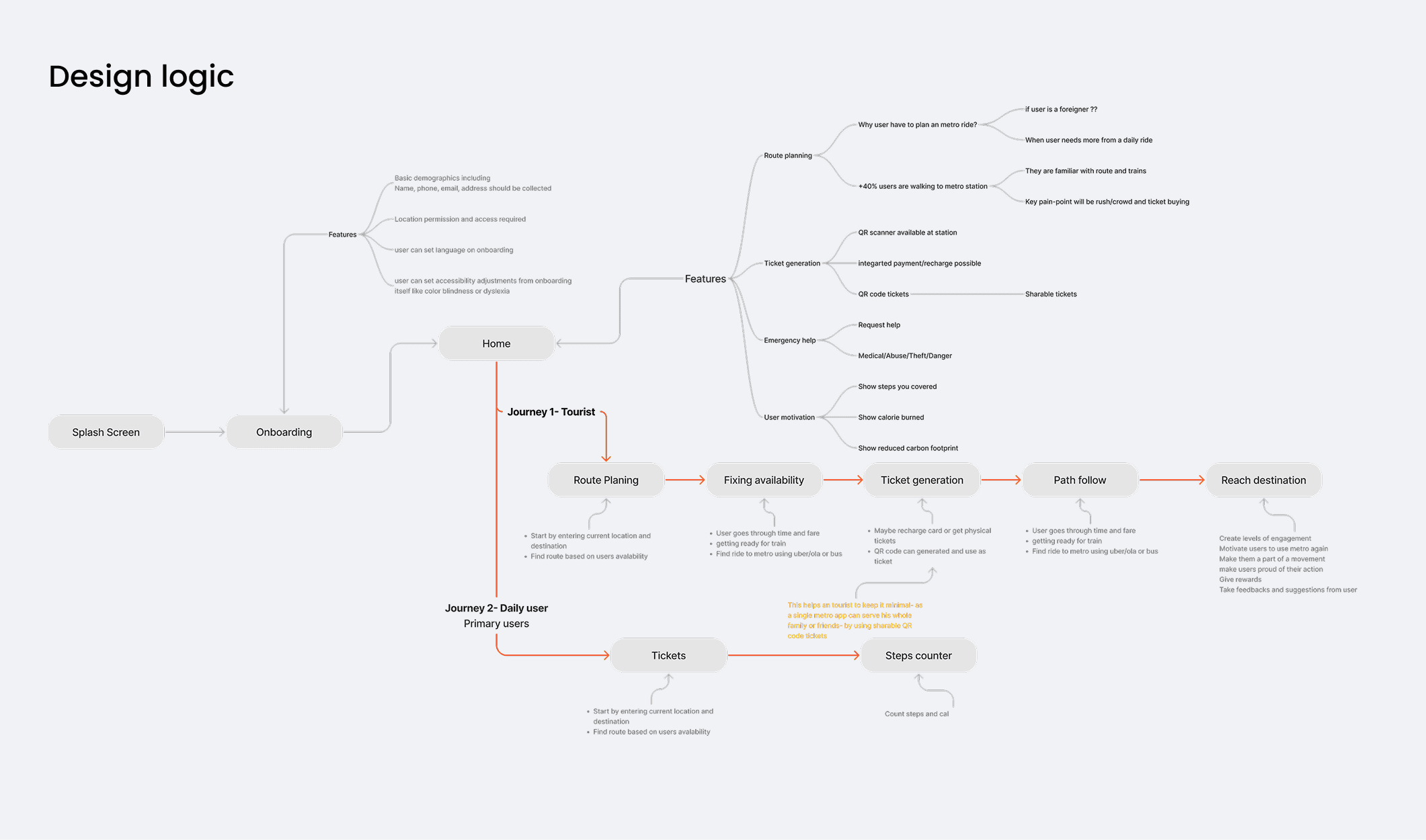
Delhi Metro has excellent physical infrastructure, but no continuous support for the decisions in between. Riders used one app for the ticket, Google Maps for directions, and signs and guards for everything else. They were stitching the journey together themselves.
What I learned
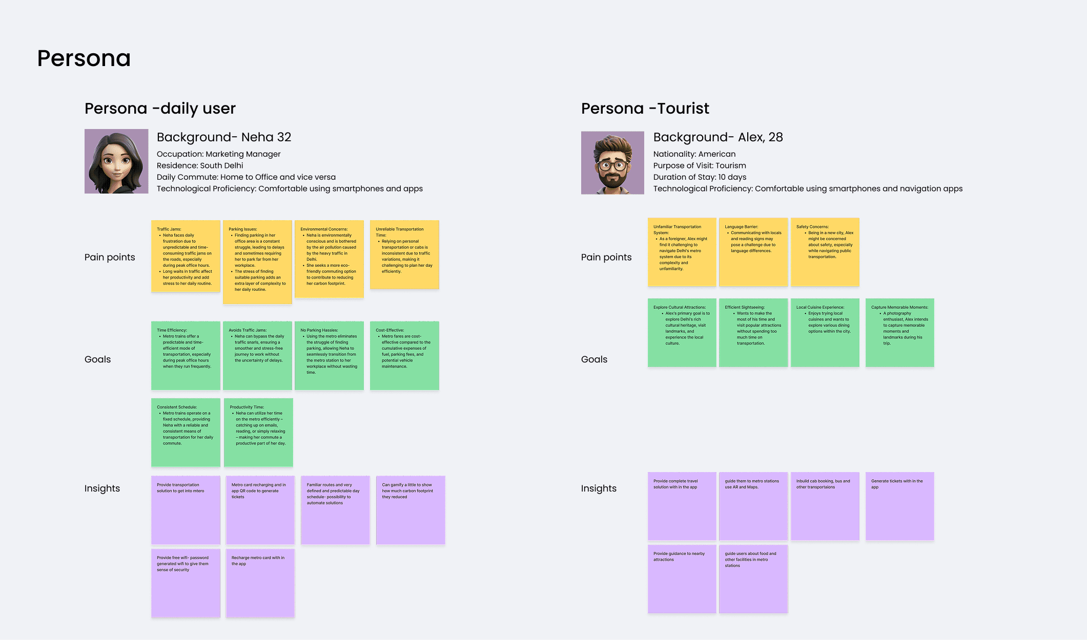
I spoke with students, office commuters and daily riders in Delhi and Kochi, shadowed riders through Rajiv Chowk, Kashmere Gate, Chandni Chowk, Sikandarpur and Hauz Khas, reviewed public incident reports from large metros, and compared wayfinding in Singapore, Hong Kong, Seoul and Tokyo.
People slow down only when they are unsure.
Most wrong turns happen in the first 20 seconds of entering a new space.
Riders didn’t call themselves frustrated. They called themselves uncertain.
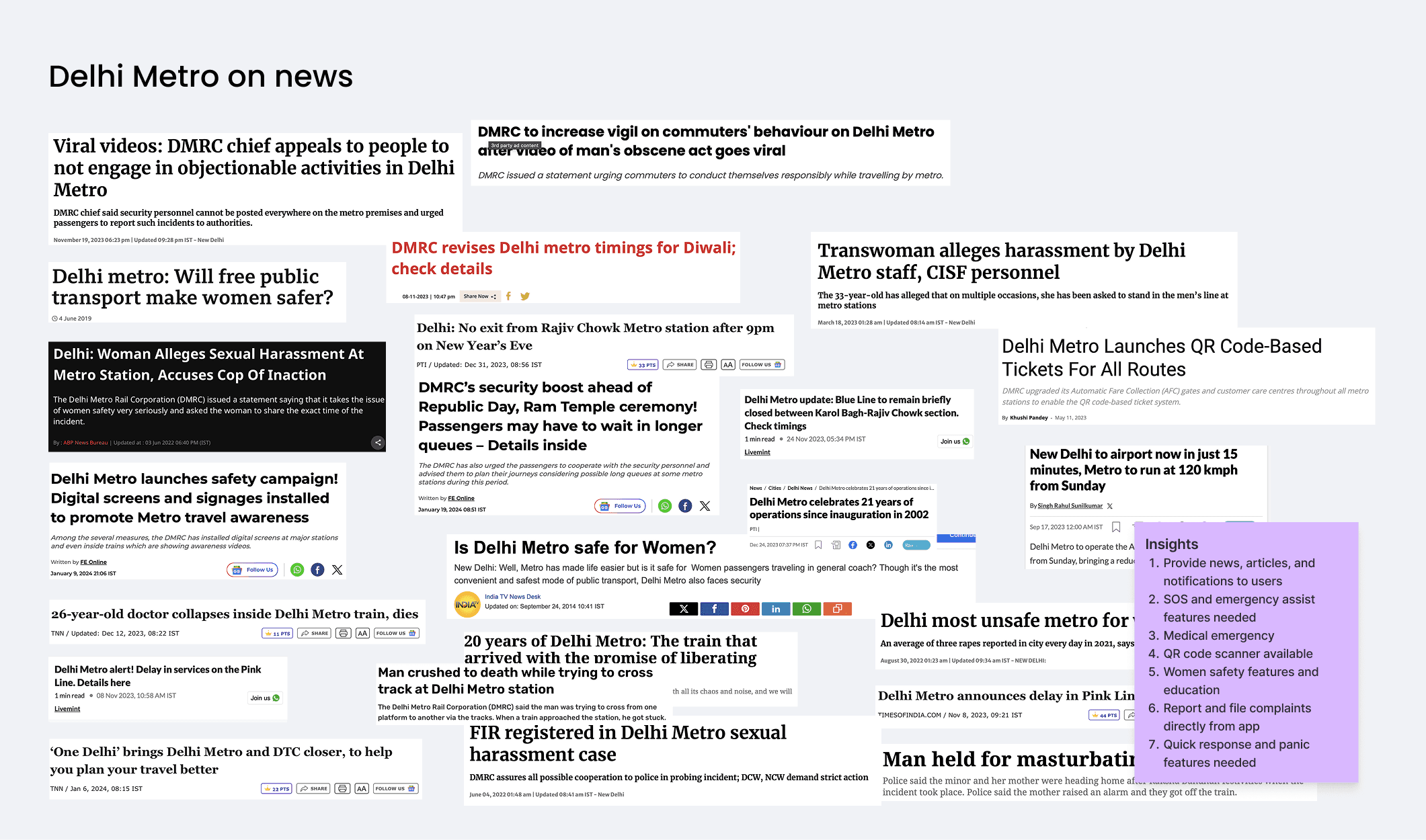
Getting help meant finding a guard, dialling a hotline or leaving the app, all slow in distress.
The best metros remove the need to interpret signs at all.
Walking was never the bottleneck. Deciding was.
Research
1 / 8
Where doubt spikes
Entering the station. Where do I go from here?
On the platform. Which side is my direction?
At an interchange. How far is the change, and which corridor?
Leaving. Which exit is closest to where I’m going?
Each design decision answers one of these before the rider has to ask.
Five decisions
1 of 5
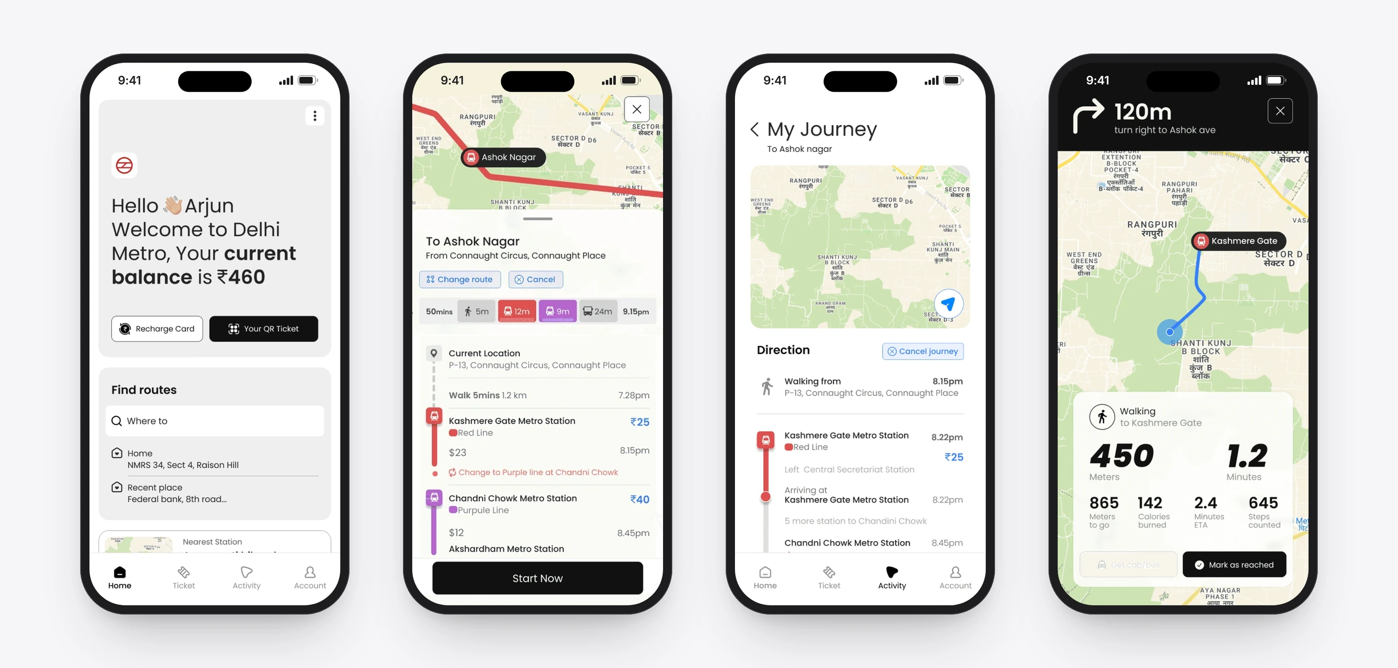
The wallet becomes the journey
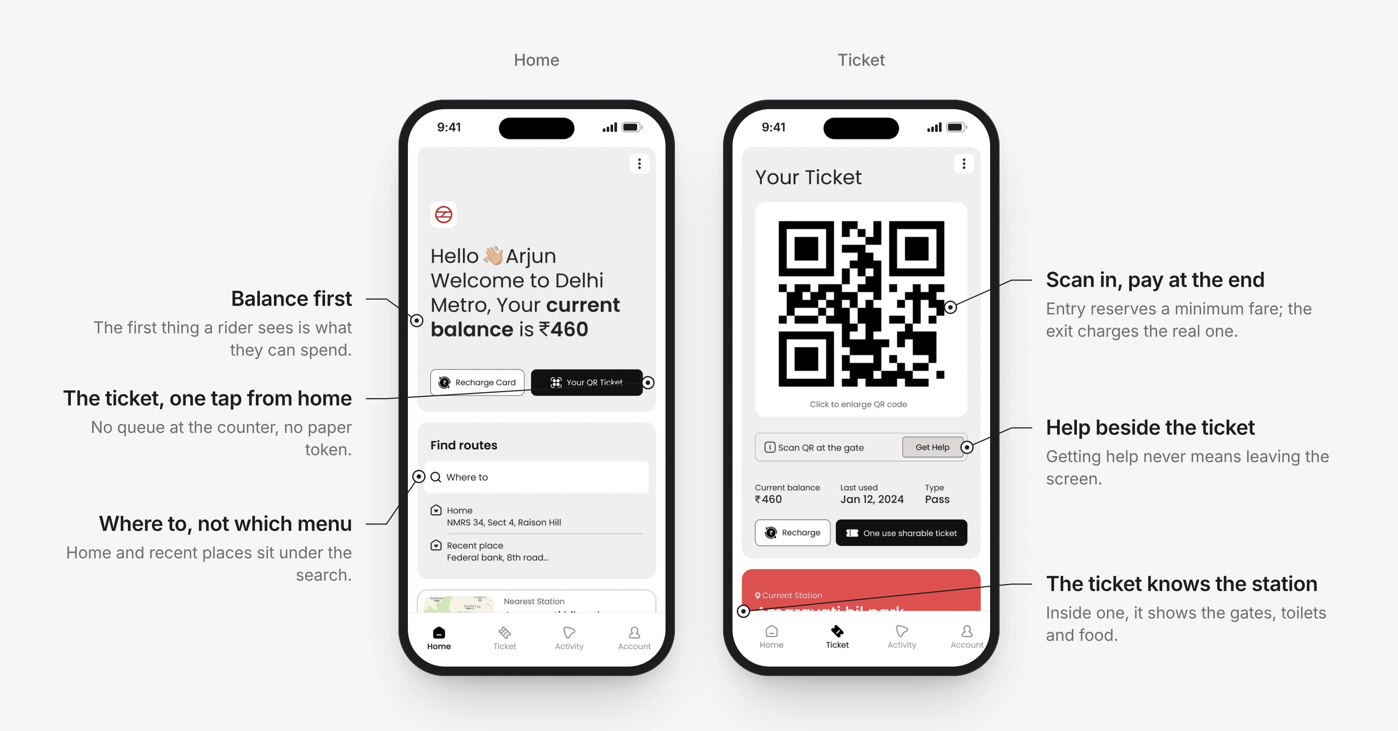
BeforeThe ticket lived in one app and the route in another, so the ticket had no context.
ChangeThe QR ticket sits on the home screen beside the balance and the route search. Scanning in reserves a minimum fare and the exit charges the real one, so there is no counter to queue at.
Intended outcomeOne place for the ticket and the trip.
2 of 5
Plan with everything visible
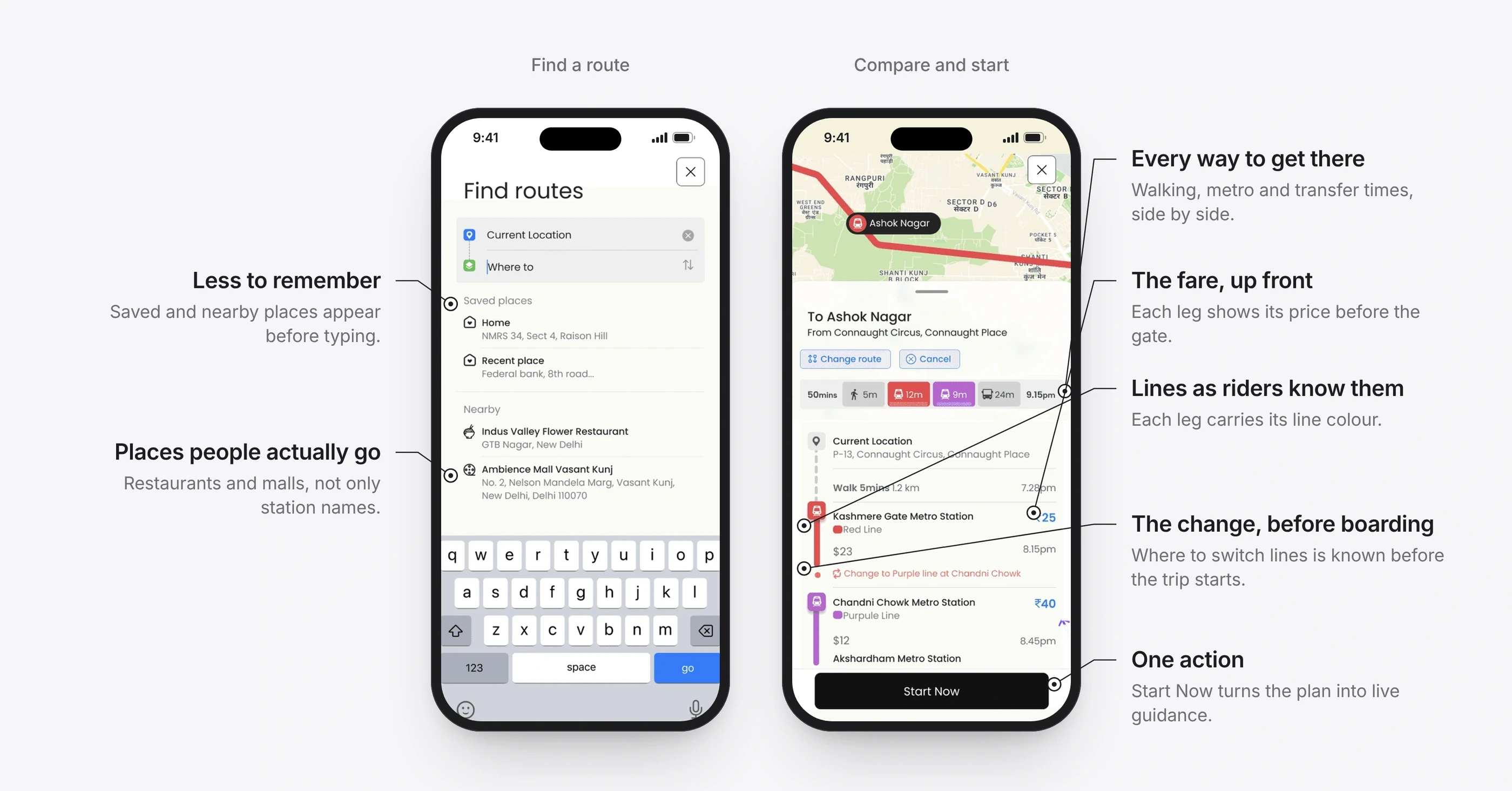
BeforeRiders confirmed routes, fares and changes at the last second, on the platform.
ChangeRoute search starts from saved and nearby places. Options compare walking, metro and transfer times, each leg carries its line colour and fare, and the change is shown before boarding.
Intended outcomeThe decisions move from the platform to the planning screen.
3 of 5
Guidance before the doubt
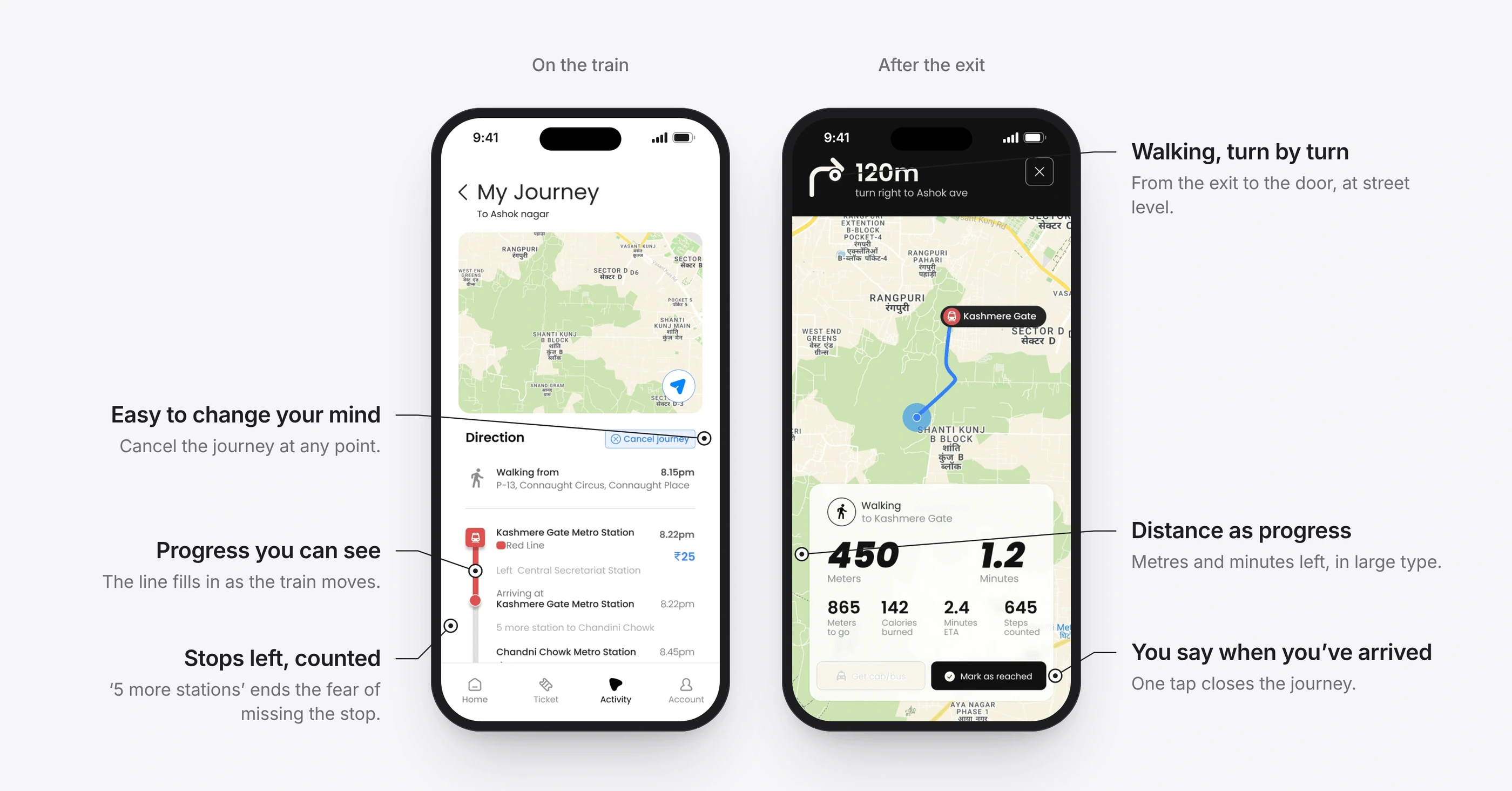
BeforeRiders slowed at platforms and interchanges to check, and guessed at exits.
ChangeOnce the journey starts, the line fills in as the train moves and counts the stops left. After the exit, walking turns become turn by turn, with distance and time in large type.
Intended outcomeFewer checks, fewer wrong turns, and less worry about missing the stop.
4 of 5
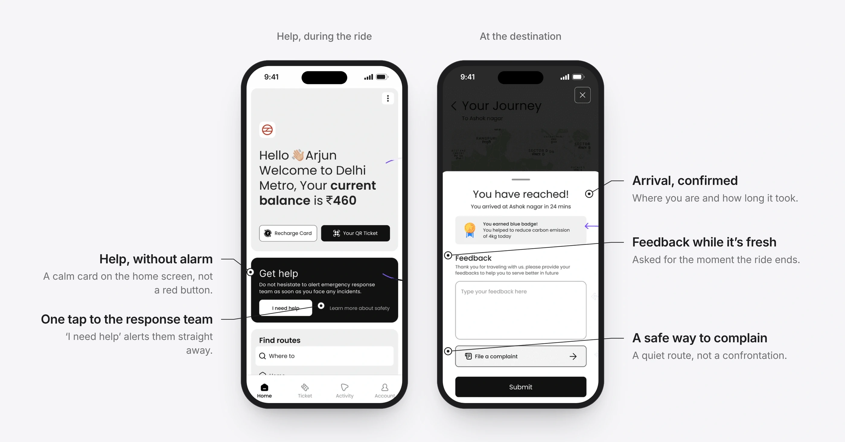
Help that is always one tap away
BeforeWomen, late-night and solo riders had no quick, discreet way to reach help.
ChangeA calm ‘Get help’ card on the home screen and ‘Get Help’ beside the ticket alert the response team in one tap. The ride ends with a quiet route to feedback or a complaint.
Intended outcomeHelp is visible without making the ride feel unsafe.
5 of 5
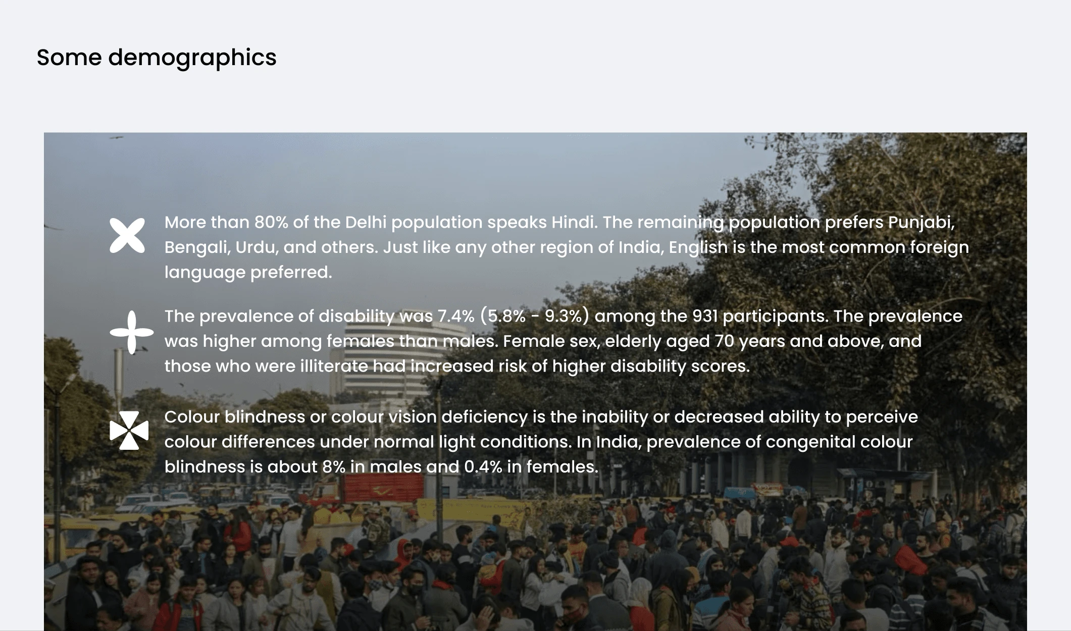
Lines you can tell apart without colour
BeforeLine colours alone don’t work for colour-blind riders, in glare, or on a cheap screen.
ChangeEach of the ten lines pairs its colour with a pattern drawn from something familiar: diamonds for Red, waves for Blue, grapes for Violet.
Intended outcomeEvery line can be told apart by shape alone.
Details that did the work
Small touches that make a daily commute feel looked after.
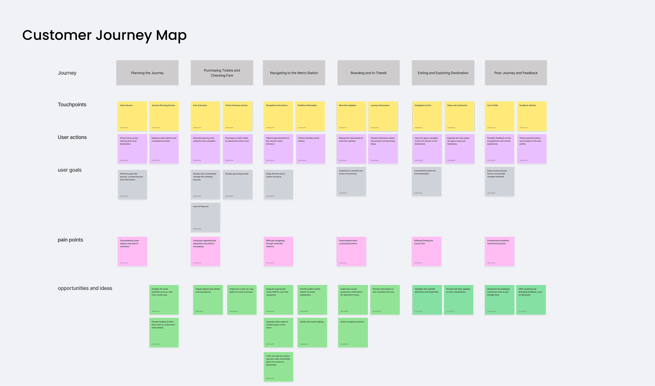
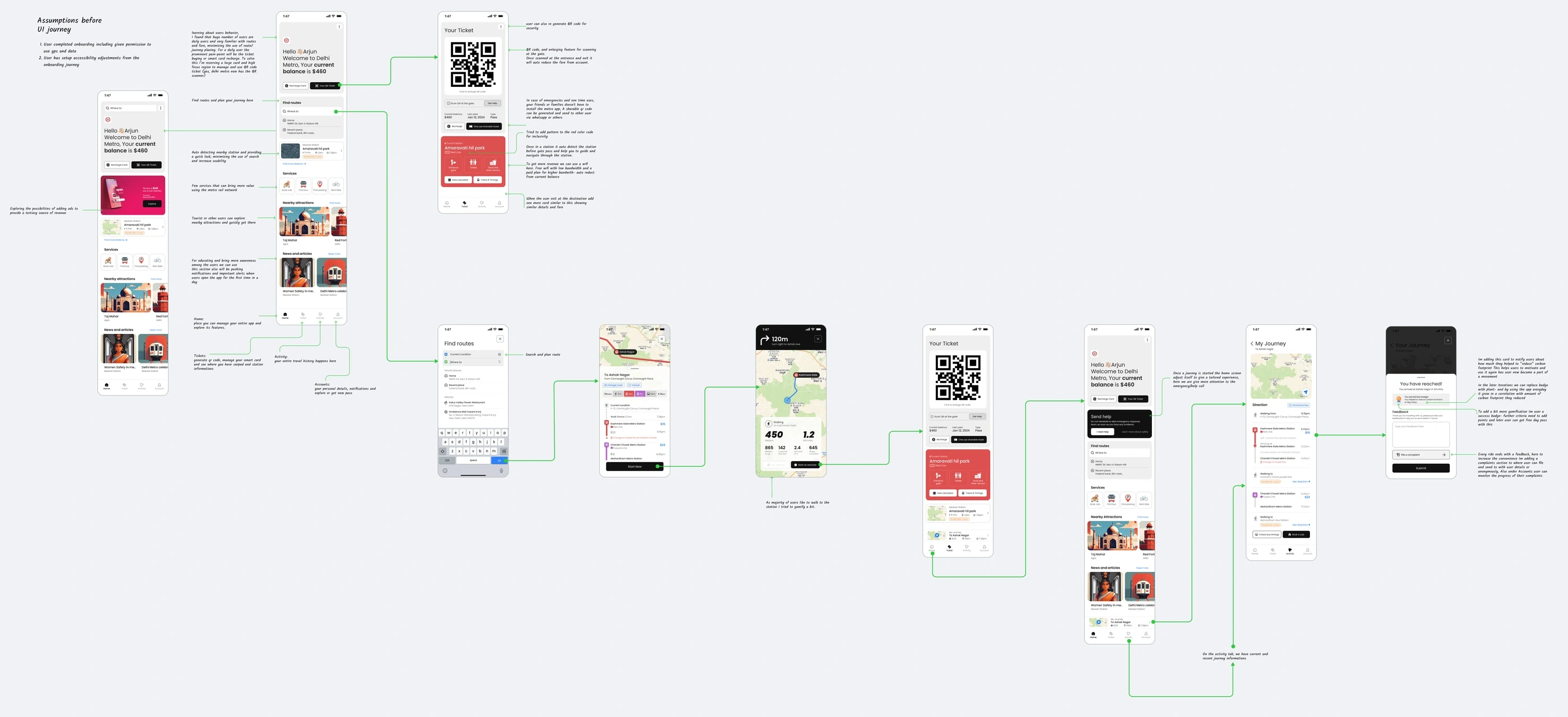
The whole journey
From planning to exit
What’s unproven
This is a concept. Its ideas haven’t been tested with riders, and the fare reservation would need the operator’s gate systems. The next step would be a prototype test at a single interchange, measuring hesitation, wrong turns and time to exit against riders using today’s app.
Success is when riders take the right train, leave by the right gate and get home feeling safe, without noticing the design.
The full story
The complete case study, with the research, the iterations and the reasoning behind each decision, is on Medium.